A survey of script behaviors
Chinese Writing System (Han Ideographs)
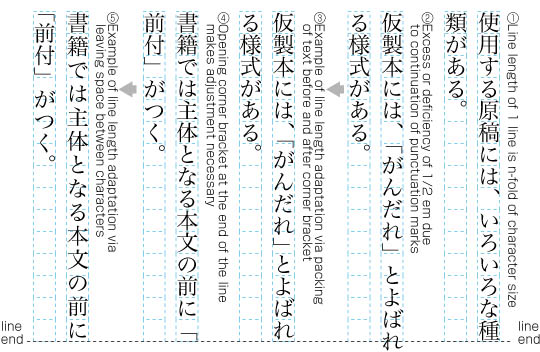
Historically, Chinese was written as Han ideographs, with no punctuation. Under this system, justification was automatic, as the characters fit perfectly into a square grid, and lines could wrap between any two characters. However, the introduction of punctuation in recent centuries, along with its accompanying line-breaking restrictions, plus the increase in mixed-script text (such as the inclusion of European numbers and/or words, phrases, names, and trademarks) has created a need for adjustments within a line.
Punctuation introduced line-breaking restrictions such as not starting a line with a period or closing parentheses; and Latin text, while sometimes typeset in a full-width character style with Chinese-style line-breaking, is also frequently typeset with proportional fonts and line-wrapped or hyphenated according to its usual rules, breaking the Chinese grid. These newer developments thus open up space at the end of a line, which justification needs to deal with.
Chinese notably does not use word spaces, so these do not provide a justification opportunity within the lines; thus justification techniques focus on adjustments to spacing around punctuation, script-change boundaries, and inter-character spacing.
Japanese Writing System
Like Chinese, Japanese was historically written in Han ideographs; however it has since developed its own phonetic scripts Hiragana and Katakana (collectively, Kana). While pure kana texts do exist, particularly in children’s literature, Han ideographs (Kanji, in Japanese) continue to be an integral part of normal Japanese text, and are interspersed with kana within a sentence.
Like Chinese, Japanese embraced European-inspired punctuation, numerals, and other foreign snippets that don’t conform to the standard full-width character grid. The Japanese writing system also does not use word spaces, and similarly focuses on adjustments to spacing around punctuation, script-change boundaries, and inter-character spacing, with a notable preference for compression of intra-glyph spacing over expansion between glyphs.
Punctuation normally fits in the same square glyph as ideographic and kana characters, but typically leaves a substantial part of that square blank. When attempting to justify text on a line, justification may reduce the blank space in such glyphs first, before attempting other strategies.
Korean Writing System
Like Japanese, Korean was historically written in pure Han ideographs, but long ago developed its own phonetic script, Hangul, which has mostly supplanted ideographs in modern Korean writing.
While Han ideographs (Hanja, in Korean) were kept as part of the writing system, they have become increasingly scarce over time such that many documents are written in pure Hangul, and some only use Hanja in a limited way for things such as proper nouns, or dates, or as inline annotations for disambiguation among homophones rather than as part of the main text. However, Hanja and Hangul together remain important components of Korean writing.
Like Japanese, Korean adopted punctuation and numerals. However, unlike Japanese, Korean also adopted word spaces, and tends towards narrow (Western-style, rather than full-width) punctuation.
The word spaces allow Korean to use inter-word justification: as in English publications, this method adjusts the spaces between words in order to fill the line. However, unlike English, modern Korean normally wraps characters rather than whole words to a new line when the end of a line is reached. This can to some extent reduce the difficulty of justifying text.
Latin (Roman) Writing System
Quite possibly the writing system familiar to more people than any other, the Latin writing system derives from the Roman alphabet, including a few additional characters and diacritic marks to accommodate languages such as Icelandic and modern Vietnamese. Thanks to the Europeans in the Age of Exploration, their missionaries, and the Western-dominated global scholastic culture of the modern age, most languages in the world have one or more Latin transcriptions, even those that do not use it as their primary writing system.
The Latin alphabet is a phonetic system with disjoint letterforms, and typically uses spaces between words. This allows it to use inter-word justification, although it can and sometimes does adjust the spacing between individual letters as well. Line breaks generally occur between words, although hyphenation is also allowed to reduce the variance in line lengths.
Since text in Latin script is frequently adopted into other writing systems, it can sometimes take on characteristics of that system; for example, some styles of Japanese typesetting treat Latin letters the same as Japanese characters for the purpose of line-breaking and justification.
Ethiopic Writing System
Like Latin, the Ethiopic writing system uses an alphabet of disjoint letters
and uses punctuation to indicate the break between words.
Unlike Latin, Ethiopic traditionally uses a visible word separator –
Because the traditional word space is visible, the question arises as to whether it should stay with the previous word or be centred between words when the space between words is stretched. Both approaches are attested. A similar question arises for the ETHIOPIC FULL STOP U+1362 ።: in some cases the author may prefer that the space to the right side of the full stop is “more elastic”, rather than stretching the space around it equally.
Arabic Writing System (and Other Cursive Systems)
Arabic is a cursive script, meaning its letters are typically joined together within a word. This creates additional challenges, and opportunities for full justification.
Since Arabic uses spaces between words,
one method for justification is inter-word justification –
For example, baseline connections may be stretched (kashida), or alternate forms of glyphs, including ligated forms, may be used to lengthen or shorten words. There tend to be complex rules for the use of such techniques, which may depend on things such as the number of syllables in a word, or the proximity of a word to the start of the line, etc. The applicability of such techniques also tends to vary across different font styles, such as naskh, nastaʻlīq, and ruqʻa. Ruqʻa font styles avoid elongation techniques for justification.
A simplistic variant of the kashida technique inserts baseline elongation marks (U+0640 TATWEEL ـ) at appropriate points in the text to produce justified lines, but the result is generally regarded as ugly. Depending on the implementation, it may also affect operations such as copy-paste, and searching. It is a particular problem for browser-based text, if content authors add tatweels to their source text, since stretching the browser window will invalidate the distribution of the tatweel characters.
Syriac and Mongolian have properties similar to Arabic, and in the absence of additional information should be given similar treatment for justification.
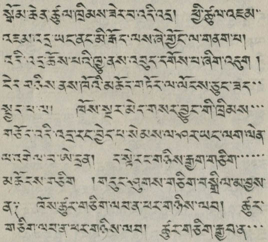
Tibetan Writing System
Tibetan is a Brahmic writing system related to Indic scripts like Devanagari and Gujarati; however, unlike these systems, it does not use Western-style punctuation nor spaces between words, and instead uses the TIBETAN MARK INTERSYLLABIC TSHEG U+0F0B ་ between individual syllables (regardless of word boundaries), and has its own punctuation marks such as the TIBETAN MARK SHAD U+0F0D ། and TIBETAN MARK NYIS SHAD U+0F0E ༎, which indicate the end of longer segments.
Justification techniques used in Tibetan include stretching the space after a shad, minutely increasing the spaces after tsheg marks, and simply filling the remaining space on a line with tsheg marks.
South & Southeast Asian Writing Systems
Tamil has many very long words, and in Tamil news columns it may not be possible to fit more than a single word on a line. In such cases it is common to stretch the word to fit the whole width of the line. To do so, equal space is added between each non-connected glyph across the line. Space is inserted evenly between the unconnected glyphs, regardless of whether a glyph is part of a syllabic cluster, or even a single code point.
The figure just below illustrates how this stretching is based on glyphs, and is independent of the underlying code points.
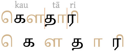
Note the following:
- The sequence of three items on the far left is actually composed of only two code points, க [U+0B95 TAMIL LETTER KA] followed by the circumgraph ௌ [U+0BCC TAMIL VOWEL SIGN AU]. Notice that there are spaces between the base consonant and both glyphs that make up the vowel-sign.
- To its immediate right, the base character and combining mark that make up the middle syllable have been split apart, so the units are codepoints rather than grapheme clusters.
- The last grapheme cluster (on the right) is kept intact, because the vowel-sign is joined to the base consonant.
In Southeast Asian systems such as Thai and Lao, there are no spaces between words, but spaces serve to separate larger units of text. However, lines are still broken at (invisible) word boundaries, and the text may be stretched to make the line ends flush. If there are no spaces on a line, or if expanding the spaces produces gaps that are too large, similar glyph-based algorithms may be applied to the text in order to produce the expansion needed.
Other Writing Systems
Most (but not all) writing systems not mentioned here have discrete letters, like Latin, and in the absence of more specific information may be assumed to justify in a similar manner.
Readers who wish to provide such “more specific information” are invited (and strongly encouraged) to create a github issue so that we can add information or links to this article and the Language enablement index.