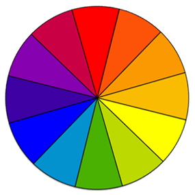
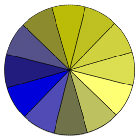
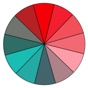
Fig. 4Full color perceptionFig. 5Red-green color blindnessFig. 6Blue-yellow color blindness
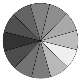
Fig. 7No color perception (rare)
Below is a text description of the Figures 4, 5 and & 6 in the Low Vision Requirements document. These figures show that colors that are different for people with full color perception may appear to be the same color for different types of color blindness.
The Position column refers to the clock position in the color wheel. The Gray values are the Brightness levels from Hue, Saturation and Brightness settings.
Note: 2 versions of table. Added the image to <th> to more closely associate image with description
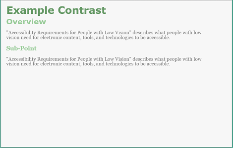
first heading is largest, sans-serif font, dark-green
second heading is next largest, sans-serif font, green
text is smallest text, serif font, dark-gray
third heading is 3rd largest heading, serif font, green (same color as second heading)
link is serif font, blue, underlined
bold is bold serif text
italic is italic serif text
bullet items are indented 3 spaces, filled circle dot vertically centered (1/3 size text font size), one space, item text
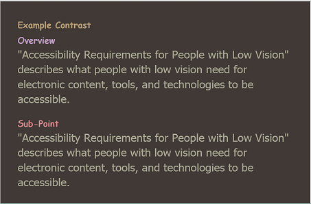
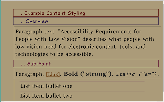
Fig. 12Web page with user style - with different fonts, indentation, borders, different colors, and dots preceding text to differentiate heading levels
Background is khaki
all text including headings is the same size
first heading is sans-serif font, maroon text and full border around element, 1 period with a space (. ) precedes text of heading, period and text indented 2 spaces from border
second heading is sans-serif font, blue text and border around element, 2 periods with a space (.. ) precedes text of heading, periods and text indented 2 spaces from border
text is larger than headings, serif font, black text, gray border around element, text not indented
third heading is 3rd largest heading, serif font, purple text and border around element, 3 periods with a space (... ) precedes text of heading, periods and text indented 2 spaces from border
link is serif font, brown, underlined, surrounded by square brackets [ ]
bold is bold serif text
italic is italic serif text
bullet items are indented one space, the list has a left margin border of light blue, each item has a top border of lavender
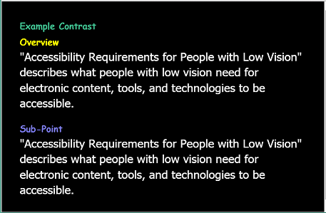
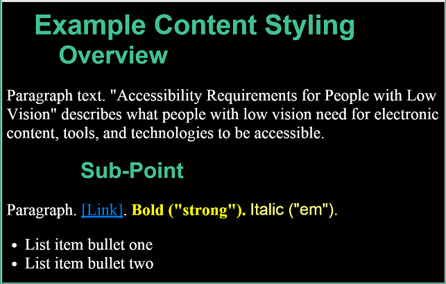
Fig. 13Web page with user style - with different fonts, indentation, and colors to differentiate heading levels
Background is black
all headings are sans-serif font, spring green
first heading is largest text, indented 2 spaces from left margin
second heading is next largest text, indented 4 spaces from left margin
text is smallest text on page, serif font, white
third heading is 3rd largest heading, indented 6 spaces from left margin
link is serif font, blue, underlined, surrounded by square brackets [ ]
bold is bold serif text, yellow
italic is italic serif text, pale yellow
bullet items indented 1 space, horizontally centered bullet, one space, text