CSS Grid Layout Module Level 3

Editor’s Draft,

More details about this document
This version:
https://drafts.csswg.org/css-grid-3/
Issue Tracking:
CSSWG Issues Repository
Inline In Spec
Editors:
Tab Atkins Jr. (Google)
Elika J. Etemad / fantasai (Apple)
(Mozilla)
Jen Simmons (Apple)
Brandon Stewart (Apple)
Suggest an Edit for this Spec:
GitHub Editor
Test Suite:
https://wpt.fyi/results/css/css-grid/masonry/tentative/

Abstract

This module introduces masonry layout as an additional layout mode for CSS Grid containers.

CSS is a language for describing the rendering of structured documents (such as HTML and XML) on screen, on paper, etc.

Status of this document

This is a public copy of the editors’ draft. It is provided for discussion only and may change at any moment. Its publication here does not imply endorsement of its contents by W3C. Don’t cite this document other than as work in progress.

Please send feedback by filing issues in GitHub (preferred), including the spec code “css-grid” in the title, like this: “[css-grid] …summary of comment…”. All issues and comments are archived. Alternately, feedback can be sent to the (archived) public mailing list www-style@w3.org.

This document is governed by the 03 November 2023 W3C Process Document.

This specification represents two variations on the proposal for masonry layout. Feedback on the alternatives is welcome.

1. Introduction

This section is not normative.

Grid Layout is a layout model for CSS that has powerful abilities to control the sizing and positioning of boxes and their contents. Grid Layout is optimized for 2-dimensional layouts: those in which alignment of content is desired in both dimensions.

An example of grid layout:
		     two rows of items,
		     the first being four items — the last of which spans both rows,
		     and the second being two items —
		     the first of which spans the first two columns —
		     plus the spanned item from the first row.
Representative Grid layout example

Although many layouts can be expressed with regular Grid Layout, restricting items into a grid in both axes also makes it impossible to express some common layouts on the Web.

This module defines a layout system that removes that restriction so that items can be placed into Grid-like tracks in just one of the axes, while stacking them one after another in the other axis. Items are placed into the column (or row) with the most remaining space based on the layout size of the items placed so far. This module also extends CSS Grid with this new grid item placement strategy and CSS Box Alignment with new alignment features.

1.1. Background and Motivation

Masonry layout, sometimes also called “waterfall layout”, is a common Web design pattern where a number of items—​commonly images or short article summaries—​are placed one by one into columns in a way that loosely resembles stone masonry. Unlike multi-column layout, where content is placed vertically in the first column until it must spills over to the second column, masonry layout selects a column for each new item such that it is generally closer to the top of the layout than items placed later.
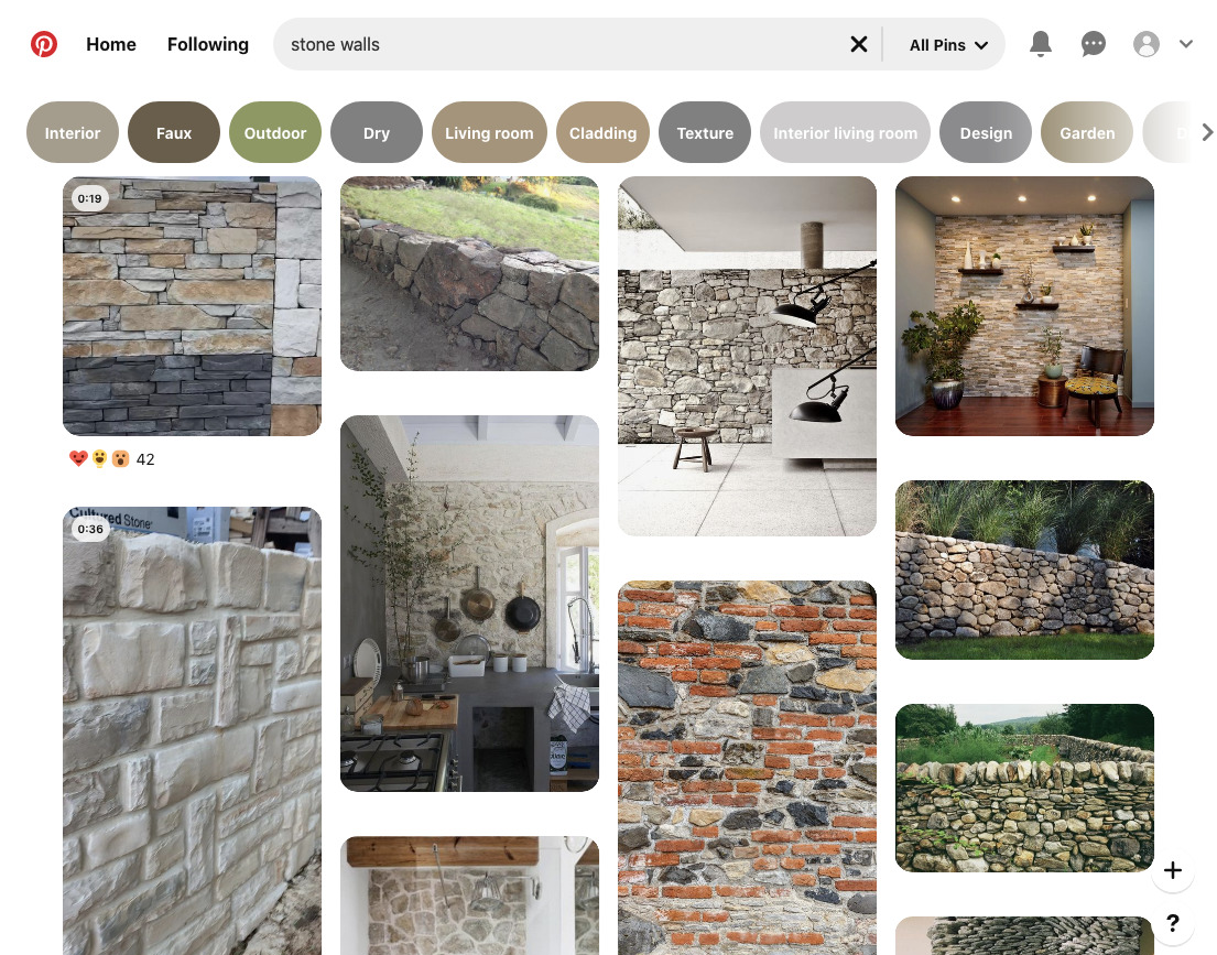
The Pinterest search results page exemplifies this layout:
An example of masonry layout:
			          four columns of items,
			          each item is placed into the column with the smallest height so far.
Representative masonry layout example

Here, each item has a different height (depending on the content and the width of the column), and inspecting the DOM reveals (as the visual content itself gives no indication of ordering) that each item has been placed into the column with the smallest height so far.

This layout superficially looks similar to multi-column layout; but it has the advantage that scrolling down will naturally lead to "later" items in the layout (that is, those less relevant in the search results).

It’s not possible to achieve this layout using earlier CSS layout models, unless you know up-front how tall each item will be, or use JavaScript for content measurement or placement.

1.2. Alternative Syntax Proposals

The masonry layout feature of this specification is drafted with two different syntaxes to promote debate and discussion of these two alternatives.
Grid-integrated Option
In this syntax model, masonry layout is integrated into the grid layout model, re-using all of the grid-* properties.
Grid-independent Option
In this syntax model, masonry layout is its own display type, and has its own parallel set of masonry-* properties.

1.3. Value Definitions

This specification follows the CSS property definition conventions from [CSS2] using the value definition syntax from [CSS-VALUES-3]. Value types not defined in this specification are defined in CSS Values & Units [CSS-VALUES-3]. Combination with other CSS modules may expand the definitions of these value types.

In addition to the property-specific values listed in their definitions, all properties defined in this specification also accept the CSS-wide keywords as their property value. For readability they have not been repeated explicitly.

2. Masonry Layout Model

Masonry layout lays out items into pre-defined tracks similar to grid layout in one axis (called the grid axis), but flows them freely similar to flex layout in the other (called the stacking axis). Similar to grid layout and unlike flex layout, masonry layout’s auto-placement distributes items across the tracks to keep the lengths of those tracks as similar as possible.

Grid items are formed and blockified exactly the same as in a regular grid container.

(For clarity, grid items and grid tracks of a masonry container can be referred to as masonry items and masonry tracks.)

All CSS properties work the same as in a regular grid container unless otherwise specified by this specification. For example, order can be used to specify a different layout order for the items.

Note: Subgrid items are supported, but subgridding only occurs in the grid axis; see § 3.3 Subgrids for details.

A masonry container is a box whose contents participate in masonry layout. A masonry container is a column masonry container if its stacking axis is the block axis, or a row masonry container if its stacking axis is the inline axis.

Establishing Masonry Containers
Grid-integrated Syntax Grid-independent Syntax Description
Column Masonry
display: grid;
grid-template-columns: 1fr 2fr 3fr;
grid-template-rows: masonry;
display: masonry;
masonry-tracks: 1fr 2fr 3fr;
masonry-direction: column;
Column masonry lays out items in columns,
					     but ordered across the columns,
					     placing each item in the then-shortest column.
Row Masonry
display: grid;
grid-template-rows: 1fr 2fr 3fr;
grid-template-columns: masonry;
display: masonry;
masonry-tracks: 1fr 2fr 3fr;
masonry-direction: row;
Row masonry lays out items in rows,
					     but ordered down across the rows,
					     placing each item in the then-shortest row.

2.1. Reordering and Accessibility

Although masonry layout generally progresses in a forwards fashion (placing the next item down or endward of the current item, matching the natural "reading order"), it can switch between these two in a seemingly arbitrary manner. In simple cases, the masonry-slack property can help reduce the feeling of backtracking due to small sizing differences in the block axis when laying out auto-placed items. But when auto-placement is mixed with explicit placement or spanning items, some amount of backtracking may occur.

For example, in the following markup sample, the fourth item is a spanner that doesn’t fit in the remaining empty column on the first line. It ends up positioned into the into the first column, which is the highest available space into which it will fit. The next few items, which have a span of 1, end up laying out “above” it in the empty column, violating the natural reading order.
<section class=masonry>
  <div class=item>1</div>
  <div class=item>2</div>
  <div class="item tall">3</div>
  <div class="item wide">4</div>
  <div class=item>5</div>
  <div class=item>6/div>
  <div class=item>7</div>
</section>
<style>
.masonry {
  display: masonry;
  masonry-tracks: repeat(5, auto);
}
.item { height: 50px; }
.item.wide { masonry-track: span 3; }
.item.tall { height: 90px; }
</style>
In this example, the first row is items 1, 2, 3, 5, 6,
			          with item 3 slightly taller than the others.
			          Item 4 spans the first three columns, and is placed
			          just below item 3, while item 7 is tucked under item 5.
Auto-placed masonry layout with mixed-height items and mixed span sizes
Similarly, items explicitly placed into specific tracks can leave gaps behind them, into which subsequent auto-placed items can be placed visually out-of-order.

Authors should be aware of these possibilities and design layouts where such backtracking is minimized so that focus and reading order can be more easily followed. Alternatively, if the items do not have an inherent order, use the reading-flow property to allow the UA to re-order the items for reading and linear navigation.

Or should reordering be the default behavior for auto-placed items here?

Techniques for reducing backtracking include:

As with grid layout and flex layout authors can use the order property to re-order items; the same caveats apply. See CSS Grid Layout 2 § 4 Reordering and Accessibility and CSS Flexbox 1 § 5.4.1 Reordering and Accessibility.

2.2. Grid-integrated Option: Establishing Masonry Layout

2.2.1. Indicating the stacking axis: the masonry keyword for grid-template-columns/grid-template-rows

Name: grid-template-columns, grid-template-rows
New values: masonry
Initial: none
Applies to: grid containers
Inherited: no
Percentages: refer to corresponding dimension of the content area
Computed value: the keyword none or the keyword masonry or a [[computed track list]]
Animation type: see CSS Grid Level 2

Masonry layout can be applied to grid containers by specifying the value masonry for one of its axes, defining it as the stacking axis. Such grid containers are called masonry containers.

If masonry is specified for both grid-template-columns and grid-template-rows, then the used value for grid-template-columns is none, and thus the inline axis will be the grid axis.

2.2.2. Auto Flow Directions: the grid-auto-flow property

Name: grid-auto-flow
Value: [ row | column | row-reverse | column-reverse ] || dense || wrap-reverse
Initial: row
Applies to: grid containers
Inherited: no
Percentages: n/a
Computed value: specified keyword(s)
Canonical order: per grammar
Animation type: discrete

This specification extends the grid-auto-flow property to add row-reverse, column-reverse, and wrap-reverse, which reverse the directions of the grid item placement algorithm.

In masonry layout, the flow axis specified by grid-auto-flow is ignored: items are always placed by filling across the grid axis.

Should that be the case, or should we follow the grid-auto-flow axis always (so it would fill similar to flexbox, but with explicitly-sized tracks)?

Should dense packing apply to masonry? It’s much more expensive in masonry, as you have to lay out the element in every possible gap spot to see if it’s short enough to fit; Grid gets to just juggle some integers. [Issue #9326]

2.3. Grid-independent Option: Establishing Masonry Layout

2.3.1. Establishing Masonry Containers: the masonry and inline-masonry display values

Name: display
New values: masonry | inline-masonry
masonry

This value causes an element to generate a masonry container box that is block-level when placed in flow layout.

inline-masonry

This value causes an element to generate a masonry container box that is inline-level when placed in flow layout.

2.3.2. Masonry Track Direction: the masonry-direction property

Name: masonry-direction
Value: row | column | row-reverse | column-reverse
Initial: column
Applies to: masonry containers
Inherited: no
Percentages: n/a
Computed value: as specified
Canonical order: per grammar
Animation type: discrete

The masonry-direction property specifies how items are placed in the masonry container, by setting its stacking axis and direction.

column

The masonry container’s stacking axis is its block axis, and masonry layout starts from its block-start edge.

column-reverse

The masonry container’s stacking axis is its block axis, and masonry layout starts from its block-end edge.

row

The masonry container’s stacking axis is its inline axis, and masonry layout starts from its inline-start edge.

row-reverse

The masonry container’s stacking axis is its inline axis, and masonry layout starts from its inline-end edge.

The masonry container’s grid axis is perpendicular to its stacking axis.

2.3.3. Masonry Cross Direction: the masonry-fill property

Name: masonry-fill
Value: normal | reverse
Initial: normal
Applies to: masonry containers
Inherited: no
Percentages: n/a
Computed value: as specified
Canonical order: per grammar
Animation type: discrete

masonry-fill determines what direction auto-placed items are laid out in when multiple tracks are tied for “shortest”.

normal

Ties are broken by filling the startmost track

reverse

Ties are broken by filling the endmost track.

2.3.4. Masonry Flow Directions: the masonry-flow shorthand

Name: masonry-flow
Value: <'masonry-direction'> || <'masonry-fill'>
Initial: see individual properties
Applies to: see individual properties
Inherited: see individual properties
Percentages: see individual properties
Computed value: see individual properties
Animation type: see individual properties
Canonical order: per grammar

The masonry-flow property is a shorthand for the masonry-direction and masonry-fill properties.

2.3.5. Masonry Definition Shorthand: the masonry property

Name: masonry
Value: <'masonry-template-areas'> || <'masonry-template-tracks'> || <'masonry-direction'> || <'masonry-fill'>
Initial: see individual properties
Applies to: see individual properties
Inherited: see individual properties
Percentages: see individual properties
Computed value: see individual properties
Animation type: see individual properties
Canonical order: per grammar

The masonry shorthand sets masonry-template-areas, masonry-template-tracks, masonry-direction, and masonry-fill at the same time.

3. Masonry Track Specification

In the grid axis, the full power of grid layout is available for track specification:

However, auto-placed items contribute sizing to all tracks, not just the track into which they are ultimately placed; see § 3.5 Grid Axis Track Sizing.

Note: This is because auto-placed items must be laid out as they are placed, so that each track knows how “full” it is (and therefore which track should receive the next auto-placed item); thus, the tracks themselves must already have a definite size so that the items know their available space during layout.

3.1. Grid-integrated Option: Declaring Masonry Track Templates: the grid-template-* properties

The grid-template-* and grid-auto-rows/grid-auto-columns properties (and their shorthands) apply in the grid axis of the masonry container and establish tracks just as on regular grid containers.

3.2. Grid-independent Option: Declaring Masonry Track Templates: the masonry-template-* properties

Tracks in the grid axis of a masonry container are established with masonry-template-tracks, masonry-template-areas, and masonry-auto-tracks.

Name: masonry-template-tracks
Value: <'grid-template-columns'>
Initial: repeat(auto-areas, auto)
Applies to: masonry containers
Inherited: no
Percentages: refer to correspodning dimension of the content area
Computed value: by computed value type per item in the computed track list
Canonical order: per grammar
Animation type: if list lengths match, by computed value type; otherwise, discrete

masonry-template-tracks has the same syntax and interpretation as grid-template-columns, but a different initial value.

(Instead of defaulting to no tracks, as in Grid Layout, it defaults to matching masonry-template-areas, if possible, or otherwise filling the masonry container with as many auto tracks as possible.)

Name: masonry-template-areas
Value: none | <string>
Initial: none
Applies to: masonry containers
Inherited: no
Percentages: n/a
Computed value: the keyword none or a string
Canonical order: per grammar
Animation type: discrete

masonry-template-areas has the same syntax and interpretation as grid-template-areas, except it only takes a single string defining one "row" of area names.

Name: masonry-auto-tracks
Value: <'grid-auto-columns'>
Initial: auto
Applies to: grid containers
Inherited: no
Percentages: refer to correspodning dimension of the content area
Computed value: a computed track list
Canonical order: per grammar
Animation type: if the list lengths match, by computed value type per item; discrete otherwise

masonry-auto-tracks has the same syntax and interpretation as grid-auto-columns.

3.3. Subgrids

Subgridding allows nested masonry containers (and grid containers) to share track sizes. If the parent’s corresponding axis is a grid axis, the subgridded axis is taken from the parent container as specified for grid containers; if the parent’s corresponding axis is a stacking axis...

Grid-integrated Syntax: ...the subgridded axis acts like masonry.

Note: If this results in masonry in both axes, it is resolved as normal for masonry containers with double-axis masonry templates, i.e. it acts like grid-template-columns: none; grid-template-rows: masonry.

Grid-independent Syntax: ...the subgridded axis acts like none.

In masonry layout, auto-placed subgrids don’t inherit any line names from their parent grid, because that would make the placement of the item dependent on layout results; but the subgrid’s tracks are still aligned to the parent’s tracks as usual.

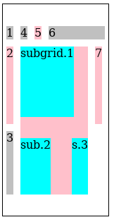
Here’s a subgrid example:
<style>
.grid {
  display: inline-grid;
  grid: auto auto 100px / masonry;
  align-content: center;
  height: 300px;
  border: 1px solid;
}

.grid > * {
  margin: 5px;
  background: silver;
}
.grid > :nth-child(2n) {
  background: pink;
}

.grid subgrid {
  display: grid;
  grid: subgrid / subgrid;
  grid-row: 2 / span 2;
  grid-gap: 30px;
}
.grid subgrid > * { background: cyan; }
</style>
<div class="grid">
  <item>1</item>
  <item>2</item>
  <item>3</item>
  <subgrid>
    <item style="height:100px">subgrid.1</item>
    <item>sub.2</item>
    <item>s.3</item>
  </subgrid>
  <item>4</item>
  <item>5</item>
  <item style="width: 80px">6</item>
  <item>7</item>
</div>
The rendering of the subgrid example above.

Note how the subgrid’s first item ("subgrid.1") contributes to the intrinsic size of the 2nd row in the parent grid. This is possible since the subgrid specified a definite position so we know which tracks it will occupy. Note also that trying to subgrid the parent’s stacking axis results in the subgrid getting masonry layout in its inline axis.

A subgrid that is a masonry container can be referred to as a submasonry.

3.4. Track Repetition: the repeat() notation

This specification introduces new keywords and masonry-specific behavior for the repeat() notation.

3.4.1. repeat(auto-areas)

The new auto-areas value for the repeat() notation represents the number of repetitions necessary for the total number of explicit tracks to match the grid-template-areas / masonry-template-areas value in effect in the corresponding axis. If multiple tracks are listed for the repetition, the final repetition is truncated as necessary to produce the correct number of tracks.

Note: Unlike auto-fill—​which always repeats at least once and always repeats the track listing entirely—​the number of repetitions for auto-areas can be zero (if there are already enough explicit tracks), and the final repetition can be partial.

If grid-template-areas / masonry-template-areas is none, this value behaves as auto-fill.

Note: This value applies both to regular grid containers and to masonry containers.

3.4.2. repeat(auto-fit)

In masonry containers (as in regular grid containers) auto-fit acts like auto-fill, but with empty tracks collapsed. However, because placement occurs after track sizing, masonry containers use a heuristic to determine if a track will be occupied:

All tracks produced by the auto-fit repetition and considered unoccupied by this heuristic are assumed “empty” and are collapsed. A collapsed track cannot accept placement of auto-placed items.

Note: It is possible for an auto-placed item to be placed in a track when auto-fill is used that would be collapsed if auto-fit is used if there are auto-placed items with a span greater than 1 mixed with explicitly-placed items that leave gaps too small for the auto-placed items.

3.5. Grid Axis Track Sizing

Track sizing works the same as in CSS Grid, except that when considering which items contribute to intrinsic sizes:

For example, suppose there are two columns in the grid axis and that

In this case, items A, B, C, and D all contribute to sizing the first column, while only A, B, and C (and not D) contribute to the second column.

In the case of spanning items with an automatic grid position, they are assumed to be placed at every possible start position, and contribute accordingly.

For example, suppose there are 5 columns in the grid axis, with the middle having a fixed size of 100px and the other two being auto-sized. For the purpose of track sizing, an item that spans 2 tracks and has an intrinsic contribution of 220px is essentially copied and assumed to exist:

Note: This algorithm ensures that each track is at least big enough to accommodate every item that is ultimately placed in it, and does not create dependency cycles between placement and track sizing. However, depending on the variation in sizes, tracks could be larger than necessary: an exact fit is only guaranteed if all items are explicitly placed in the grid axis or all items are the same size (or matching multiples of that size, in the case of spanning items).

3.5.1. Subgrid Item Contributions

When sizing the tracks of either a regular grid container or a masonry container, a submasonry has special handling of items that have an automatic grid position:

3.5.2. Optimized Track Sizing

Track sizing can be optimized by aggregating items that have the same span size and placement into a single virtual item as follows:

  1. Separate all the masonry items into item groups, according to the following properties:
    • the span of the item

    • the placement of the item, i.e. which tracks it is allowed to be placed in

    • the item’s baseline-sharing group

    Note: For example, an item with span 2 placed in the second track will be in a different group than an item with span 2 that has an automatic grid position.

  2. For each item group, synthesize a virtual masonry item that has the maximum of every intrinsic size contribution among the items in that group.

    If the items apply baseline alignment, determine the baselines of the virtual masonry item by placing all of its items into a single hypothetical grid track and finding their shared baseline(s) and shims. Increase the group’s intrinsic size contributions accordingly.

  3. Place hypothetical copies of each virtual masonry item into the grid axis tracks in every position that the item could potentially occupy, and run the track sizing algorithm with those items. The resulting track sizes are the masonry container’s track sizes.

Note: This optimization should give the same results as the track sizing description above; if not this is an error, please report it to the CSSWG.

4. Masonry Placement

In the grid axis, items can be explicitly placed into tracks and span them using the familiar grid-placement properties’ syntax. Auto-placement, however, uses the § 4.4 Masonry Layout and Placement Algorithm, placing each item with an automatic grid position into the “shortest” masonry track available.

Here’s a masonry layout example demonstrating placed and spanning items:
Rendering of the example above.

Need a better example!!!

4.1. Grid-integrated Option: Specifying Masonry Item Placement: the grid-column-* and grid-row-* properties

The grid-column-* and grid-row-* properties (and their shorthands) apply in the grid axis of the items and establish placement just as in regular grid layout.

4.2. Grid-independent Option: Specifying Masonry Item Placement: the masonry-track-* properties

Item placement in the grid axis of a masonry container is established with the masonry-track-start and masonry-track-end properties (and their masonry-track shorthand), whose syntax and interpretation are analogous to the grid-column-start and grid-column-end properties (and their grid-column shorthand).

4.3. Placement Precision: the masonry-slack property

Name: masonry-slack
Value: <length-percentage>
Initial: 1em
Applies to: masonry containers
Inherited: no
Percentages: relative to the grid-axis content box size of the masonry container
Computed value: a computed length
Canonical order: per grammar
Animation type: discrete

Masonry containers are filled by placing each masonry item in whichever masonry track is currently the least filled. When multiple tracks are tied for least-filled, placing the items in order looks good. But if tracks are only very slightly different heights, it can look strange to have them not fill in order, as the height differences aren’t perceived as meaningfully different.

The masonry-slack property specifies what the threshold is for considering tracks to be “the same height”, causing them to fill in order.

<length>

Specifies the tie threshold for the masonry container. Placement positions are considered to be equally good (“tied”) if they are within the specified distance from the shortest position.

Note: The initial value is a “small” distance (1em) that is probably appropriate to represent “close enough”.

Is 1em the right default?

4.4. Masonry Layout and Placement Algorithm

For each of the tracks in the grid axis, keep a running position initialized to zero. Maintain also a auto-placement cursor, initially pointing to the first line.

For each item in order-modified document order:

  1. If the item has a definite grid position in the grid axis, use that placement.

    Should this also update the placement cursor?

    Otherwise, resolve its grid axis placement using these substeps:

    1. Starting at the first grid axis line in the implicit grid, find the largest running position of the grid axis tracks that the item would span if it were placed at this line, and call this position max_pos.
    2. Increment the line number and repeat step 2 until the item would no longer fit inside the grid.
    3. Let possible lines be the line that resulted in the smallest max_pos, and all lines that result in a max_pos within the tie threshold of this max_pos.
    4. Choose the first line in possible lines greater than or equal to the auto-placement cursor as the item’s position in the grid axis; or if there are none such, choose the first one.
    5. Update the auto-placement cursor to point to item’s last line.
  2. Place the item in its grid axis tracks at the maximum of the running positions of the tracks it spans.
  3. Calculate the size of the item’s containing block and then layout the item. Set the running position of the spanned grid axis tracks to max_pos + outer size + grid-gap.

Note: This algorithm chooses the track that would result in the item being placed as highly as possible. If there are ties, it chooses the earliest such track, after the most recently placed item if possible (ensuring that it always “moves forward” even in the presence of ties).

If placing items in reverse order (see grid-auto-flow/masonry-flow), the algorithm is analogous but in reverse order.

4.4.1. Containing Block

The containing block for a grid item participating in masonry layout is formed by its grid area in the grid axis and the grid container's content box in the stacking axis.

4.4.2. Placement and Writing Modes

Note: Like all of grid layout, masonry layout and placement is sensitive to the writing mode. For example, for direction: rtl, items are placed right-to-left rather than left-to-right, whether the inline axis is a grid axis or a stacking axis.

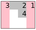
Here’s a simple example using direction: rtl in the grid axis:
<style>
  .grid {
    display: inline-grid;
    direction: rtl;
    grid: masonry / repeat(4, 2ch);
    border: 1px solid;
  }

  item { background: silver }
  item:nth-child(2n+1) {
    background: pink;
    height: 4em;
  }
  </style>
<div class="grid">
  <item>1</item>
  <item style="grid-column:span 2">2</item>
  <item>3</item>
  <item>4</item>
</div>
Rendering of the direction: rtl example above.
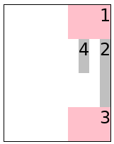
Here’s a simple example using direction: rtl in the stacking axis:
<style>
.grid {
  display: inline-grid;
  direction: rtl;
  width: 10ch;
  column-gap: 1ch;
  grid: repeat(4, 2em) / masonry;
  border: 1px solid;
}

item { background: silver }
item:nth-child(2n+1) {
  background: pink;
  width: 4ch;
}
</style>
<div class="grid">
  <item>1</item>
  <item style="grid-row:span 2">2</item>
  <item>3</item>
  <item>4</item>
</div>
Rendering of the direction: rtl example above.

5. Sizing Grid Containers

Sizing Grid Containers works the same as for regular grid containers but with the following addendum for the stacking axis: The max-content size (min-content size) of a grid container in the stacking axis is the size of the masonry box in that axis when sized under a max-content constraint (min-content constraint).

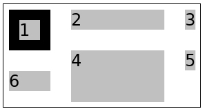
Here’s a simple example:
<style>
.grid {
  display: inline-grid;
  grid: masonry / 50px 100px auto;
  grid-gap: 10px;
  border: 1px solid;
}
item { background: silver; margin: 5px; }
</style>
<div class="grid">
  <item style="border:10px solid">1</item>
  <item>2</item>
  <item>3</item>
  <item style="height:50px">4</item>
  <item>5</item>
  <item>6</item>
</div>
Rendering of the grid container intrinsic sizing example above.

6. Alignment and Spacing

Gutters are supported in both axes. In the stacking axis, the gap is applied between the margin boxes of each pair of adjacent items. Margins do not collapse in either axis.

In the grid axis, alignment works the same as in a regular grid container.

In the stacking axis, content-distribution is applied to the content as a whole, similarly to how it behaves in block containers. More specifically, the alignment subject is the masonry box, which is the smallest rectangle bounding the margin boxes of all the grid items.

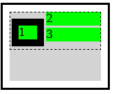
The extent of the masonry box is indicated by the dashed border. (Note that item 1 has a 5px bottom margin here.)

Note: There is only ever one alignment subject for these properties in the stacking axis, so the unique align-content / justify-content values boil down to start, center, end, and baseline alignment. (The behavior of normal and stretch is identical to start, and the distributed alignment values behave as their fallback alignments.) If the grid items overflow the grid container's content box in the stacking axis, then the masonry box will be larger than the grid container's content box.

Should alignment in the stacking axis do something more sophisticated? What should that be?

6.1. Baseline Alignment in the stacking axis

Item baseline alignment inside the grid axis tracks works as usual for a regular grid container, and the grid container's baseline is determined the same as for a regular grid container in that axis.

Baseline alignment is not supported in the stacking axis. The first baseline set of the grid container in this axis is generated from the alignment baseline of the first grid item in the first occupied track, and the last baseline set from the last grid item placed.

We could support baseline alignment in the first row. Do we want to?

Should the last baseline come from the last lowest item placed instead?

7. Fragmentation

7.1. Fragmentation in the stacking axis

Each grid axis track is fragmented independently in the stacking axis. If a grid item is fragmented, or has a forced break before/after it, then the running position for the tracks that it spans in the grid axis are set to the size of the fragmentainer so that no further items will be placed in those tracks. An item that is split into multiple fragments retains its placement in the grid axis for all its fragments. A grid item that is pushed, however, is placed again by the next grid container fragment. Placement continues until all items are placed or pushed to a new fragment.

Here’s an example illustrating fragmentation of a grid with masonry layout in its block axis. It renders like this:
Visualization of fragmentation in a block-axis masonry layout.

7.2. Fragmentation in the Grid Axis

Fragmentation in the grid axis with masonry layout in the other axis is also supported. In this case the fragmentation behaves more like in a regular grid container; however, there’s a separate step to determine which grid-axis track each item is placed into, before fragmentation occurs.

Here’s an example illustrating fragmentation of a grid with masonry layout in its inline axis. In this case the breaks occurs between the grid-axis rows. It renders like this:
Visualization of fragmentation in the block axis with inline-axis masonry layout.

8. Absolute Positioning

Grid-aligned absolute-positioned descendants are supported in masonry containers just as for regular grid containers; however, in the stacking axis there exist only two lines (in addition to the auto lines) for placement:

It might be useful to define a static position in the stacking axis. Maybe it could defined as the max (or min?) current running position of the grid-axis tracks at that point? Or the end of the item before it?

9. Performance Notes

In general, masonry layout should have significantly better performance than the equivalent regular (2-axis) grid layout, particularly when the stacking axis is the block axis since the intrinsic sizing of grid rows is typically quite expensive. Any intrinsic track sizing in the grid axis should be cheaper too, because, typically, only a subset of items contribute to the intrinsic sizing in a masonry layout, contrary to a 2-axis grid where all items spanning an intrinsically-sized track contribute. Stretched items do a second layout with the new size (when it actually changed) so this can be costly if there are a huge amount of stretched items that each contains a lot of content. Especially nested stretched masonry layouts should be avoided unless they are small/trivial.

This can be ameliorated by the author by opting out from the stretching on most items though, e.g. specifying align-items:start and then opting in for just a few items with align-self:stretch to let those items fill the stacking axis. (This performance analysis is from a Gecko perspective, but I suspect there’s some truth to it for other layout engines as well.)

10. Graceful Degradation

Typically, a masonry design can be expected to degrade quite nicely in a UA that supports Grid layout but not masonry layout if the grid/grid-template shorthands are avoided and the longhands are used instead. e.g.

grid-template-rows: masonry; /* ignored by UAs that don't support it */
grid-template-columns: 150px 100px 50px;
Here’s an example to illustrate this. It’s a layout with three columns, but will have "more gaps" in the block axis if the UA doesn’t support masonry layout. Here’s what it looks like with Masonry support for comparison:
Rendering of the example in a UA with Masonry support.

11. Acknowledgements

Thanks goes to Cameron McCormack who wrote a masonry layout explainer document (from which I lifted the Background chapter) and presented it to the CSSWG. Thanks also to everyone who provided feedback on the initial proposal for this feature.

12. Security Considerations

As a layout specification, this spec introduces no new security considerations beyond taht exposed by CSS layout in general.

13. Privacy Considerations

As a layout specification, this spec introduces no new privacy considerations beyond that exposed by CSS layout in general.

Tests

Conformance

Document conventions

Conformance requirements are expressed with a combination of descriptive assertions and RFC 2119 terminology. The key words “MUST”, “MUST NOT”, “REQUIRED”, “SHALL”, “SHALL NOT”, “SHOULD”, “SHOULD NOT”, “RECOMMENDED”, “MAY”, and “OPTIONAL” in the normative parts of this document are to be interpreted as described in RFC 2119. However, for readability, these words do not appear in all uppercase letters in this specification.

All of the text of this specification is normative except sections explicitly marked as non-normative, examples, and notes. [RFC2119]

Examples in this specification are introduced with the words “for example” or are set apart from the normative text with class="example", like this:

This is an example of an informative example.

Informative notes begin with the word “Note” and are set apart from the normative text with class="note", like this:

Note, this is an informative note.

Advisements are normative sections styled to evoke special attention and are set apart from other normative text with <strong class="advisement">, like this: UAs MUST provide an accessible alternative.

Tests

Tests relating to the content of this specification may be documented in “Tests” blocks like this one. Any such block is non-normative.


Conformance classes

Conformance to this specification is defined for three conformance classes:

style sheet
A CSS style sheet.
renderer
A UA that interprets the semantics of a style sheet and renders documents that use them.
authoring tool
A UA that writes a style sheet.

A style sheet is conformant to this specification if all of its statements that use syntax defined in this module are valid according to the generic CSS grammar and the individual grammars of each feature defined in this module.

A renderer is conformant to this specification if, in addition to interpreting the style sheet as defined by the appropriate specifications, it supports all the features defined by this specification by parsing them correctly and rendering the document accordingly. However, the inability of a UA to correctly render a document due to limitations of the device does not make the UA non-conformant. (For example, a UA is not required to render color on a monochrome monitor.)

An authoring tool is conformant to this specification if it writes style sheets that are syntactically correct according to the generic CSS grammar and the individual grammars of each feature in this module, and meet all other conformance requirements of style sheets as described in this module.

Partial implementations

So that authors can exploit the forward-compatible parsing rules to assign fallback values, CSS renderers must treat as invalid (and ignore as appropriate) any at-rules, properties, property values, keywords, and other syntactic constructs for which they have no usable level of support. In particular, user agents must not selectively ignore unsupported component values and honor supported values in a single multi-value property declaration: if any value is considered invalid (as unsupported values must be), CSS requires that the entire declaration be ignored.

Implementations of Unstable and Proprietary Features

To avoid clashes with future stable CSS features, the CSSWG recommends following best practices for the implementation of unstable features and proprietary extensions to CSS.

Non-experimental implementations

Once a specification reaches the Candidate Recommendation stage, non-experimental implementations are possible, and implementors should release an unprefixed implementation of any CR-level feature they can demonstrate to be correctly implemented according to spec.

To establish and maintain the interoperability of CSS across implementations, the CSS Working Group requests that non-experimental CSS renderers submit an implementation report (and, if necessary, the testcases used for that implementation report) to the W3C before releasing an unprefixed implementation of any CSS features. Testcases submitted to W3C are subject to review and correction by the CSS Working Group.

Further information on submitting testcases and implementation reports can be found from on the CSS Working Group’s website at http://www.w3.org/Style/CSS/Test/. Questions should be directed to the public-css-testsuite@w3.org mailing list.

Index

Terms defined by this specification

Terms defined by reference

References

Normative References

[CSS-ALIGN-3]
Elika Etemad; Tab Atkins Jr.. CSS Box Alignment Module Level 3. URL: https://drafts.csswg.org/css-align/
[CSS-BOX-4]
Elika Etemad. CSS Box Model Module Level 4. URL: https://drafts.csswg.org/css-box-4/
[CSS-BREAK-4]
Rossen Atanassov; Elika Etemad. CSS Fragmentation Module Level 4. URL: https://drafts.csswg.org/css-break-4/
[CSS-CASCADE-5]
Elika Etemad; Miriam Suzanne; Tab Atkins Jr.. CSS Cascading and Inheritance Level 5. URL: https://drafts.csswg.org/css-cascade-5/
[CSS-DISPLAY-4]
CSS Display Module Level 4. Editor's Draft. URL: https://drafts.csswg.org/css-display-4/
[CSS-FLEXBOX-1]
Tab Atkins Jr.; et al. CSS Flexible Box Layout Module Level 1. URL: https://drafts.csswg.org/css-flexbox-1/
[CSS-GRID-1]
Tab Atkins Jr.; et al. CSS Grid Layout Module Level 1. URL: https://drafts.csswg.org/css-grid/
[CSS-GRID-2]
Tab Atkins Jr.; Elika Etemad; Rossen Atanassov. CSS Grid Layout Module Level 2. URL: https://drafts.csswg.org/css-grid-2/
[CSS-SIZING-3]
Tab Atkins Jr.; Elika Etemad. CSS Box Sizing Module Level 3. URL: https://drafts.csswg.org/css-sizing-3/
[CSS-VALUES-3]
Tab Atkins Jr.; Elika Etemad. CSS Values and Units Module Level 3. URL: https://drafts.csswg.org/css-values-3/
[CSS-VALUES-4]
Tab Atkins Jr.; Elika Etemad. CSS Values and Units Module Level 4. URL: https://drafts.csswg.org/css-values-4/
[CSS-WRITING-MODES-4]
Elika Etemad; Koji Ishii. CSS Writing Modes Level 4. URL: https://drafts.csswg.org/css-writing-modes-4/
[CSS2]
Bert Bos; et al. Cascading Style Sheets Level 2 Revision 1 (CSS 2.1) Specification. URL: https://drafts.csswg.org/css2/
[RFC2119]
S. Bradner. Key words for use in RFCs to Indicate Requirement Levels. March 1997. Best Current Practice. URL: https://datatracker.ietf.org/doc/html/rfc2119

Informative References

[CSS-MULTICOL-1]
Florian Rivoal; Rachel Andrew. CSS Multi-column Layout Module Level 1. URL: https://drafts.csswg.org/css-multicol/
[CSS-WRITING-MODES-3]
Elika Etemad; Koji Ishii. CSS Writing Modes Level 3. URL: https://drafts.csswg.org/css-writing-modes-3/

Property Index

Name Value Initial Applies to Inh. %ages Anim­ation type Canonical order Com­puted value
grid-auto-flow [ row | column | row-reverse | column-reverse ] || dense || wrap-reverse row grid containers no n/a discrete per grammar specified keyword(s)
masonry <'masonry-template-areas'> || <'masonry-template-tracks'> || <'masonry-direction'> || <'masonry-fill'> see individual properties see individual properties see individual properties see individual properties see individual properties per grammar see individual properties
masonry-auto-tracks <'grid-auto-columns'> auto grid containers no refer to correspodning dimension of the content area if the list lengths match, by computed value type per item; discrete otherwise per grammar a computed track list
masonry-direction row | column | row-reverse | column-reverse column masonry containers no n/a discrete per grammar as specified
masonry-fill normal | reverse normal masonry containers no n/a discrete per grammar as specified
masonry-flow <'masonry-direction'> || <'masonry-fill'> see individual properties see individual properties see individual properties see individual properties see individual properties per grammar see individual properties
masonry-slack <length-percentage> 1em masonry containers no relative to the grid-axis content box size of the masonry container discrete per grammar a computed length
masonry-template-areas none | <string> none masonry containers no n/a discrete per grammar the keyword none or a string
masonry-template-tracks <'grid-template-columns'> repeat(auto-areas, auto) masonry containers no refer to correspodning dimension of the content area if list lengths match, by computed value type; otherwise, discrete per grammar by computed value type per item in the computed track list

Issues Index

The masonry layout feature of this specification is drafted with two different syntaxes to promote debate and discussion of these two alternatives.
Grid-integrated Option
In this syntax model, masonry layout is integrated into the grid layout model, re-using all of the grid-* properties.
Grid-independent Option
In this syntax model, masonry layout is its own display type, and has its own parallel set of masonry-* properties.
Or should reordering be the default behavior for auto-placed items here?
Should that be the case, or should we follow the grid-auto-flow axis always (so it would fill similar to flexbox, but with explicitly-sized tracks)?
Should dense packing apply to masonry? It’s much more expensive in masonry, as you have to lay out the element in every possible gap spot to see if it’s short enough to fit; Grid gets to just juggle some integers. [Issue #9326]
Need a better example!!!
Is 1em the right default?
Should this also update the placement cursor?
Should alignment in the stacking axis do something more sophisticated? What should that be?
We could support baseline alignment in the first row. Do we want to?
Should the last baseline come from the last lowest item placed instead?
It might be useful to define a static position in the stacking axis. Maybe it could defined as the max (or min?) current running position of the grid-axis tracks at that point? Or the end of the item before it?
MDN

grid-template-columns

In all current engines.

Firefox52+Safari10.1+Chrome57+
Opera?Edge79+
Edge (Legacy)16+IENone
Firefox for Android?iOS Safari?Chrome for Android?Android WebView?Samsung Internet6.0+Opera Mobile?

CSS_Grid_Layout/Masonry_Layout

Firefox🔰 77+Safaripreview+ChromeNone
Opera?EdgeNone
Edge (Legacy)?IENone
Firefox for Android?iOS Safari?Chrome for Android?Android WebView?Samsung Internet?Opera Mobile?

grid-template-rows

In all current engines.

Firefox52+Safari10.1+Chrome57+
Opera?Edge79+
Edge (Legacy)16+IENone
Firefox for Android?iOS Safari?Chrome for Android?Android WebView?Samsung Internet6.0+Opera Mobile?