This document describes requirements for the layout and presentation of text in languages that use the Ethiopic script when they are used by Web standards and technologies, such as HTML, CSS, Mobile Web, Digital Publications, and Unicode.

This document describes the basic requirements for Ethiopic script layout and text support on the Web and in eBooks. These requirements provide information for Web technologies such as CSS, HTML and digital publications about how to support users of Ethiopic scripts. Currently the document focuses on Amharic and Tigrinya.

The editor’s draft of this document is being developed by the Ethiopic Layout Task Force, part of the W3C Internationalization Interest Group. It is published by the Internationalization Working Group. The end target for this document is a Working Group Note.

Introduction

Purpose of this Document

This document describes requirements of the layout and presentation of text in the Ethiopic script for use with Web standards and technologies, such as HTML, CSS, Mobile Web and Digital Publications (e.g. eBooks). In addition to the Ethiopian and Eritrean homelands, the script is widely used throughout the diaspora of these two nations. Accordingly, requirements are gathered from stakeholders engaged in Ethiopic publishing from all regions.

The document does not describe implementations or issues related to specific technologies, such as CSS. Instead, it describes the typographic requirements of Ethiopic in a technology-agnostic manner, so that the content remains evergreen and is equally relevant to all technologies that aim to represent Ethiopic text on the Web.

How this Document was Created

This document was created by the W3C Ethiopic Layout Task Force. The Task Force will discuss many issues and harmonize the requirements from user communities and solutions from technological experts.

The following types of experts will be involved in the creation of this document:

  1. Ethiopic typography experts.
  2. Experts from the publishing industry representing the spectrum of traditional to modern layout practices.
  3. Academic experts with a focus on Ge’ez manuscripts and philology.

The Task Force will conduct a survey of the publishing industry to solicit input and identify the set of in-use layout styles. This document will then represent the normalized results of the industry survey which in turn becomes a basis for its validity and suitability to purpose. In the interim before to the survey results have been compiled and applied to this document, tentative specifications will be given based on the most-probable survey results anticipated from participating experts. Survey Pending notes will appear along side specification sections to denote their status.

Basic Principles for Document Development

Growing out of the 182 element Ge’ez language syllabary for two millenia, Ethiopic in its present day form is a multilingual, and multinational, script comprised by 494 symbols representing: syllables, numerals, punctuation and tonal marks. Numerous linguistic, cultural, literary, historical and political issues surround the script and its utilization -all of which the authors strive to avoid discussing unless directly relevant to clarifying a given layout use case. The following principles are applied in the development of this document:

  1. View publishers as the primary stakeholders.
  2. Attempt a “90% solution” where the common and primary needs of publishers are addressed. Important but less widely used practices such as for Yaredic Zaima Notation will be addressed at a future time.
  3. It does not cover every issue of Ethiopic typography, but only the import differences from the Western language systems.
  4. The technical aspects of actual implementation are not covered by this document.
  5. In order to help readers’ understanding of how Ethiopic is used, typical real-life examples are provided.
  6. Text layout rules and recommendations for readable design are different things, however these two issues are difficult to discuss independently. In this document, these two aspects are carefully separated. The aesthetic design recommendations are mainly described using notes.
  7. The main target of this document is common books. The authors’ experiences are mainly related to common books, and the quality required for common books is the highest in the market. There are many kinds of books in the market, and the requirements are quite diverse. The task force has a lot of accumulated experience in requirements and solutions for Ethiopic text composition. Nonetheless, many issues, which have been discussed over a long period of time, are applicable for other kinds of publication.
  8. In terms of frequency of use, the importance of magazines, technical manuals, and Web documents rates alongside common books. However, there are several characteristics in these publications, which are different from common books. These issues should be treated more fully in future documents.

In-Scope Publishing Eras

While Ethiopic documents can be characterized under a number of time periods, we discern only two gross eras herein. Classical Ethiopic encompases the layout requirements found in the documents of the first printing presses and coming into fruition under the reign of Emperor Haile Selassie. While not the focus of this document, “Classical Ethiopic” also encompasses handwritten manuscripts whose practices are present in early publishing. This era is characterized more by the influences of the Ge’ez tradition as embodied by the Ethiopian Orthodox Church with respect to spelling conventions, syntax and punctuation use, Ethiopic Wordspace and numeral system preference. Also featuring less variation in layout practice which is likely the result of having fewer publishing houses in operation.

The Classical Ethiopic era is followed by Modern Ethiopic spanning from the post-Imperial period up until the present day. Modern Ethiopic practices are characterized by looser spelling conventions, the preference change toward whitespace and western numerals, more variation in layout styles and in some cases limitations imposed by desktop publishing software designed for Western markets.

The focus of this document is on the Modern Ethiopic layout conventions with distinctions pertaining to Classical Ethiopic noted when known. An exception will be a complication that the authors hope to resolve found in Classical era documents where Ethiopic Wordspace interplays with Whitespace in a number of contexts.

Characters & Phrases

Interlingual Documents with Ethiopic

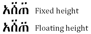
Relative Character Heights

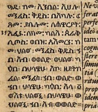
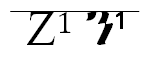
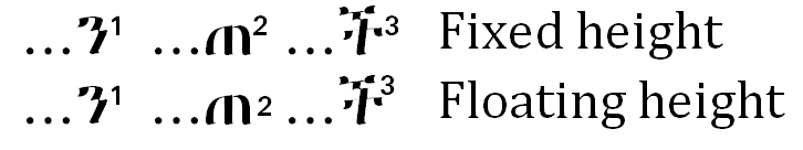
In multilingual documents, differences between the heights of letters in Ethiopic script and its companion foreign script are often found. The difference is likely an artifact of the typesetting technology in use and does not represent the intent of the author or publisher. In the classic typeface style of Ethiopic script the letters will be of variable heights. Fixed height styles are more generally used for advertisement and not publishing. The nature of variable height Ethiopic letters is a factor that complicates how to best align letter height with a foreign script.

Comparative heights of English and Ethiopic script.

At a given point size, letter heights within a script may vary widely between typefaces. This adds another level of difficulty to aligning heights between scripts as an alignment will only be optimal between a specific typeface pair. Within a script featuring variable (not fixed) height letters the relative heights of letters are subject to change between typefaces. This phenomena reinforces the previous assertion on typeface pair optimization, but also introduces the possibility that alignment optimization can be language sensitive. This happens when an alignment pair designed for the letter inventory of one language is applied to another language that includes letters that exceed the heights of the optimized set.

Comparative letter heights.

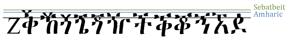
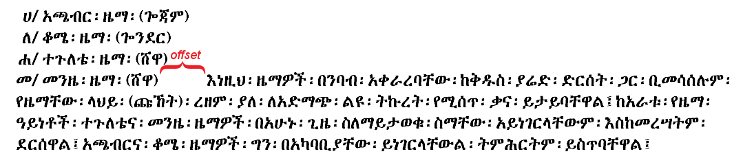
The relative heights of letters used in different languages may also change with typeface as this next figure illustrates.

Comparative letter heights change with typeface, of Blin and Tigrinya now exceeds the heights of Amharic.

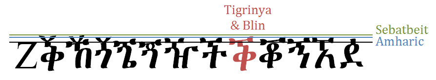
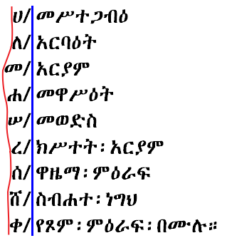
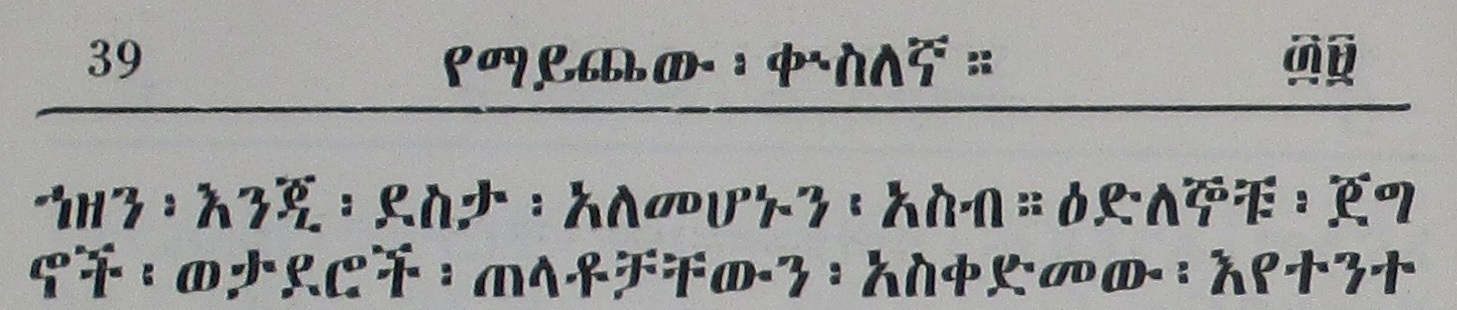
With these caveats considered, “Zen” alignment is a means to optimize an Ethiopic-Latin typeface pair that is suitable for a general use case when priori knowledge of a document language is unknown. Its basis is reviewed here. The Latin letter “Z” and Ethiopic letter “” are chosen as pairing symbols representative of the mean height . They both feature broad horizontal strokes that are easy for the eye to follow as a nearly continuous stroke. Ethiopic letters that were introduced as an extension to the Ge’ez core will typically feature a macron or other modifier at the top of a base letter in order to form the extension letter. The macron necessarily extends the height of a letter. Using the top of the macron for the reference height of a letter leads to height alignment that makes the majority of Ethiopic letters appear too short against Latin letters.

Alignment and top of symbols (Ethiopic letters too squat).

A better approach is to align Z with caron (Ž) against with macron (ኝ) while aligning and Z with and find typefaces with a good tuple of aligned pairings.
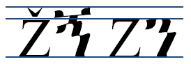
Alignment below accent (better sizing).

Going further, we may assume that the and Ž will align satisfactorily (optionally check any irregularities) and simply align the Z- pair. Phonetically the sequence of these two letters would sound like “zen”, hence the name.

Z- or “Zen” Reference Alignment.

Issues/Questions:

  1. Does Z- alignment seem reasonable?
  2. If not Z- alignment, what Ethiopic letter should be applied as a height reference point for alignment? Or what other height alignment basis should be used?
  3. Should height alignment be attempted as per the letter inventory of a target language or for the script as a whole (practical but less optimal)?
  4. Relative to a Latin uppercase letter, should the height of Ethiopic letters: (a) equal (b) shorter (c) taller?
  5. Is height alignment an issue with other writing systems? If so, how is it addressed?

Relative Typeface Weights

A common practice in Ethiopic literature is the change of typeface weight in one script to appear more visually similar to the other. Most typically a Latin typeface will be made heavier to better match its Ethiopic counterpart. This weight increase is demonstrated in many Ethiopic fonts that include Latin letters. The font designer may have increased the weight of the Latin range primarily to provide heavier weight punctuation to use with Ethiopic script (see Ethiopicized Punctuation).

Literature produced with a heavier Latin typeface may represent the author’s stylistic sensibilities but, in some cases, may only be a pragmatic outcome when an author finds manually changing between fonts too burdensome. The view of professional publishers is unknown here and should be determined.

Issues/Questions:

  1. When publishing in the classical Ethiopic weight, should English words appear in their default English weight?
  2. If heavier Latin letters are desirable, how much so? Can a weight increase be defined as a percentage of the Ethiopic?

Baseline Alignment

It is not uncommon to observe mid-sentence baseline changes in interlingual documents produced with pre-digital typesetting systems where Ethiopic and Latin text, for example, would appear to be laid out along different baselines in a line of text. The most common example of this appears in documents produced with a typewriter where a sheet of paper had to be moved between typewriters to produce a line in two scripts. An apparent baseline difference here would be the result of mechanical misalignment.

Note: The only point that seems can be made here would be to state that Ethiopic and foreign scripts should share the same baseline. This may already be the case with computer typography. If so, this section should be removed.

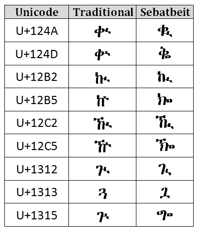
Sebatbeit Glyph Preferences

The Sebatbeit (aka Sebat Bet) language features a greater number and frequency of labiovelarized letter forms in comparison to the larger language communities utilizing Ethiopic script. In Sebatbeit publishing a number of modifications to diacritical marks are regularly applied to aid glyph clarity. These modified glyphs will sometimes appear within in font as a Stylistic Alternative or an entirely separate font may be used in publishing where these letter shapes appear as the default forms. The glyphs are enumerated here and are recommended for Sebatbeit literature.

Labiovelar letter shape preferences for Sebatbeit (Sebat Bet) literature.

Issues/Questions:

  1. Do any parties publishing in Sebatbeit disagree with these letter shapes?
  2. Are any other glyph changes known for other languages?

Punctuation

Punctuation Used in Ethiopic

In Classical era Ethiopic up to nine punctuation marks can be found. Though rarely, if ever, would all nine be found in a single document. The Classical Ethiopic punctuation inventory may appear to be larger in number as a result of bi-chromatic rendering which can be applied to any punctuation and in several different styles. However, the bi-chromatic forms do not change the syntactic role of a given punctuation. In the Modern era, a third of the punctuation marks: , , and have largely fallen into disuse while a number of punctuation marks from Western practices have been adopted. Bi-chromatic punctuation is now reserved for spiritual materials and remains a calligraphic practice.

Ethiopic punctuation segments text and is non-enclosing. The Ethiopic word separator, labeled “Ethiopic Wordspace” in the Unicode standard, is given special attention in this section as follows more complex rules of interaction with other punctuation as well as justification. Ethiopic punctuation is often aligned with similar English punctuation though these associations must be understood as approximate. Ethiopic fullstop and wordspace are highly regular in their application, others, particularly , , and will be consistently used within a document but their roles may change between authors or institutes. A detailed review of punctuation semantics is beyond the scope of this document, however Ethiopic comma is given special attention in the following section.

The following descriptions of Ethiopic punctuation usage has been translated from Gebre and Shewaye.

Symbol Address Names Usage
U+1361 Ge’ez: ንዑስ ነጥብ
Amharic: ሁለት ነጥብ
Tigrinya: ክልተ-ነጥቢ
English: Ethiopic Wordspace
Literally “two dots” or “two points”. This mark is used to separate words. Since the rise of digital publishing the mark is primarily applied today in a handwritten document.
U+1366 Ge’ez: አስተአምሮ
Amharic: አስረጂ ሰረዝ
Tigrinya:
English: Ethiopic Preface Colon
This mark is used following clarification of a certain subject. It will preface validation statements and examples that support the clarification.
፣ ፥ U+1363 U+1365 Ge’ez: ነጠላ ሠረዝ
Amharic: ነጠላ ሰረዝ
Tigrinya: ንጽል ጭሕጋር (ንጽል ሰረዝ)
English: Ethiopic Comma
Often used to separate comparative and sequential list of names, phrases, or numbers as well as to separate parts of a sentence that are not complete by themselves. A special note of explanation is needed here. While the Unicode standard refers to “” as “ETHIOPIC COLON” the correlation with “colon” from Western practices as the name implies can given the wrong impression over the functional role of the symbol in writing. Noted writing experts Desta Tekle Wold, Kidane Wolde Kifle, Dereje Gebre, and Tesfaye Shewaye all assert the equivalence of the two symbols; a shared view that reduces the two symbols to simple glyph alternatives of one another. There is some observed tendency to use “” glyph more frequently in religious works, thus to distinguish the two in discussion the “” glyph will be referred to in this document as either ንዑስ ሠረዝ or ecclesiastical comma
U+1364 Ge’ez: ዐቢይ ሠረዝ
Amharic: ድርብ ሰረዝ
Tigrinya: ድርብ ጭሕጋር
English: Ethiopic Semicolon
To separate equivalent main phrases in one idea. Even though it is not placed at the end of a paragraph, it can be used to separate sentences with similar ideas in a paragraph.
U+1367 Ge’ez: ሠለስተ ነጥብ
Amharic: ሦስት ነጥብ
Tigrinya: ምልክት ሕቶ (ትእምርተ ሕቶ)
English: Ethiopic Question Mark
Used at the end of the questioning sentence. In modern writing “?” is preferred.
U+1362 Ge’ez: ዐቢይ ነጥብ
Amharic: አራት ነጥብ
Tigrinya: ኣርባዕተ ነጥቢ
English: Ethiopic Fullstop
This mark is placed at the end of the sentence that describes the completeness of an idea.
U+1360 Ge’ez:
Amharic:
Tigrinya:
English: Ethiopic Section Mark
Used to divide sections or subsections; generally three or more used together on a line of their own.
U+1368 Ge’ez:
Amharic:
Tigrinya:
English: Ethiopic Paragraph Separator
English: Ethiopic Seven Dot Section Mark
May be used to conclude the final paragraph of a section in lieu of Ethiopic Full Stop. May also be used under the same rules given for Ethiopic Section Mark.

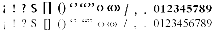
Adopted into Ethiopic writing practices are enclosing punctuation such as parenthesis, brackets, single and double quotation marks and guillemets. Expressive punctuation such as question mark, exclamation point, inverted exclamation mark, and ellipsis are also incorporated into Ethiopic practices. Additional foreign symbols that denote currency, time, mathematics, or communicate with Internet protocols (e.g. "@" , "://") have also been adopted as over the last century as international communication grew.

The ES-781:2002 standard identifies the following inventory of western symbols to be used with Ethiopic:

1234567890 ? ! ¡ . / () [] {} < = > \ # % & _ - + ± × ÷ ‘ ’ “ ” ‹ › « »

Additionally the following punctuation is observed to be used with Ethiopic writing:

$ : , € @ …

Inverted exclamation mark is repurposed and utilized differently than in its Western usage. In Ethiopic writing the inverted exclamation mark is known as “Timirte Slaq” (ትእምርተ፡ሥላቅ) appears at the end of a sentence and will denote sarcasm. All borrowed punctuation is subject to typeface alignment with Ethiopic weights and shapes, an aesthetic enhancement discussed in this section as “Ethiopicized Punctuation”.

Ethiopic Comma Usage

In Ethiopic writing practices three encoded symbols will be used in the context of comma, however they are generally not used together. Looked at another way, the Ethiopic comma may appear with three different glyphs. The western comma also has an important role in Ethiopic writing. Usage rules are as follows:

፣ - ነጠላ ሠረዝ
U+1363 ETHIOPIC COMMA (አማ/ ነጠላ ሠረዝ, ትግ/ ንጽል ሰረዝ) is used as a comma in Ethiopian practices and as a semicolon in Eritrea. “” will also be used in Ge’ez writing as a semicolon (is this a modern usage or classic?). U+1364 ETHIOPIC SEMICOLON, , in turn is used as a colon in Eritrean writing (verify).
፥ - ንዑስ ሠረዝ
U+1365 ETHIOPIC COLON in contrast to its Unicode name, is never used as a colon in any known Ethiopic practices. Rather, it is a classical glyph variant of U+1364 ETHIOPIC SEMICOLON (፣). is the default comma glyph in Ge’ez writing and is the preferred comma glyph by some modern writers writing in other languages. is the default comma in most Amharic bibles, likely in keeping with the Ge’ez Bible that the Amharic would have been translated from. Some modern Bible translations into Amharic, as well as other religious literature, will use as the default comma in prose but maintain for passage references, e.g. ማቴ4፥23 , ዮሐ13፥16 , etc. Given this common usage in religious materials “ecclesiastical comma” is a practical English term for referring to the glyph variant. As mentioned already, writing experts Desta Tekle Wold, Kidane Wolde Kifle, Dereje Gebre, and Tesfaye Shewaye all attest to the equivalence of the two symbols.
፡ - ንዑስ ነጥብ
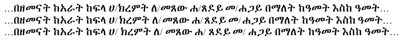
U+1361 ETHIOPIC WORDSPACE (አማ/ ሁለት ነጥብ, ትግ/ ክልተ ነጥቢ) in keeping with Ge’ez heritage, is used as the word separator (i.e. space) in the classical writing practices of both Eritrean and Ethiopia. In modern Eritrean writing practices ETHIOPIC WORDSPACE will be used in the role of a comma (illustrated in Figure ). When used in modern Ethiopian writing, it retains its classic role as word separator (space). See for elaboration on this topic.
, - comma
U+002C COMMA is utilized in Eritrean and Ethiopian writing practices in the formatting of western numbers only.

Issues/Questions:

  1. Are the above descriptions correct?
  2. Should authors be able to set a default comma (,,) in software?
  3. Should authors be able to set a default space symbol in software?

Ethiopic Wordspace in the Context of Comma

In recent decades some communities have adopted a practice of employing the wordspace symbol as a comma when U+0020 SPACE [ ] is used as the word separator. The interpretation of the symbol is then dependent on the context of the writing convention in use by the author. Accordingly, an application user setting could be offered to set the symbol context.

An alternative view point on this practice is that U+1363 ETHIOPIC COMMA [] is in fact in use by these user communities; however its glyph has decayed whereby the line segment is lost and so it visually coincides with U+1361 ETHIOPIC WORDSPACE []. Under this perspective, a simple solution would be modify an Ethiopic font for these users (perhaps adding an alternative glyph in an OpenType stylistic set) where the Ethiopic comma character address and semantics remain intact though the visual form has been tailored to meet aesthetic needs.

Ethiopic Wordspace in the context of comma (Itedalewe, 1987 (1979 EC))

Issues/Questions:

  1. Should comma context be a user preference?
  2. Not an issue but a note; an author of this document recommends strongly preserving the symbol semantics of Ethiopic Wordspace and not overloading it with the semantics of Ethiopic Comma. Doing so simplifies spacing rules for the Wordspace symbol as the comma usage context will not need to be addressed. Applying the “decayed glyph” perspective as an alternative glyph in a font is preferred as it mitigates the semantic overloading.

Ethiopicized Punctuation

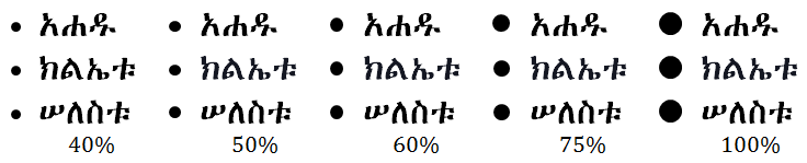
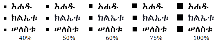
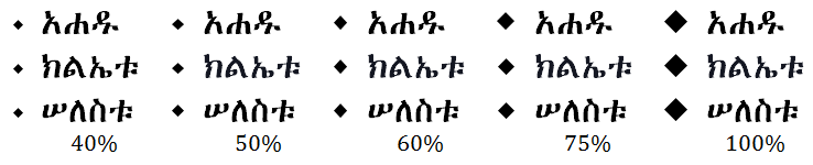
The shape and weight of adopted symbols are often changed for a better visual fit with an accompanying Ethiopic typeface. Enhanced foreign symbols are referred to here as “Ethiopicized”. While many symbols are borrowed from western writing, not all necessarily benefit from Ethiopicization. Those that do will primarily be used in a context where the foreign symbol directly abuts some Ethiopic symbol. Common Ethiopic symbols are demonstrated in the following figure:

Samples of Ethiopicized punctuation compared to shapes in a companion Latin typeface.

Issues/Questions:

  1. Are there any additional western symbols required for Ethiopic writing?
  2. Are any symbols from other foreign script (Chinese, Arabic, etc.) that should be included?
  3. What symbols benefit from shape change?
  4. What symbols benefit from weight change?
  5. Noteworthy for layout correction is that an isolated left double guillemet, », is common in tabular text to indicate that the entry above is to be duplicated. This is a use case where the left double guillemet is not required to be balanced by a right double guillemet (“ትእምርተ፡ደጊመ፡ቃል፡” context).
  6. Are square “dots” in punctuation preferable over circular?
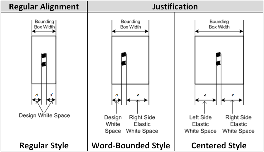
Optical Balancing

Foreign language words or phrases are regularly found inline within a paragraph of Ethiopic text, often bounded within enclosing punctuation such as brackets and quotation marks (e.g. []()""''«»‹›). This practice is most often observed in news articles on international topics. The weight of the enclosing punctuation may be found as matching either the Ethiopic or Latin weight. The preference of stakeholders must be determined here. Comparative samples follow:

Latin text enclosed with Latin weight guillemets.
Latin text enclosed with Ethiopic weight guillemets.
Latin text enclosed with Latin weight quotes.
Latin text enclosed with Ethiopic weight quotes.

As a rule within the embedded foreign script, the weight of punctuation and other symbols (numbers, etc) should be in keeping with the weight of the foreign text and not that of the surrounding Ethiopic.

Issues/Questions:

  1. What do stakeholders feel should be the default weight for enclosing punctuation?
  2. Would preferences change if Ethiopic wordspace were applied in the samples?

Ethiopic Wordspace Alongside Other Punctuation And Line Breaks

It modern literature where punctuation may be borrowed from Western writing, inconsistent formatting practices are found with respect to the presence of Ethiopic Wordspace () alongside borrowed punctuation. It is helpful to establish rules for Ethiopic Wordspace in the presence of other symbols so that software grammar and formatting checkers can offer corrections leading to better quality and more consistent literature. The following rules are proposed:

  • A letter or number may border either side of Ethiopic Wordspace.
  • Ethiopic Wordspace may appear before, but not after, an opening punctuation, such as: ( , [ , { , « , ‹ , “ .
  • Ethiopic Wordspace may appear after, but not before, an closing punctuation, such as: ) , ] , } , » , › , ” .
        Example:
            Incorrect: … ፅፋት፡(ፅፍዓት፡)፡ከመ፡ኪደተ፡ንስር፡(እንደ፡አሞራ፡ፈጣን፡)።
                            … ፅፋት፡(ፅፍዓት፡)ከመ፡ኪደተ፡ንስር፡(እንደ፡አሞራ፡ፈጣን፡)።
              Correct: … ፅፋት፡(ፅፍዓት)፡ከመ፡ኪደተ፡ንስር፡(እንደ፡አሞራ፡ፈጣን)።
  • No other punctuation may border Ethiopic Wordspace.
  • A new line may follow, but not precede, an Ethiopic Wordspace (a wordspace may not start a new line).
  • Whitespace may not follow or precede an Ethiopic Wordspace (note, this does not include stretchable space used in line justification).
  • An Ethiopic Wordspace followed by another Ethiopic Wordspace must be interpreted as an Ethiopic Full Stop ().

Issues/Questions:

  1. Are the above rules valid?

Space-Wordspace Substitution Rules

Rules are presented here to aid layout software that would offer the functionality of space symbol conversion to and from Ethiopic wordspaces. This functionality is desirable in a viewer application (e.g. web browser, eBook reader) to make the same substitution as per a user preference. Thus the user would be able to read a document with Ethiopic wordspaces that was composed and delivered with white space. Likewise in the reverse, a user who preferred white space could have their preference supported in a document that encodes Ethiopic wordspaces only. Similarly, this functionality would be useful to users of an editor application.

[TBD: Test cases should be developed to validate these rules. Apply screenshots of test cases to help illustrate the requirement that a rule addresses.]

Space to Wordspace Transformation Rules

  1. White space symbols other than space (U+0020) are not processed. Issue: how should non-breaking-space be handled?
  2. Space(s) at the start of a line are assumed to be there for positioning and are not processed.
  3. A sequence of one or more spaces is treated as a single space.
  4. Space(s) are substituted for wordspace when bounded by letters, or between a letter and number.
  5. Space(s) are substituted for wordspace before or after enclosing punctuation as per the convention applied in Ethiopic Wordspace Alongside Other Punctuation and Line Breaks.
  6. Space(s) before or after non-enclosing punctuation are removed.
  7. Space(s) bounded by non-Ethiopic numbers are not processed.
  8. A wordspace will be appended to the end of line (a line ending with a hard return) that does not end with punctuation.

Wordspace to Space Transformation Rules

  1. A sequence of more than two wordspaces is not converted as the author’s intent is indeterminate.
  2. A sequence of exactly two wordspaces is converted to an ETHIOPIC FULLSTOP (U+1362).
    Note: This conversion is suggested as an auto-correct feature.
  3. A sequence of exactly one wordspace is convert to space.
  4. A wordspace at the end of a line may be removed.

An additional wordspace conversion rule that is independent of the above space-wordspace substitution rules: Very commonly in Ethiopic documents a sequence of two wordspaces are found and may be substituted for Ethiopic fullstop. This may be considered a defect correction rule.

Ethiopic Gemination Mark (ጥብቅ) Vertical Positioning

The Ethiopic gemination mark, ጥብቅ, is almost universally found at a fixed height above the baseline in typeset literature. The mark’s position must then be fixed so that it remains above the tallest Ethiopic letter symbol; this produces a variable height gap between the top of the letter and the mark. Conversely, when the symbol is hand written (often above typeset text) the mark will be found at a variable height above the baseline and demonstrating a fixed height above the letter symbol. Quite possibly the former style is an artifact of a limitation of the layout technology employed, and the later representative of an author’s desired rendering.

Two gemination styles compared: typical printed (above) and handwritten (below).

Issues/Questions:

  1. What do stakeholders feel should be the default positioning style (fixed, floating)?
  2. The same rules apply to the ETHIOPIC COMBINING VOWEL LENGTH MARK (U+135E) and ETHIOPIC COMBINING GEMINATION AND VOWEL LENGTH MARK (U+135D). Stakeholders here (current or past) should be identified.
  3. OpenType shaping logic may be sufficient to handle the issue. Thus a specification here might only be utilized by font implementations.

Parenthetical Expressions

Parenthetical expressions are found regularly in modern Ethiopic writing and will apply any of the enclosing symbol pairs: // , () and [].

A practical example of inner parenthesis found in Maṣḥafa Sawāsew Wages Wamazgaba Qālāt Hadis by Kidane Wolde Kifle.

Issues/Questions:

  1. What are the preferred parenthetical enclosing symbol pairs for modern writing?
  2. Do special rules apply for inner expressions?
  3. Do copy editors or publishers set a policy for parenthesis symbols, or leave it up to the author to decide?
  4. Of interest: when are parenthesis first found in Ethiopic writing and in what form?
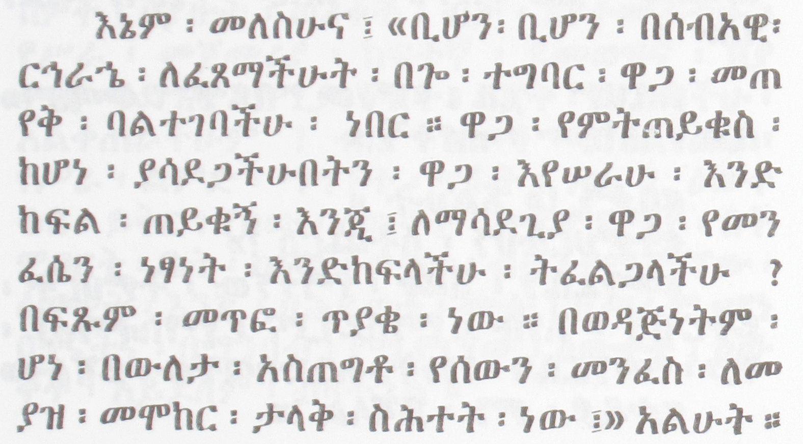
Quotation

Classical Ethiopic literature applying quotation marks will employ double guillemet (« ») in a primary style and single guillemets (‹ ›) in a secondary style. Single guillemets will be used for inner-quotation and single word quotation. Modern Ethiopic writing will additionally utilize Latin quotation marks similarly (“ ” ‘ ’, U+201C, U+201D, U+2018, U+2019). The choice of Latin script quotation may represent either an author preference or a software limitation that made guillemets unavailable or difficult to access.

Issues/Questions:

  1. What are the preferred quotation marks for modern Ethiopic literature?
  2. Is the single quotation mark usage statement correct?
  3. Do any other rules apply to quotation usage in Ethiopic writing?
  4. Do copy editors or publishers set a policy for quotation mark choice, or leave it up to the author to decide?
  5. Do the same rules apply for Ethiopic wordspace surrounding a closing quotation mark as with a closing parenthesis?
  6. Of interest: When are quotation marks first found in Ethiopic writing and in what form?

Ellipsis

Both punctuation-baseline and raised ellipses are found in Ethiopic literature. In Ethiopic publishing ellipsis may have anywhere from 3 to 6 dots used regularly. The presence of one style over the other may simply be an artifact of the publishing technology and not necessarily in line with the publisher's preference.

Example of a raised 4-dot ellipsis found in Atsie Menilik by Paulos Ngongo.

Issues/Questions:

  1. How many dots should be in an ellipsis?
  2. Which ellipsis form is preferred as the default?
  3. How much spacing between dots is desirable?
  4. Are square dots preferable over circular?
  5. What spacing (if any) before and after the dots?

Word Boundaries

Discuss: Do regular rules apply? One consideration for Ethiopic would be that a newline is not a dependable word boundary in the common case where words are split across lines without a hyphen symbol and white space is the default wordspace. Word boundaries are known here only by context.

Discuss: The special case with wordspace sticking to a word leading to the mouse text selection rule that a following wordspace should be automatically selected with text, analogous to the rule applied to white space. MS Word does this.

Formatting of Ethiopic Wordspace

Rules of Applying Whitespace in Ethiopic Text

When Ethiopic Wordspace () is used to separate words, there may still be some valid application for white space “ ”. White space is permissible to support the following formatting needs:

  • Indentation.
  • Following a counter suffix.
  • Within a numeric sequence, like a phone number.
  • Within a date format (sometimes, not always).
  • Within a scripture reference (sometimes not always).
  • Before and following quotation marks.
  • Following an ellipsis (?).
  • Within a block of embedded foreign script.

[TBD: Image samples needed]

Issues/Questions:

  1. Are the above rules valid?
  2. For the above cases where white space is valid, can the spacing width rules applied for Latin text be applied for Ethiopic?

Numbers

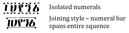
Ethiopic Numeral Bars

Sequences of Ethiopic numerals, such as years and page numbers, may be written in one of two styles. In the most common style in modern literature the numerals are written as discrete, independent, symbols. In a second “joining” style of writing, primarily found in calligraphic text and handwriting, the numerals may share a common upper and lower bar. Conceivably the joining style went out of favor as it proved more difficult to support in publishing technology. Modern preferences should be determined from stakeholders.

Two numeral styles compared.

Issues/Questions:

  1. What do stakeholders feel should be the default style (joined, isolated)?
  2. Do stakeholders want the option for both styles?
  3. Are there any context rules to determine when a given style is appropriate?

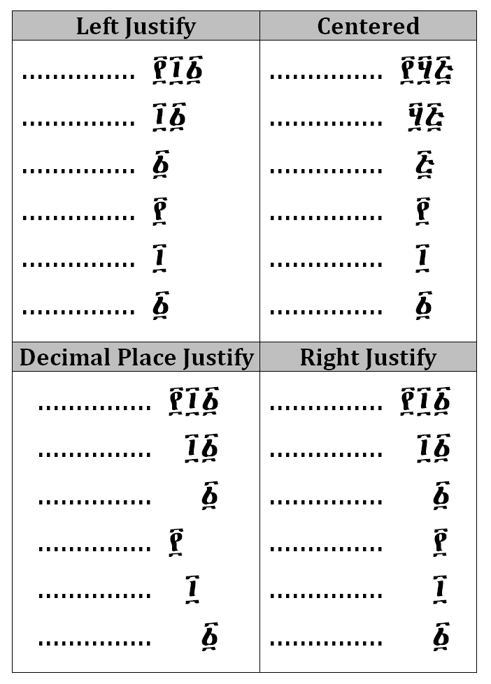
Ethiopic Numeral Vertical Alignment

In the Ethiopic numeral system a single symbol may represent a numeral with an order of magnitude in the power of 0, 1, 2 or 4. This feature of the numeral system leads to several potential layout possibilities when numerals are arranged vertically.

Four vertical alignments compared.

Issues/Questions:

  1. Are the vertical alignment rules of Roman or Coptic numerals appropriate (and what are they)?
  2. In what layout context is right justification appropriate?
  3. In what layout context is decimal place justification appropriate?
  4. In what layout context is left justification appropriate?

Ordinal Notation

An ordinal is formed in Amharic when “”, and in Tigrinya when “”, follows a cardinal number. The ordinal marker is often, but not always, rendered in superscript form. The superscript practice is most prevalent with ordinals in western numerals, but is also applied with Ethiopic numerals.

Issues/Questions:

  1. What letters should be superscripted, and it what contexts? For example, “” and “ብር” may also be superscripted in presentation of prices but is not common in print (found mostly in store front advertising).
  2. Are ordinals always superscripted, or is superscript language or locale specific? Should superscript for ordinals be a setting?
  3. An argument goes that superscript of “” should not follow an Ethiopic numerals since the counting system is put into a Ge’ez context and Ge’ez literature does not use a superscript. Yet “” is appropriate to Amharic language and is not a letter found in Ge’ez. The class of literature may be at issue here, such a religious materials.
  4. What should the height (in percentage) of the superscripted symbol be with respect to the base text?
  5. How should the superscripted symbol be aligned vertically with the base text?

Emphasis

Classical Ethiopic writing does not feature a letter shape stylistic change to communicate word emphasis. In religious works, the color red will be used to emphasize a spiritual aspect of a word in a passage (i.e. “rubricate”).

Emphasis in modern Ethiopic writing will employ every emphasis device available from the available publishing technology (e.g. underline, slant, embolden, letter size, letter outline, background shapes, etc.). The practice however is idiosyncratic and inconsistently applied leading to debate and disagreement within the publishing community.

The following subsections present a proposed best practice of the authors.

Emphasis Within Prose

Italic applied to Ethiopic has been experiment with since the arrival of desktop publishing. Earlier in the 20th century, a typeface change to a pre-20th century style would be applied in place of italic. Underlined text was introduced to Ethiopic publishing in the earlier 20th century and was well established by mid-century. It is not uncommon to find the underline “Ethiopicized” whereby the weight is made heavier to correspond with the greater weight of Ethiopic letters relative to Western weights.

Heavier underline weight found in YeMaychew Qwuslegna by Mekonnen Zewdie.
Typeface change for emphasis found in Maṣḥafa Sawāsew Wages Wamazgaba Qālāt Hadis by Kidane Wolde Kifle.
Typeface size change for emphasis found in Mazgaba Fidal by Kidane Wolde Kifle.

Issues/Questions:

  1. How much slant when an italic designed typeface is not available? 10% is suggested.
  2. Should the underline of Ethiopic text use a weight that is proportionally heavier (with respect to the text), or apply only the weight of the word processor?

Ecclesiastical Emphasis

In religious literature, certain words or phrases with a spiritual or more holy aspect may be rubricated (inked in red). The practice is context dependent and a word rubricated in one sentence may not be in the next (or elsewhere in the same sentence).

Ecclesiastical emphasis sample from Maṣḥafa Ṣalot Mes Ser’ate Kiddase Betegreññā, Page 32 (Woldemariam, 1995 (1988 EC))

Issues/Questions:

  1. What shade of red?
  2. What is the preferred substitute for red when only monochrome publishing is available?

Emphasis With Ethiopic Wordspace

As a rule, a wordspace following a word that is emphasized in some way (color, bold, italic, underline, etc.) shall receive the same emphasis. This is in keeping with the Ge’ez literature tradition.

Issues/Questions:

  1. Does this rule make aesthetic sense in full justification with wordspace in centered positioning style? In Ge’ez manuscripts no issue arises since little or no white space appears between the wordspace and boundary words. The elastic space around wordspace may stretch considerably in typeset documents, under justification, where continuation of the emphasis may appear peculiar after some stretching threshold width.
  2. Related: Does word emphasis include a following punctuation?

Abbreviation Formation

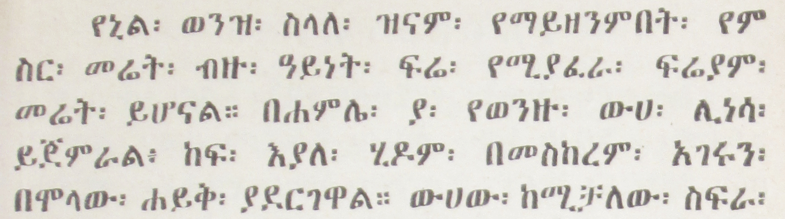
Abbreviations in Ethiopic languages will apply an abbreviation marker ("/" or ".") placed between the first letters of each word in a phrase. In a multi-word abbreviation, the last word may sometimes remain whole. Abbreviation of a single word will keep the first and final letters of the word separated by slash “/”. Classical literature that uses the Ethiopic Wordspace may not use an abbreviation marker and instead will rely on the Ethiopic Wordspace to separate initial letter abbreviations that will be understood from context: (e.g. ዓመተ፡ምሕረት፡ዓ፡ም፡).

Examples:
Single Word
ሚኒስትር ⇒ ሚ/ር
ሆስፒታል ⇒ ሆ/ል
Multi Word
ጠቅላይ ሚኒስትር ⇒ ጠ/ሚ/ር
ኢትዮጵያ ኦርቶዶክስ ተዋሕዶ ቤተ ክርስቲያን ⇒ ኢ/ኦ/ተ/ቤ/ክ

Issues/Questions:

  1. When “.” is used as the abbreviation marker, it is sometimes found at the end of the abbreviation.
  2. Confirm single word abbreviation rule.
  3. Are mixed abbreviation markers appropriate? Some well-established abbreviations apply a “.” as the marker, for example “አዲስ አበባ ዩኒቨርሲቲ” becomes “አ.አ.ዩ”. This may reflect the chosen convention of the institute.
  4. What symbol is applied for foreign words transcribed into an Ethiopic languages?
  5. Do copy editors or publishers set a policy for abbreviation, or leave it up to the author to decide?
  6. Of interest: when are abbreviations first found in Ethiopic writing and in what form?

Letter Spacing

Any number of kerning pairs and ligatures are possible for Ethiopic typography that would lead to better visual quality of printed literature. While beyond the present scope of this task force, raising the topic with stakeholders to gauge the level of interest would be beneficial to help set the direction of future work.

An assumption here is that ligatures are only relevant to the reproduction of calligraphical manuscripts and not a requirement of modern literature.
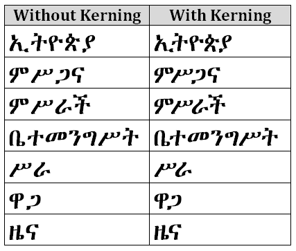
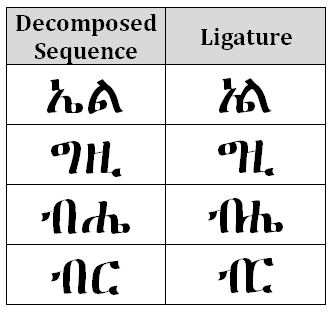
Examples of Common Words With and Without Kerning Applied
Examples of Common Ligatures found in Calligraphical Manuscripts

Issues/Questions:

  1. Is defining kerning pairs of interest to your organization?
  2. Is defining ligatures of interest to your organization?

Lines & Paragraphs

Line Breaking

Word processors and text readers such as web browsers, eBook devices, etc. will automatically format the sentences of a paragraph over a number of lines as allowable by the available width of the viewing area. These software systems apply formatting rules that govern where and how a line may end and a new line begin. Line breaking rules for Ethiopic are expressed with rules for how a line may start. A line may start with:

Issues/Questions:

  1. Are the above rules valid?
  2. Are any additional rules needed to govern how a line may end or begin?

Hyphenation

In classical Ethiopic writing the wordspace separator symbol () negated the need for word hyphenation across a line of text. Accordingly, a word could be split over across a line at any position. When wordspace fell out of favor in modern writing the practice of splitting a word across lines of text continued without change. The reader would know to mentally reconstruct a word by relying on knowledge of lexicon and context. The scanned document samples within this report illustrate word splitting across lines both in the presence of wordspace and without.

Issues/Questions:

  1. When wordspace, “”, is used, what rules for splitting a word across lines apply?
  2. When space is used, should Ethiopic writing use a hyphen “‐” to split words across lines?
  3. When space is used, and if words should be split across lines (with or without a hyphen), are the following rules for word splitting suitable?
    • Words are split at a morpheme boundary, for example: ቤተ‐
      መንግሥት
      .
    • Words are split along a syllable boundary.
    • Words of a single syllable are not split over lines.
    • Words are split after a prefix.
    • Words are split before a suffix.
    • Numbers are not split over lines.
    • Words of two letters are not split over lines.

Justification

Justification When SPACE is the Word Delimiter

When space (U+0020) is used as the word separator in Ethiopic text, the line spacing rules applicable to western text may be applied to meet user expectations.

Issues/Questions:

  1. Is the above assessment correct? Are there any special justification formatting considerations when SPACE is used with Ethiopic text?

Justification When ETHIOPIC WORDSPACE is the Word Delimiter

Since the arrival of the printing press in Ethiopia in 1863 (Pankhurst, 1998), full justification of Ethiopic has been a common typesetting practice in Ethiopian, and later Eritrean, publishing houses. Earlier, Ethiopic justification rules are a feature of Hiob Ludolf’s Historia Æthiopica, which is noted as the first use of movable type for Ethiopic script (Ludolf, 1681). Prior to letterpress typography, calligraphic manuscripts rendered on parchment also featured full, or approximately full, justification. Though the latter likely reflects the scribe’s desire not to waste a millimeter of available lateral writing space.

The placement of Ethiopic wordspace presents a complication to the justification of Ethiopic text. Two placement styles developed in typeset literature which will be referred to here as “word bound” and “centered” styles. Additionally, the word spacing following an Ethiopic fullstop may (or may not) be governed by a special rule and in combination with the two wordspace spacing styles. These spacing rules are discussed in the following sections.

Ethiopic Justification in Historia Æthiopica (Ludolf, 1681)
Justification with Word Bound Wordspace and Punctuation

In keeping with line justification for Latin script, the non-printed or “blank space” (space and gaps) between words is treated as stretchable. The width of the space symbol itself will be elongated to some aesthetic width value that may vary from space symbol to space symbol across a printed line. In Ethiopic justification, the blank space between the Ethiopic word separator and the words it separates is likewise allowed to stretch. This stretching of blank space may be either symmetrical (“centered”) or asymmetrical but in the latter case space stretching is always between the right-side of the separator and the following word –referred to here as “word bound”.

In “word bound” justification the word separator, which may be either a punctuation symbol or U+1361 ETHIOPIC WORDSPACE [], appears to adhere to the word to the left as if it were its final character. Figures and both illustrate the word bound style.

Ethiopic justification in word bound style (Erikson, 1921 (1913 EC))
Justification with Centered Wordspace and Punctuation

In the second major form of Ethiopic justification the blank space around word separators is stretched equally on both the left and right sides; giving the appearance of the separator being centered between the words it divides. depicts the "centered wordspace" justification style, which applies equally for other punctuation.

Ethiopic justification in centered style (Gubenya, 1973 (1966 EC)).

To further illustrate the justification spacing applied to both Ethiopic punctuation and wordspace, presents blank space stretching from the point of view of the symbol’s typographic bounding box. Here the “design blank space”, the space between the visible symbol and the box border, is itself stretched as needed to meet line justification:

Depiction of blank space around Ethiopic wordspace for three modes of text justification.

Issues/Questions:

  1. Which spacing style should be the default used by applications?
  2. Do stakeholders have names or use-cases for these different wordspace formatting styles?
Spacing Threshold Following Full Stop

In the regular mode of Ethiopic justification (both forms), U+1362 ETHIOPIC FULL STOP [], will be treated equally with all other punctuation symbols. In a second mode, the Ethiopic full stop will have special spacing rules applied to it whereby more separation space is allowed following the symbol and the start of the next word. In a sense, the right side space of the full stop is “more elastic” than in the regular mode. The elasticity rule and the visual effect are similar to that of the final line of a fully justified paragraph in Western text. When the final line of a paragraph of Latin script crosses a certain horizontal threshold, the line will become fully justified. Below that threshold the line will appear left aligned. The same rule appears to be applied to the Ethiopic full stop but on any line of the paragraph. An illustration of this sub-mode is depicted in the following:

Justification Sample from Maṣḥafa Sawāsew, Page 159 (Kifle, 1955 (1948 EC))

Issues/Questions:

  1. Does the additional spacing after fullstop apply to other Ethiopic punctuation? Additional spacing is also seen in the above sample following ETHIOPIC SEMICOLON.
  2. Is additional spacing after punctuation desirable by current day publishers? If so, how much space and for which punctuation symbols?
Shortcomings Found in Electronic Typesetting Systems

To date, computer software that typesets text has applied justification rules for blank space stretching that were designed to meet publishing requirements in the Western world. When the same rules are applied to Ethiopic text, the results are unsatisfactory as they do not meet user expectations. Largely responsible for the formatting dissonance when Western justification is applied to Ethiopic text, is the absence of a white space symbol in the writing system. There is no explicit white space symbol (in classic Ethiopic writing) to be “stretched”.

Formatting algorithms will then process U+1361 ETHIOPIC WORDSPACE [] as a punctuation symbol where word enclosing rules, rather than word spacing rules, will be applied. While still stretchable, “white space” in the Ethiopic wordspace is implicit rather than explicit. For a complete solution, software will ultimately need to be enhanced to stretch implicit space as required. Reclassifying the Ethiopic wordspace as a “Zs” symbol is expected to help alleviate justification issues and clears the way for software firms to implement comprehensive support for Ethiopic justification. Since the Ethiopic wordspace interferes with justification in present day software, authors may opt not to use it or may “pad” wordspace and Ethiopic punctuation with explicit white space to produce the desired justification style (i.e. Word Bound or Centered). To properly render text formatted in this way, future “wordspace aware” software, should elide spaces bordering Ethiopic wordspace and punctuation when producing justified text.

The following samples depict formatting of Kidane Wolde Kifle’s seminal work Maṣḥafa Sawāsew with a popular word processor (Kifle, 1955 (1948 EC)) under the limitations of Western spacing rules justification.

Full Justification Sample from Maṣḥafa Sawāsew, Page 65 (Kifle, 1955 (1948 EC))
The sample from the previous figure with a 12 point font and fully justified by Microsoft Word 2010 within a 6.5 inch margin with line-breaking rules applied. No spaces (U+0020) in sample.
The sample from the earlier figure with space (U+0020) replacing Ethiopic wordspace. Space characters have additionally been added following Ethiopic punctuation.

In digital documents such as in web pages and eBooks, it is recommended that the appearance of either U+0020 SPACE [ ] or U+1361 ETHIOPIC WORDSPACE [] be configurable as a user preference. An easy to access “space” toggle button would enhance a viewing application’s usability.

First Paragraph Rule

Paragraph indentation is a regular practice in Ethiopic publishing, and not common in hand written manuscripts where a Hareg (ሐረግ) or Mekfel (መክፈል) will be used instead. Some Western publishers will apply a special rule whereby the first paragraph of a section is not indented. The same rule can be found applied in Ethiopic publications; however, the adoption appears to be limited.

Issues/Questions:

  1. How much should a paragraph be indented?
  2. Should the first paragraph of a section be indented?
  3. Should a new paragraph be indented following a list?
  4. Are there any other special rules for when to, or not to, indent a paragraph?

Lists and Counters

Bullet Lists

Bullet lists are utilized regularly in Ethiopic literature. Authors using a computer or typewriter will work with the list marker symbols made available by their software or machine. Many marker, or “bullet”, symbols are accepted for Ethiopic literature though not all will be considered optimal. Some creative writers have even recently applied and (U+1368 ETHIOPIC PARAGRAPH SEPARATOR and U+1360 ETHIOPIC SECTION MARK respectively) as list bullets. The following samples compare common bullet shapes and sizes with example lists:

Circle bullet size relative to letter height.
Square bullet size relative to letter height.
Diamond bullet size relative to letter height.

Issues/Questions:

  1. What are the preferred bullet shapes?
  2. Should and be available as bullet choices?
  3. What are the preferred shape sequences in nested lists (e.g. bullet hierarchy)?
  4. What is bullet height and width relative to letter dimensions?
  5. What is the default distance of the list item text from the bullet?
  6. Are lists indented (left margin)? If so, how much?
  7. Examples are needed for pre-digital, classical, literature.
  8. Diamond shaped bullets are found commonly and may represent a desired default. The Unicode standard provides a number of similar diamond shaped symbols. From this set of diamond symbols, those suitable for adorning Ethiopic bullet lists must be determined.

    ⬩ (U+2B29)
    ◆ (U+25C6)
    ⬥ (U+2B25)
    ❖ (U+2756)
    ♦ (U+2666)

  9. Do copy editors or publishers set a policy for list symbols, or leave it up to the author to decide?
  10. Of interest: when are bullet lists first found in Ethiopic writing and in what form?

Ordered List Counter Suffix

In Ethiopic ordered lists a number of symbols are used for the counter suffix. For example: "/" , "" , "." , ")" and even "" (Ethiopic Wordspace).

Issues/Questions:

  1. What are the preferred counter suffix symbols? What is the best default?
  2. How much, if any, white space follows the suffix? Perhaps the same amount of space as would follow a bullet symbol?
  3. Do copy editors or publishers set a policy for counter suffix, or leave it up to the author to decide?
  4. Of interest: when are ordered lists first found in Ethiopic writing and in what form?

Counter Suffix Alignment

Ethiopic corpus will present lists with two styles of alignment. These are a left side alignment at the list counter, or alignment along the counter suffix. Layout software will align a list at the suffix in keeping with the later style. The former style (left justified at counter) may reflect a limitation of the layout technology employed and not a preference of the author, copy editor or typesetter. A depiction of these two alignment styles is presented in the following figures:

Alphabetical list aligned justified on counter left.
Alphabetical list aligned on suffix.

Issues/Questions:

  1. What alignment style(s) do stakeholders desire?

Inline Lists

Inlined enumerated lists are commonly found in Ethiopic documents. Inline lists will follow the same sequences as regular lists. However, the spacing after the counter suffix may be different. Typically a regular keyboard space is observed following the suffix, if any. This is most likely a matter of convenience for the author and not necessarily representative of good formatting.

Ethiopic inline list sample using wordspaces with 3 spacings (none, hair and thin) following the counter suffix.
Ethiopic inline list sample using spaces with 3 spacings (none, hair and thin) following the counter suffix.

Issues/Questions:

  1. How much space (what width) should appear after the counter suffix?
  2. Is the space after the counter suffix different when Ethiopic wordspace is used?

Numbered Lists

Ethiopic literature will apply ordered numbered list using both Ethiopic and Western numeral systems. Ethiopic numeral lists are addressed in the Ethiopic Numeric Counter Style section of the CSS Counter Styles Level 3 specification.

Ethiopic Numeral Lists
፩፡ ...
፪፡ ...
፫፡ ...
፬፡ ...
፩/ ...
፪/ ...
፫/ ...
፬/ ...
፩) ...
፪) ...
፫) ...
፬) ...
፩. ...
፪. ...
፫. ...
፬. ...
፩፦ ...
፪፦ ...
፫፦ ...
፬፦ ...
Western Numeral Lists
1፡ ...
2፡ ...
3፡ ...
4፡ ...
1/ ...
2/ ...
3/ ...
4/ ...
1) ...
2) ...
3) ...
4) ...
1. ...
2. ...
3. ...
4. ...
1፦ ...
2፦ ...
3፦ ...
4፦ ...

Issues/Questions:

  1. What is the counter suffix preference with Ethiopic numbers? Does it depend on language?
  2. What is the counter suffix preference with Western numbers? Does it depend on language?
  3. Are there any sublist (nested list) considerations?

Alphabetical (ሀለሐመ) Lists

The Unicode standard encodes Ethiopic syllables for many languages using Ethiopic script past and present. Alphabetic lists are commonplace in Ethiopic literature, but will conform to the letter inventory of the language of the surrounding content. The W3C’s Internationalization Working Group publishes alphabetical counter style code snippets for a large number of languages using Ethiopic script. Many of these lists are believed to be only hypothetical and based upon the letter inventory of the identified languages; but may not have been used in practice. The alphabetical counter styles specified here encompass a smaller collection of languages with a demonstrated requirement as found by example in corpus or have come from stakeholder input.

Ge’ez Amharic Blin Tigrinya
(Eritrean)
Tigrinya
(Ethiopian)
  • ሀ፦
  • ለ፦
  • ሐ፦
  • መ፦
  • ሠ፦
  • ረ፦
  • ሰ፦
  • ቀ፦
  • በ፦
  • ተ፦
  • ኀ፦
  • ነ፦
  • አ፦
  • ከ፦
  • ወ፦
  • ዐ፦
  • ዘ፦
  • የ፦
  • ደ፦
  • ገ፦
  • ጠ፦
  • ጰ፦
  • ጸ፦
  • ፀ፦
  • ፈ፦
  • ፐ፦
  • ሀ/
  • ለ/
  • ሐ/
  • መ/
  • ሠ/
  • ረ/
  • ሰ/
  • ሸ/
  • ቀ/
  • በ/
  • ተ/
  • ቸ/
  • ኀ/
  • ነ/
  • ኘ/
  • አ/
  • ከ/
  • ኸ/
  • ወ/
  • ዐ/
  • ዘ/
  • ዠ/
  • የ/
  • ደ/
  • ጀ/
  • ገ/
  • ጠ/
  • ጨ/
  • ጰ/
  • ጸ/
  • ፀ/
  • ፈ/
  • ፐ/
  • ሀ/
  • ለ/
  • ሐ/
  • መ/
  • ረ/
  • ሰ/
  • ሸ/
  • ቀ/
  • ቐ/
  • በ/
  • ተ/
  • ቸ/
  • ኀ/
  • ነ/
  • ኘ/
  • አ/
  • ከ/
  • ኸ/
  • ወ/
  • ዐ/
  • ዘ/
  • ዠ/
  • የ/
  • ደ/
  • ጀ/
  • ገ/
  • ጘ/
  • ጠ/
  • ጨ/
  • ጰ/
  • ጸ/
  • ፀ/
  • ፈ/
  • ፐ/
  • ሀ/
  • ለ/
  • ሐ/
  • መ/
  • ረ/
  • ሰ/
  • ሸ/
  • ቀ/
  • ቐ/
  • በ/
  • ተ/
  • ቸ/
  • ነ/
  • ኘ/
  • አ/
  • ከ/
  • ኸ/
  • ወ/
  • ዐ/
  • ዘ/
  • ዠ/
  • የ/
  • ደ/
  • ጀ/
  • ገ/
  • ጠ/
  • ጨ/
  • ጰ/
  • ጸ/
  • ፈ/
  • ፐ/
  • ሀ/
  • ለ/
  • ሐ/
  • መ/
  • ሠ/
  • ረ/
  • ሰ/
  • ሸ/
  • ቀ/
  • ቐ/
  • በ/
  • ተ/
  • ቸ/
  • ኀ/
  • ነ/
  • ኘ/
  • አ/
  • ከ/
  • ኸ/
  • ወ/
  • ዐ/
  • ዘ/
  • ዠ/
  • የ/
  • ደ/
  • ጀ/
  • ገ/
  • ጠ/
  • ጨ/
  • ጰ/
  • ጸ/
  • ፀ/
  • ፈ/
  • ፐ/

Issues/Questions:

  1. appears to be equally included and omitted in ሀለሐመ lists. Stakeholders should be resolve to include or exclude it, or define two list styles (with and without ).
  2. How is end of sequence handled in ሀለሐመ lists?
    1. Sequence as radix, e.g.: ... ፈ ... ፐ ... ሀሀ ... ሀለ ...
    2. Columnar radix, e.g.: ... ፈ ... ፐ ... ሀሁ ... ሀሉ ...
    3. Wrap to next column, e.g.: ... ፈ ... ፐ ... ሁ ... ሉ ...
    4. With any approach, how is the end of matrix handled?

Abegede (አበገደ) Lists

The አበገደ ordering of the Ethiopic syllabary is an alignment with the Coptic and Greek alphabets possibly to facilitate interdenominational communication or for the transfer of gematria practices. The ordering is used today largely for pedagogical purposes and has been used by some authors for the collation of entire works such as dictionaries. More often authors will apply the ordering for list orders.

The አበገደ ordering is potentially desirable to any language using the Ethiopic syllabary. The ordering is less likely to be found in the writing practices of languages that have a written tradition of under a hundred years. The language specific orders shown here are only those found utilized in corpus.

Ge’ez Amharic Tigrinya
(Eritrean)
Tigrinya
(Ethiopian)
  • አ፦
  • በ፦
  • ገ፦
  • ደ፦
  • ሀ፦
  • ወ፦
  • ዘ፦
  • ሐ፦
  • ጠ፦
  • የ፦
  • ከ፦
  • ለ፦
  • መ፦
  • ነ፦
  • ሠ፦
  • ዐ፦
  • ፈ፦
  • ጸ፦
  • ቀ፦
  • ረ፦
  • ሰ፦
  • ተ፦
  • ኀ፦
  • ፀ፦
  • ጰ፦
  • ፐ፦
  • አ/
  • በ/
  • ገ/
  • ደ/
  • ጀ/
  • ሀ/
  • ወ/
  • ዘ/
  • ዠ/
  • ሐ/
  • ጠ/
  • ጨ/
  • የ/
  • ከ/
  • ኸ/
  • ለ/
  • መ/
  • ነ/
  • ኘ/
  • ሠ/
  • ዐ/
  • ፈ/
  • ጸ/
  • ቀ/
  • ረ/
  • ሰ/
  • ሸ/
  • ተ/
  • ቸ/
  • ኀ/
  • ፀ/
  • ጰ/
  • ፐ/
  • አ/
  • በ/
  • ገ/
  • ደ/
  • ጀ/
  • ሀ/
  • ወ/
  • ዘ/
  • ዠ/
  • ሐ/
  • ጠ/
  • ጨ/
  • የ/
  • ከ/
  • ኸ/
  • ለ/
  • መ/
  • ነ/
  • ኘ/
  • ዐ/
  • ፈ/
  • ጸ/
  • ቀ/
  • ቐ/
  • ረ/
  • ሰ/
  • ሸ/
  • ተ/
  • ቸ/
  • ጰ/
  • ፐ/
  • አ/
  • በ/
  • ገ/
  • ደ/
  • ጀ/
  • ሀ/
  • ወ/
  • ዘ/
  • ዠ/
  • ሐ/
  • ጠ/
  • ጨ/
  • የ/
  • ከ/
  • ኸ/
  • ለ/
  • መ/
  • ነ/
  • ኘ/
  • ሠ/
  • ዐ/
  • ፈ/
  • ጸ/
  • ቀ/
  • ቐ/
  • ረ/
  • ሰ/
  • ሸ/
  • ተ/
  • ቸ/
  • ኀ/
  • ፀ/
  • ጰ/
  • ፐ/

Issues/Questions:

  1. appears to be equally included and omitted in አበገደ lists. Stakeholders should be resolve to include or exclude it, or define two list styles (with and without ).
  2. How is end of sequence handled in አበገደ lists?
    1. Sequence as radix, e.g.: ... ጰ ... ፐ ... አአ ... አበ ...
    2. Columnar radix, e.g.: ... ጰ ... ፐ ... አቡ ... አጉ ...
    3. Wrap to next column, e.g.: ... ጰ ... ፐ ... ቡ ... ጉ ...
    4. With any approach, how is the end of matrix handled?

Inline End of List Continuation

An observed formatting practice is to begin a paragraph on the same line with the last item in a list. The paragraph may flow immediately from the last item, or some indentation may be applied. This practice is illustrated in the following figure:

Sample for inlined paragraph continuation at end of list.

Issues/Questions:

  1. Is this an older style? Idiosyncratic to a few authors? The desired norm?
  2. When appropriate, what is the width of the paragraph offset (if any) from the final list item?

Styling initials

Although initial letter styling is not an innate feature of the Ethiopic script, there have been occurrences of its usage noted. However, the specifications and guidelines for composition of these decorative elements are undefined or insubstantial.

Layout & Pages

Page Margins

Proper document layout is very import for religious works in the Ge’ez traditions. Certain works like homiliaries (such as ድርሳነ፡ሚካኤል) are consistently formatted in two columns and the Synaxarium (መጽሐፈ፡ስንክሳር) in three. Margins in this class of literature will most common exhibit a 1x2x4 ratio where the top and fore edge margins are twice that of the gutter and half that of the bottom (depicted in the following figure).

Page margins in Ge’ez literature.

These practices are not well understood by the authors and comprehensive input is sought from experts.

Issues/Questions:

  1. What are the margin requirements for the various classes of Ethiopic literature?
  2. What works should be in multiple columns? How many columns and what width and spacing should be between them?
  3. Is header formatting different for Ethiopic documents than Western?
  4. Is footer formatting different for Ethiopic documents than Western?
  5. Is page number positioning and formatting different for Ethiopic documents than Western?
  6. Does Ethiopic page layout have any special requirements that are different from Western?
  7. Are there page dimensions used in Ethiopic publishing that are not standard in the West?

Page Numbering

The layout and formatting of page and section numbering in Ethiopic practices does not demonstrate a marked difference from Western conventions. Most often the page number itself will appear in the center footer position or in the outer header section, but may appear in any standard position. Page counting differences do need to be considered.

Page numbering in two systems from Metsehafe Chewata Sigawi by Zeneb Ethiopia.

In Ethiopic book publishing, the first numbered page will generally be seen on the መቅድም section. When a መቅድም section is not present, numbering is expected to begin at the መግቢያ. The prevailing Modern Ethiopic practice is to begin counting pages from the inner cover page (this is a matter of perception, by some views the outer cover is the first page and the inner cover, which is generally empty, is not counted). Thus, the first printed number appearing at either the መቅድም or መግቢያ is not “1” (or “”) but the physical page count up to this point (for example “4” or “5”).

At the author's discretion, either Western or Ethiopic numerals may be used for page numbers. In digital publishing, it is recommended that a setting be offered the user to toggle the numeral system from the published default. Additionally, a tooltip that appears when focus is over an Ethiopic page number to present the Western numeral equivalent would be helpful for some readers.

Issues/Questions:

  1. Where is page 1 counted from?
  2. Where does the first printed page appear?
  3. Are there any other special considerations with page numbering? For example, page numbering of appendices, etc.

Preface Page Numbering

Increasingly, modern authors and publishers are adding additional front matter sections (see Document Structure) and moving "page 1" out to either the መቅድም or መግቢያ. Prior to "page 1" preceding pages may be numbered in one of two ways. In the first convention where pages are numbered with Ethiopic numerals, the preface numbering may be alphabetic in the ሀለሐመ counting system or in the አበገደ sequence (for example in Desta Tekle Wold's “ዐዲስ፡ያማርኛ፡መዝገበ፡ቃላት።”).

In the second convention where pages are numbers with Western numerals, the preface page numbering will apply Ethiopic numerals. Under both conventions the preface page number begins on the first printed page after the cover.

Issues/Questions:

  1. Are the above descriptions accurate?
  2. Are there any other page numbering conventions that should be supported by software?

Document Structure

Layout and formatting rules may specific to a section or region of a document. Page numbering as discussed in the previous section is a good example. It is important to properly identify the regular sections of documents and to record any special requirements they may have in regards to layout and formatting. In this way software will be able to present documents as expected, reduce the formatting burden of authors through automation, as well as automatically generate a table of contents as expected.

The following are identified book sections found a small corpus survey. A maximal view is presented, few books may exhibit all sections indicated:

መጽሐፍ
  አርእስት
  መታሰቢያ
  መስታወሻ
  መዘክር
  ምስጋና
  ማውጫ
  ቅድመ መቅድም
  መቅድም
  መግቢያ
  ክፍል ፩
    ምዕራፍ ፩
    ምዕራፍ ፪
    ምዕራፍ ፫
  ክፍል ፪
    ምዕራፍ ፬
    ምዕራፍ ፭
    ምዕራፍ ፮
  ክፍል ፫
    ⋮
  ሙዳዬ ቃላት
  ዋቢ መጻሕፍት
  መጠቍም

Issues/Questions:

  1. Are these sections correct? Are any missing?
  2. What sections are optional?
  3. Do any sections require special formatting?
  4. Do certain classes of literature use different sections?

Section Headings

[Consider if all or part of this section should be integrated with ]

The default section headings stylistic changes (size, weight) applied to Roman script in word processors and web browsers are generally applicable to Ethiopic literature. In classic and modern layout practices applied to books and magazines, the document and chapter titles will be centered.

The use of underlining and color changes are not recommended for Ethiopic headings as they are not a traditional practice.

The following presents the six heading levels defined in the HTML standard and their applicable context in Ethiopic literature. Samples are provided here for review and consideration of the default settings for letter sizing and line spacing.

Heading 1
To be applied for document titles (usually centered). Default display properties: https://www.w3.org/TR/html-markup/h1.html
Heading 2
To be applied for chapter titles (usually centered). Default display properties: https://www.w3.org/TR/html-markup/h2.html
Heading 3
To be applied for chapter section titles. Default display properties: https://www.w3.org/TR/html-markup/h3.html
Heading 4
To be applied for chapter sub-section titles. Default display properties: https://www.w3.org/TR/html-markup/h4.html
Heading 5
To be applied for chapter sub-sub-section titles. Default display properties: https://www.w3.org/TR/html-markup/h5.html
Heading 6
To be applied for chapter sub-sub-sub-section titles. Default display properties: https://www.w3.org/TR/html-markup/h6.html

Relative sizes for comparison: አርእስትአርእስትአርእስትአርእስትአርእስትአርእስት

The following illustrates vertical spacing of the heading sizes. Heading and paragraph blocks are highlighted to illuminate spacing boundaries.

አርእስት 1

ይህን መጽሐፍ ለመጻፍ ያሰብኩበት ምክንያት የሮማ ልዑካን ባጼ ልብነ ድንግል በሺ፭፻፲፯ ዓ.ም ...

አርእስት 2

ይህን መጽሐፍ ለመጻፍ ያሰብኩበት ምክንያት የሮማ ልዑካን ባጼ ልብነ ድንግል በሺ፭፻፲፯ ዓ.ም ...

አርእስት 3

ይህን መጽሐፍ ለመጻፍ ያሰብኩበት ምክንያት የሮማ ልዑካን ባጼ ልብነ ድንግል በሺ፭፻፲፯ ዓ.ም ...

አርእስት 4

ይህን መጽሐፍ ለመጻፍ ያሰብኩበት ምክንያት የሮማ ልዑካን ባጼ ልብነ ድንግል በሺ፭፻፲፯ ዓ.ም ...

አርእስት 5

ይህን መጽሐፍ ለመጻፍ ያሰብኩበት ምክንያት የሮማ ልዑካን ባጼ ልብነ ድንግል በሺ፭፻፲፯ ዓ.ም ...

አርእስት 6

ይህን መጽሐፍ ለመጻፍ ያሰብኩበት ምክንያት የሮማ ልዑካን ባጼ ልብነ ድንግል በሺ፭፻፲፯ ዓ.ም ...

Issues/Questions:

  1. Should heading sizes 1 and 2 be centered by default, or should this be left to custom stylesheet?
  2. What percentage emboldened when a bold designed typeface is not available?

Footnotes & Superscript

Using Microsoft Word as a reference point, Footnote counters are simple superscripted cardinal numbers. The superscripted text is "top-aligned" with the reference text. This alignment style works well the letters of the typeface are fixed height, but may not be visually optimal in a variable letter height writing system. We will apply Z- Alignment to illustrate the difficulty encountered with Ethiopic text.

Superscript Top Alignment.

The variable heights of Ethiopic letters introduces the same “fixed-vs-floating” issue with superscript text as discussed in the previous section on the Ethiopic gemination mark.

Two superscript styles compared.

Issues/Questions:

  1. What do stakeholders feel should be the default positioning style (fixed, floating)?
  2. What should the relative height be of the superscripted text? The English default is a 7/12ths ratio.
  3. Are Ethiopic numerals used for footnote counting?
  4. Top-alignment of superscript text may only be an MS Word practice; superscript in web documents does not appear to follow the same vertical alignment rules.

Bibliographic Citation

A formally recognized standard for bibliographic citation of Ethiopic publications is not found in the Ethiopian publishing community, and bibliographic convention is left to the discretion of individual authors. Establishing a standard is recommended by the present authors and will aid in document consistency and in the machine processing of reference citations. To address a book citation convention, a strong starting point is available from the work of a recognized subject matter expert, Dereje Gebre of the AAU Amharic Language Department, and past Vice President of the Ethiopian Writer’s Association. Professor Dereje employs the following convention:

     <Citation> ::= <Author Full Name> "" <Publication Date> "" <i><Title></i> <City> "" <Publisher> ""

where

     <Title> ::= <Terminated Title> | ( <Unterminated Title> "" )
     <Terminated Title> ::= <Unterminated Title> [፡፤።?]
     <Unterminated Title> ::= <Text> [:Letter:]

An example:
     ደረጀ ገብሬ፤ ሚያዝያ 1996፤ ተግባራዊ፡የጽህፈት፡መማሪያ። ንግድ ማተሚያ ድርጅት፤ አዲስ አበባ።

Issues/Questions:

  1. Does the Ethiopian Writer’s Association endorse any conventions for media citation?
  2. What are formats for other media types?

Glossary

Term Amharic Tigrinya Definition
Ge’ez ግዕዝ ግዕዝ The name of both the ancient Semitic language of northern Ethiopia and Eritrea as well as the name of the corresponding syllabic writing system. Also known as “Ethiopic”. It survives today as the liturgical language of the Eritrean and Ethiopian Orthodox Chuches.
text block TBD TBD The part of the page normally occupied by text.
justify TBD TBD To adjust the length of the line so that it is flush left and right on the measure.
measure TBD TBD The standard length of the line; ie. column width or width of the overall text block.
Ethiopic Wordspace ሁለት ነጥብ ክልተ ነጥቢ The printed word separator in Ethiopic literature depicted by two vertical dots (U+1361).
Ethiopicized TBD TBD The stylization of western symbols (usually punctuation and numerals) to match the strokes and weight of an Ethiopic typeface.
Classical Ethiopic TBD TBD In the scope of this specification Classical Ethiopic refers to the set of practices observed in the mechanic printing of Ethiopian and Eritrean literature through the end of the imperial era. Literature at the start of this era begins as an outgrowth of scribal practices and in the later half is more uniform in layout and editorial quality which is likely the result of state control over publishing.
Modern Ethiopic TBD TBD Ethiopic manuscripts published primarily after the reign of Emperor Haile Selassie where writing practices have become less adherent to the Ge’ez tradition, more pragmatic so as to facilitate the constraints and limitations imposed by mass media.
Yaredic Zaima Notation ያሬዳዊ ዜማ ምልክቶቻ TBD The system of marking intonation in Ge’ez hymnody devised by the 6th century Saint Yared of Axum.
Acknowledgement ምሥጋና ምስጋና
Author’s Note መስታወሻ Also የአሳታሚው ማስታወሻ
Bibliography ዋቢ መጻሕፍት TBD
Chapter ምዕራፍ TBD
Dedication መታሰቢያ መታሓሳሰቢ
Foreward ቅድመ መቅድም TBD
Glossary ሙዳዬ ቃላት TBD
Index መጠቍም ኃባሪ ኣርእስቲ ገጽ
Introduction መግቢያ TBD
ISBN መዓመቍ TBD የመጽሐፉ ዓለምአቀፍ መለያ ቍጥር
Part ክፍል TBD
Preface መቅድም TBD Sometimes “መግለጫ ” in older books
Punctuation ስርአተ ነጥብ ስርአተ ነጥብ
Table of Contents ማውጫ TBD Same as “መክሥተ አርእስት”?
Title አርእስት TBD
TBD መሳሰቢያ Same as “ማሳሰቢያ”?
TBD ማስታወቂያ "Advertisement" resolve this with “Author’s Note”. Sometimes seen as “ማስተዋወቂያ”.

Alignment with HTML5 Layout & Formatting

This appendix is introduced to help ensure that the Ethiopic layout requirements in this recommendation has a sufficient and practical coverage in its scope. HTML5 is applied here for comparison as it is anticipated as the most frequently applied document language under which the recommendation will be applied. HTML5 elements will be reviewed in this appendix and remarks made to indicate that either: no recommendation is needed (western defaults are applicable), a document section is identified that covers the element in the Ethiopic context, or that a gap in coverage is identified and will be addressed.

Layout

<header>
TBD Notes
<nav>
TBD Notes
<section>
TBD Notes
<article>
TBD Notes
<aside>
TBD Notes
<footer>
TBD Notes

Quotation & Citation

<q>
Covered in (verify that <q> is sufficiently addressed).
<blockquote>
TBD Notes
<abbr>
TBD Notes
<address>
TBD Notes
<cite>
TBD Notes
<dfn>
TBD Notes
<bdo>
TBD Notes
<details>
TBD Notes
<summary>
TBD Notes

Formatting

<b>
TBD Notes
<strong>
TBD Notes
<i>
TBD Notes
<em>
TBD Notes
<mark>
Review: Assume for now that the yellow ( rgb(255,255,0) ) highlight default convention is adequate.
TBD Notes
<small>
Review: Assume for now that the size change for Latin script is adequate.
<del>
Review: Consider the application of the traditional overscore mark for deletion, at least in manuscript context.
<ins>
TBD Notes
<sub>
Review: Assume for now that the vertical offset for Latin script is adequate.
<sup>
Review: Assume for now that the vertical offset for Latin script is adequate.

Lists

<ul>
Covered in .
<ol>
Covered in .
<li>
Covered in .
<dl>
Review: Find a sample in traditional publishing.
<dt>
Review: Is bold an appropriate emphasis? Find a sample in traditional publishing.
<dd>
Review: How much indentation? Find a sample in traditional publishing.

Acknowledgements

Special thanks to the following people who contributed to this document (contributors’ names listed in in alphabetic order).

This Person, That Person, etc

Please find the latest info of the contributors at the GitHub contributors list.

References

Pankhurst, 1998

Ge’ez Literature, Church Libraries, and the Coming, from Europe, of the Printed Word. R. Pankhurst. Addis Tribune, August 28, 1998. Addis Ababa.

Alemayehu, 1965

Transcribed Citation:
Fəqər əskä Mäqabər, H. Alemayehu. Berhanenna Selam Printing Enterprise, 1965. Addis Ababa.

Source Citation:
ፍቅር፡እስከ፡መቃብር፣ ሀዲስ አለማየሁ። ብርሃንና ሰላም ማተሚያ ድርጀት፣ ፲፱፻፶፰። አዲስ አበባ።

Gebre, 2004

Transcribed Citation:
Tegbarawi Yetsihifet Memariya, D. Gebre. Commercial Printing Enterprises, 2004. Addis Ababa.

Source Citation:
ተግባራዊ፡የጽህፈት፡መማሪያ፣ ደረጀ ገብሬ። ንግድ ማተሚያ ድርጅት፣ ሚያዝያ 1996። አዲስ አበባ።

Shewaye, 1993

Transcribed Citation:
Anbebo YemMredatina YeMeSaf Chilotan Madaber, T. Shewaye. Educational Materials Publishing and Distribution Agency, 1993. Addis Ababa.

Source Citation:
አንብቦ የመረዳትና የመጻፍ ችሎታን ማዳበር ፣ ተስፋዬ ሸዋዬ። ት.መ.ማ.ማ.ድ.፣ 1986። አዲስ አበባ።

Full Image References

[TBD: Transcriptions are under two conventions, unify them to a single convention.]

Ludolf, 1681

Historia Aethiopica, sive brevis et succincta descriptio regni Habessinorum H. Ludolf. L.III.c.5 Paragraph 35. Frankfurt: prostat apud Joh. David Zunne. 1681

Erikson, 1921

Transcribed Citation:
YeOgrafi LeEthiopia Lijoch Tiqim, O. Erikson. Page 35. Swedish Mission, 1921 (1913 EC). Asmara.

Source Citation:
የኦግራፊ። ለኢትዮጵያ፡ልጆች፡ጥቅም፣ ኤሪክሶን። ገጽ ፴፭። የሚስዮንግ፡ስዌዱኣ፡ማኅተም፡ታተመች፣ ፲፱፻፲፫። አስመራ።

Ethiopiawi, 1944

Transcribed Citation:
Metsehafe Chewata Sigawi WeMenfesawi, Z. Ethiopiawi. Page 39. Merha Tibeb Publishers, 1952 (1944 EC). Addis Ababa.

Source Citation:
መጽሐፈ፡ጨዋታ።፡ሥጋዊ፡ወመንፈሳዊ። ዘነብ፡ኢትዮጵያዊ። ገጽ ፴፱። መርሐ፡ጥበብ፡ማተሚያ፡ቤት፣ ፲፱፻፵፬። አዲስ፡አበባ።

Gubenya, 1973

Transcribed Citation:
Alweledem, A. Gubenya. Page 87. Brana Publisher, 1973 (1966 EC). Addis Ababa.

Source Citation:
አልወለደም፣ አቤ ጉበኛ። ገጽ ፹፯። ብራና ማተሚያ ደርጅት ታተመ፣ ፲፱፻፷፮። አዲስ አበባ።

Itedalewe, 1987

Transcribed Citation:
Ḥaṣir Tarix Nebiy Muḥamed, J.H.A. Itedalewe. Page 35. Selam Printing House, 1987 (1979 EC). Asmara.

Source Citation:
ሐጺር ታሪኽ ነቢይ ሙሐመድ (ሰለላሁ ዓለይሂ ወሰለም) ብጅብሪል፣ ጅብሪል ሐጂ አቡበከር እተዳለወ። ገጽ 35። ቤት ማኅተም ሰላም፣ ፲፱፻፸፰። አሥመራ።

Kifle, 1955

Transcribed Citation:
Maṣḥafa Sawāsew Wages Wamazgaba Qālāt Hadis, K. W. Kifle. Pages 65 & 159. Artistic Printers, 1955 (1948 EC). Addis Ababa.

Source Citation:
መጽሐፈ፡ሰዋስው፡ወግስ፡ወመዝገበ፡ቃላት፡ሐዲስ፣ ኪዳነ፡ወልድ፡ክፍሌ። ገጾች ፷፭ እና ፻፶፱። አርቲስቲክ፡ማተሚያ፡ቤት፣ ፲፱፻፵፰። አዲስ አበባ።

Kifle, 1965

Transcribed Citation:
Mazgaba Fidal, K. W. Kifle. Page 43. Artistic Printers, 1965 (1957 EC). Addis Ababa.

Source Citation:
መዝገበ፡ፊደል፣ ኪዳነ፡ወልድ፡ክፍሌ። ገጽ ፵፫። አርቲስቲክ፡ማተሚያ፡ቤት፣ ፲፱፻፶፯። አዲስ አበባ።

Ngongo, 1995

Transcribed Citation:
Atse Menilik, P. Ngongo. Page 113. Bole Printers, 1992 (1984 EC). Addis Ababa.

Source Citation:
አጤ ምኒልክ፣ ጳውሎስ ኞኞ። ገጽ 113። ቦሌ ማተሚያ ቤት፣ የካቲት 1984። አዲስ አበባ።

Woldemariam, 1995

Transcribed Citation:
Maṣḥafa Ṣalot Mes Ser’ate Kiddase Betegreññā, B. Woldemariam. Page 32. Mahbere Haawaryat F-Ha Bet Mahtem Tehatmet, 1995 (1988 EC). Asmera.

Source Citation:
መጽሐፈ ጸሎት ምስ ሥርዓተ ቅዳሴ ብትግርኛ፣ በርሀ ወልደማርያም። ገጽ ፴፪። ማኅበረ ሐዋርያት ፍ-ሃ ቤት ማኅተም ተኀትመት፣ ፲፱፻፹፰። አሥመራ።

Zewdie, 1995

Transcribed Citation:
YeMaychew Qwuslegna, M. Zewdie. Page 56. Birhanena Selam Publishers, 1955 (1948 EC). Addis Ababa.

Source Citation:
የማይጨው፡ቍሶለኛ። መኰንን፡ዘውዴ። ገጽ ፶፮። ብርሃንና፡ሰላም፡ማተሚያ፡ቤት፣ ጥቅምት፡፳፫፡ቀን፡፲፱፻፵፰፡ዓ.ም.። አዲስ፡አበባ።