This document presents recommendations for the layout and formatting of Ethiopic text in keeping with best practices is use by individual languages.

This document describes the basic requirements for Ethiopic script layout and text support on the Web and in eBooks. These requirements provide information for Web technologies such as CSS, HTML and digital publications about how to support users of Ethiopic scripts. Currently the document focuses on Amharic and Tigrinya.

The editor’s draft of this document is being developed by the Ethiopic Layout Task Force, part of the W3C Internationalization Interest Group. It is published by the Internationalization Working Group. The end target for this document is a Working Group Note.

Sending comments on this document

If you wish to make comments regarding this document, please raise them as github issues. Only send comments by email if you are unable to raise issues on github (see links below). All comments are welcome.

To make it easier to track comments, please raise separate issues or emails for each comment, and point to the section you are commenting on  using a URL for the dated version of the document.

Introduction

Stylistic Scope of this Document

This style guide limits its focus to the aspects of writing style that can be automated by publishing technology. In particular technology responsible for implementing Web standards such as HTML, CSS, Mobile Web and Digital Publications (e.g. eBooks). The stylistical scope of this guide then covers primarily the visual style of text as seen by a reader and not the literary style of prose. The guide will go beyond describing best practices for the appearance of text in some cases; such as to describe best practices for the syntax of written symbols. Simple syntactic rules for punctuation can be evaluated by word processing applications without requiring the analysis of words under their part of speach or in their role shaping grammar.

Relationship to Ethiopic Layout Requirements

How this Document was Created

This document was created by the W3C Ethiopic Layout Task Force. The Task Force will discuss many issues and harmonize the recommendations from writer and publisher communities

The following types of experts will be involved in the creation of this document:

  1. Experts from the publishing industry representing the spectrum of traditional to modern layout practices.
  2. Ethiopian and Eritrean author and language associations.
  3. Ethiopic typography experts.
  4. Academic experts with a focus on manuscripts, philogy and digitization.

The Task Force will translate a draft of the style guide and circulate it in the publishing industry as well as among writer and language focused organizations. A workshop is planned to review responses and arrive at resolutions to support all perspectives on style under the guide.

Punctuation

Overview

The role of punctuation and the scope of this chapter

The role of punctuation is functional and serves to segment text into smaller parts to benefit clarity of communication with the reader. Punctuation should be used consistently to assure that the meaning of the segments they produce is not changing across the document. The more subjective topic of how to use punctuation to break text into meaningful units is avoided here. Instead this section reviews and recommends how to use specific punctuation, in combination with other punctuation and formatting approaches, to affect visual clarity.

Punctuation in Relation to Surrounding Text

Punctuation and italics

Punctuation and boldface or color

Punctuation and font—aesthetic considerations

Parentheses and brackets in relation to surrounding text

Quotation marks in relation to surrounding text

Punctuation and space—one space or two?

Punctuation in Relation to Closing Quotation Marks

Periods and commas in relation to closing quotation marks

Other punctuation in relation to closing quotation marks

Colons and semicolons—unlike periods and commas—follow closing quotation marks; question marks and exclamation points follow closing quotation marks unless they belong within the quoted matter.

Single quotation marks next to double quotation marks

When single quotation marks are nested within double quotation marks, and two of the marks appear next to each other, a space between the two marks, though not strictly required, aids legibility. For print publications, typesetters may place a thin space or a hair space between the two marks (as in the print edition of this manual). In electronic environments (including manuscripts submitted for publication), a nonbreaking space can be used (as in the online edition of this manual); such a space will prevent the second mark from becoming stranded at the beginning of a new line.

Periods

Use of the period

In Ethiopic writing the period has a more limited use than in the west. In Ethiopic writing, the period, or "dot", is appropriate for denoting decimal values, forming an ellipsis, and in single word abbreviations (see XX, YY, ZZ).

Periods in relation to parentheses and brackets

Periods in ellipses

Ethiopic Fullstop

Commas

Use of the comma

Commas in pairs

Commas relative to parentheses and brackets

Commas with “etc.” and “et al.”

Semicolons

Use of the semicolon

Colons

Use of the colon

Space after colon

Preface Colons

Use of the preface colon

Space after preface colon

Preface colons to introduce quotations or questions

Question Marks

Use of the question mark

The question mark in Ethiopian literature is used as it is internationally. Its primaray use is to indicate that the statement leading up to the mark is a direct question. It may also be used for a rhetorical question, to indicate doubt, disbelief, or a level of factual uncertainity of a statement.

An archaic question mark written with three vertical dots (፧) can be found in some legacy works. While the mark is recognized internationally as the "Ethiopic Question Mark" its use should be reserved strictly for the reproduction of materials that have employed it, and not as a substitute for the regular question mark in any new works.

Question marks in relation to surrounding text and punctuation

Question marks should be placed within any circumfix punctuation marks such as quotation marks, parenthesis and brackets. As a device for emphasis, a question mark may follow some other punctuation, specifically another question mark, an exclamation point, or an ellipsis. A question mark should replace, and not follow the Ethiopic wordspace.

With Space
Wrong:  «እንዚህ እነማን ናቸው»?ብለው
Correct: «እንዚህ እነማን ናቸው?» ብለው
With Wordspace
Wrong:  «እንዚህ፡እነማን፡ናቸው፡»?ብለው፡
Wrong:  «እንዚህ፡እነማን፡ናቸው፡?»ብለው፡
Correct: «እንዚህ፡እነማን፡ናቸው?» ብለው፡

Exclamation Points

Use of the exclamation point

Exclamation points in relation to surrounding punctuation

Use of the inverted exclamation point

Hyphens and Dashes

Hyphens in compound words

Hyphens as separators

En Dashes

Em Dashes

  • 2-em dash
  • 3-em dash

As a minus sign

With line breaks

With an unfinished number range

In lists, indexes, and tables

Parentheses

Use of parentheses

Parentheses for glosses or translations

Parentheses within parentheses

Parentheses with other punctuation

Brackets and Braces

Use of square brackets

Square brackets in translated text

Square brackets for parentheses within parentheses

Square brackets with other punctuation

Angle brackets and braces

Slashes

Slashes to signify alternatives

Slashes with dates

Slashes in abbreviations

Slashes as fraction bars

Slashes and line breaks

Speech Quotation

Guillemets pointing outwards («like this») are the preferred marks to indicated speech. Double quotes, in directional “smart” styling, may be used when guillemets are not available to a writer, but should otherwise be avoided. Favoring guillemets over quotation marks is both in keeping with pre-digital publishing and avoids confusion with the role of apostrophe (see ).

Quotation marks relative to other punctuation and text

In keeping with parentheses and brackets (), guillemets marks should appear in the same font style, regular or italic, as the surrounding text and not the style of the text enclosed.

Inner quotation marks

Inner quotation should be indicated with single guillemets (‹ and ›).

Apostrophes

Use of the apostrophe

Apostrophe (’) is an important symbol to modern Tigrinya that is applied between words in a contraction. If the second word begins with a vowel, it will be dropped. Apostrophe is then thought of as taking the place of a silent vowel. No other use of apostrophe in the Ethiopic context is known.

“Smart” apostrophes

In published works the directional “smart” (or “curly”) apostrophe should be used. This apostrophe appears like a raised western comma and should be in the same typeface weight as the letters that will surround it in a contraction.

Spaces

Use of the space

Both the Ethiopic and Western (unprinted) word spaces are important in Ethiopic writing and an author may chose to use either space as the document space.

Like the western space, Ethiopic wordspace is not punctuation per se, but plays a similar if more fundamental role. Both are used as a separator between words, however special rules apply when the Ethiopic wordspace would precede or follow punctuation and numerals. These special rules will be reviewed in the following subsections.

Spaces with punctuation

Consider space after a terminating punctuation ( ! ? ። ) in Modern Classic style.
  May Precede May Follow
፣ ፥ ፤ ። . … ! ? No No
@ $ % + - = No No
‹ « “ ‘ ( [ { Yes? (Historic -Yes) No
} ] ) ’ ” » › Yes Yes? (Historic -No)

Spaces with dates

Spaces with measurements

Multiple Punctuation Marks

Likely combinations for multiple punctuation marks

Abbreviation-ending periods with other punctuation

Periods with question marks or exclamation points

Commas with question marks or exclamation points

Question mark with exclamation point

Lists and Outline Style

Lists and outlines—general principles

Lists with item markers are a common practice found in modern Ethiopic writing. Lists may be ordered where the sequence is important and applies a “counter” that is numerical using either Ethiopic or Arabic numerals, or alphabetical applying the Ethiopic syllabary in keeping with the language of the document. Unordered lists are also used applying basic geometrical shapes such as circles and squares, solid or hollow, or more decorative shapes at the author’s discretion. Lists may be formatted vertically, vertically and multi-level, or inline (AKA “run-in”) and single level.

Style guides provide recommendations for the logical grouping of items within a list and for forming the phrases of the listed items and detail rules for their internal punctuation. In this section we focus only on formatting and positioning rules that computer software would automate for an author. List discussed here are lists that occur in text and does not apply to table of contents, lists of illustrations, lists of tables, glossaries or indexes. These more specific kinds of lists are discussed in other sections.

Run-in versus vertical lists

Two list layout orientations can be used. A list maybe laid out vertically, in a new paragraph with one list item per line. A list may also be presented horizontally within a sentence (known as “run-in” or “inline” lists). Run-in lists are more appropriate when the listed items are relatively short and the list forms a sentence with the introductory text (see ). List where the items may be longer phrases or full sentences, or have multiple levels, should be set vertically (see ).

Run-in lists

When letters or Ethiopic numerals are used to mark the items in a run-in list they should be followed by a slash, “/”. If western numbers are used to form a list, a dot “.” maybe used in place of slash. If the introductory material forms a grammatically complete sentence, a preface colon, “”, should precede the first listed item.

(needs review) Listed items should be separated by a comma, “”, unless item text also requires a comma, then semicolon, “”, should be used instead.

TBD: Review for enclosing parenthesis use and enclosing double slash like //

Vertical lists punctuation, and format

A vertical list is best introduced by a grammatically complete sentence, followed by a preface colon, “”. The list that follows may then be either ordered or unordered as introduced in Section . If the list is unordered no end punctuation is needed unless the content forms a complete sentence.

Vertical lists punctuated as a sentence

When vertical list items complete the sentence of the introductory text, commas or semicolons may be used between the items, and a period should follow the final item. Optionally, the introductory paragraph may continue inline following the final list item as depicted in :

ድጓ ቅስዱ ያሬድ ከደረሳቸው ፭ቱ ጸዋትወ ዜማዎች አንዱና የመጀመሪያው ነው። ፭ቱም በዝርዝር ሲገለጹ፦
ሀ/ ድጓ፣
ለ/ ጾመ ድጓ፣
ሐ/ ዝማሬ፤
መ/ መዋሥዕት፣
ሠ/ ምዕራፍ የተሰኙት ናቸው። ለልዑል እግዚአብሔር ክብርና ምሥጋናይግባውና ስለ ፬ቱ ጸዋትወ ዜማዎች
ቀደም ብለን የገለጽን ስለሆነ ከረጅሙ በአጭሩ፣ ድጓ ስለሚለው ብቻ ለመግለጽ እንሞክራለን። “ድጓ” የሚለው ቃል የዜማ መጽሐፍ ስም ሲሆን ቅዱስ ያሬድ በአምስተኛውና በስድስተኛው መቶ ዓመት ላይ በዓፄ ገ/መስቀል ዘመነ መንግሥት በመንፈስ ቅዱስ እየተመራ የደረሰውና ያዜመው ነው።

Punctuation of a vertical list with paragraph continuation. TBD: Ref ድጓ መግለጫ

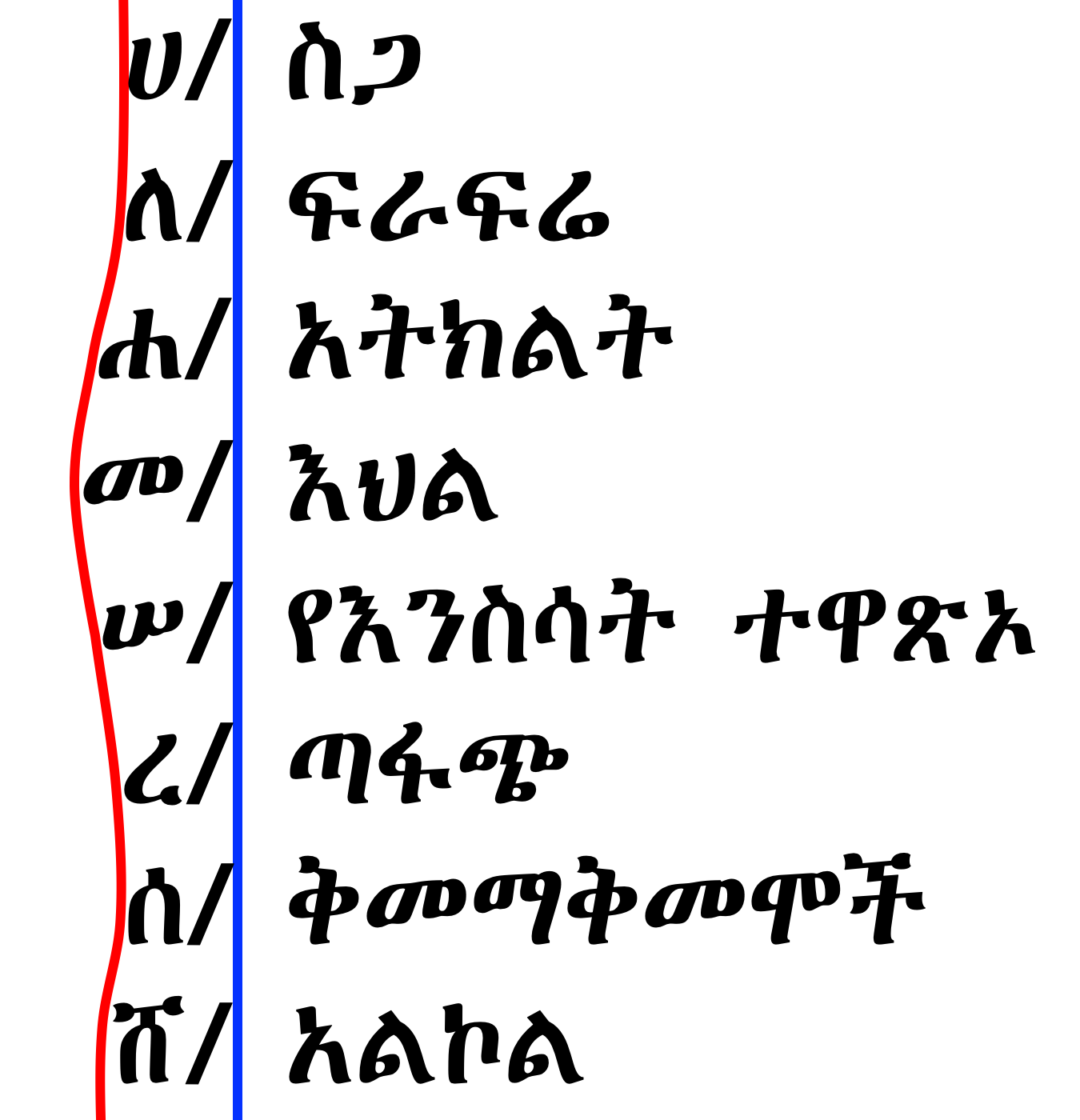
Vertical lists with multiple levels (outlines)

Where items in an ordered list introduce an additional list, both numerals and letters may be used. In keeping with the main list, any run over lines from the inner list items should be aligned with the first word following the item marker.

TBD: discuss change in list item counter, and list item marker at inner levels

  • ሀ/ ስጋ
    • ፩/ በግ
    • ፪/ ብሬ
    • ፫/ ዓሣ
    • ፬/ ዶሮ
  • ለ/ ፍራፍሬ
    • ፩/ ሙዝ
    • ፪/ አናናስ
    • ፫/ ብርቱካን
    • ፬/ ወይን
  • ሐ/ አትክልት
    • ፩/ ቲማቲም
    • ፪/ ጎመን
    • ፫/ ሽንኩርት
    • ፬/ ድንች
  • መ/ እህል
    • ፩/ ጤፍ
    • ፪/ ስንዴ
    • ፫/ ገብስ
    • ፬/ ሩዝ
A multilevel Ethiopic ordered list.

Ordered list counter suffix

The list “counter” is the number or letter that begins a list entry (e.g. “3”, “” or “”). The “list counter suffix” (also called the “list item marker”) is the symbol that follows, or in some case surrounds, the counter. For example: “.”, “/” or “()” in “3.”, “፫/” and “()”.

The recommended counter suffix for Ethiopic text in any language is the slash “/” symbol. Slash is recommended as the default suffix while authors are allowed to easily switch to a common alternative such as “”, “.”, “)” and “”.

List counter suffix alignment

In vertical lists, the list item text should initiate at the same horizontal position from the left margin. It is recommended that this positioning be achieved by aligning the list counter suffixes. The resulting list should appear as if the list were laid out in a table where the counter and its suffix appear right-justified in the first column, and the list text appearing left justified in the second column. depicts suffix based list alignment.

Alphabetical list aligned on suffix.

Emphasis

Emphasis can be expressed in a number of common approaches such as italics, boldface and underscore which maintain the same underlying typeface. In past eras that predate digital publishing, a change in the font size as well as to the underlying typeface, are more common approaches. This section provides guidance on applying the various approaches to emphasis.

Emphasis in republished works

When a pre-digital or early digital work is reproduced with modern software, it is recommended that the style of emphasis used in the original work be preserved in the updated form. Unless it can be determined that a particular style of emphasis because a technical limitation did not allow for a preferred style of emphasis to be employed. In this case the change of emphasis style would be acceptable as it reflects the intent of the author. For example, underlined text should not be changed to italics in a republishing of a work unless it is known that the author had desired italics emphasis but it was unavailable at the time.

Italics for emphasis

In works using a modern, thin weight, typeface, italic text may be used effectively for emphasis.

Boldface for emphasis

In works using the classic, heavy typeface, bold emphasis should not be used as it can be difficult to distinguish from the regular weight. An exception is found when a classic typeface is specifically designed for the bold appearance, in which case it is most suitable for chapter and section titles.

In works using a modern, thinner weight, typefaces, emboldened text may be used effectively for emphasis and is most appropriate for chapter and section titles. When the typeface used to render a document will be unknown, boldface should be avoided emphasis in favor of underline or italics.

Underscore for emphasis

Underscore (also called “underline”) is a more appropriate form of emphasis for the classic weight typeface and has some historic precedence in Ethiopic publishing, particularly where only a single typeface was available. When a document uses underscore for a special purpose, such as to denote a the presence of a hyperlink, underscore should then be avoided in favor of italics.

Size change for emphasis

In works where only a single typeface could be used, emphasis expressed mid-sentence is sometimes shown by enlarging the font size by around 25% of the regular height. Increasing the text size is sometimes used as an alternative to boldface or in a way analogous to “All Caps” in western writing. The approach should primarily be used only when reproducing a work where it has been applied in the original publication. Text size change may used cautiously when it has been determined that another form of emphasis is unsuitable.

Typeface change for emphasis

In some older, pre-digital, works emphasis can be shown by changing the typeface from the classic (“Zemen”) style to an even older style as would be found in manuscripts and early mechanical publishing. The typeface style change might also be accompanied by a change in text height. It is recommended that this approach only be used only when reproducing a work where it has been applied in the original publication. The change to a manuscript style typeface can be used in lieu of a suitable italic typeface.

Non-Ethiopic Languages

Languages Using the Latin Alphabet

Relative Character Heights

In multilingual documents, differences between the heights of letters in Ethiopic script and its companion foreign script are often found. The difference is likely an artifact of the typesetting technology in use and does not represent the intent of the author or publisher. In the classic typeface style of Ethiopic script the letters will be of variable heights. Fixed height styles are more generally used for advertisement and not publishing. The nature of variable height Ethiopic letters is a factor that complicates how to best align letter height with a foreign script.

Comparative heights of English and Ethiopic script.

At a given point size, letter heights within a script may vary widely between typefaces. This adds another level of difficulty to aligning heights between scripts as an alignment will only be optimal between a specific typeface pair. Within a script featuring variable (not fixed) height letters the relative heights of letters are subject to change between typefaces. This phenomena reinforces the previous assertion on typeface pair optimization, but also introduces the possibility that alignment optimization can be language sensistive. This happens when an alignment pair designed for the letter inventory of one language is applied to another language that includes letters that exceed the heights of the optimized set.

With these caveats considered, “Zen” alignment is a means to optimize an Ethiopic-Latin typeface pair that is suitable for a general use case when priori knowledge of a document language is unknown. Its basis is reviewed here. The Latin letter “Z” and Ethiopic letter “” are chosen as pairing symbols representative of the mean height. They both feature broad horizontal strokes that are easy for the eye to follow as a nearly continuous stroke.

A better approach is to align Z with caron (Ž) against with marcon (ኝ) while aligning and Z with and find typefaces with a good tuple of aligned pairings.

Alignment below accent (better sizing).
Phonetically the sequence of these two letters would sound like “zen”, hence the name.

Z- or “Zen” Reference Alignment.

Relative Typeface Weights

A common practice in Ethiopic literature is the change of typeface weight in one script to appear more visually similar to the other. Most typically a Latin typeface will be made heavier to better match its Ethiopic counterpart. This weight increase is demonstrated in many Ethiopic fonts that include Latin letters. The font designer may have increased the weight of the Latin range primarily to provide heavier weight punctuation to use with Ethiopic script (see Ethiopicized Punctuation).

Literature produced with a heavier Latin typeface may represent the author’s stylistic sensibilities but in some cases may only be a pragmatic outcome when an author finds manually changing between fonts too burdensome. The view of professional publishers is unknown here and should be determined.

Issues/Questions:

  1. When publishing in the classical Ethiopic weight, should English words appear in their default English weight?
  2. If heavier Latin letters are desirable, how much so? Can a weight increase be defined as a percentage of the Ethiopic?

Baseline Alignment

It is not uncommon to observe mid-sentence baseline changes in interlingual documents produced with pre-digital typesetting systems where Ethiopic and Latin text, for example, would appear to be laid out along different baselines in a line of text. The most common example of this appears in documents produced with a typewriter where a sheet of paper had to be moved between typewriters to produce a line in two scripts. An apparent baseline difference here would be the result of mechanical misalignment.

Note: The only point that seems can be made here would be to state that Ethiopic and foreign scripts should share the same baseline. This may already be the case with computer typography. If so, this section should be removed.

Arabic

Chinese

General Rules

Discuss height alignment

Numbers

Both the Ethiopic and Western (aka Hind-Arabic) numeral systems are important in Ethiopic writing. The numeric context will exclude one or the other system, or make either optional but one system preferred. For example, westernn numerals are the clear choice for phone numbers, fractions, decimal number and other calculated quantities. While literature in the Ge’ez language should preclude the use of western numerals. Cardinal numbers used for counting chapters and page numbers may use either system with Ethiopic being the preferred.

Comma between digits

The Western comma is used between groups of three numbers for values over ten thousand.

1000
9617
59,617
2,000,700

Commas are not used with Ethiopic numbers when expressing quantities.

The Ethiopic ecclesiastical comma is expected when referencing Biblical verses with Either western or Ethiopic numerals:

ዮሐ 5፥12
ዮሐ ፭፥፲፪

The decimal marker

Space between digits

Ratios

Percentages

Percentages should be expressed in western numerals and not words (e.g. “ሃምሳ ስድስት“ ) with an exception made at the start of a sentence. The word “ፐርሰንት” following the numeral(s) is preferred in nontechnical prose. The percent symbol, “%”, after the numeric value is preferred when presenting statistical or scientific study findigns. The percent symbol should follow the last digit immediately with no preceding space symbol.

Decimal fractions

Zero in the Ethiopic Numeral Context

Telephone numbers

Page Numbers

The audience should be considered when selecting a numeral system for page numbers. For a broad multilingual audience where Amharic or Tigirnya will be a second language, Western numerals would be better understood. When an Amharic or Tigrinya speakers are the primary audience, page numbers should be in Ethiopic numerals unless Western numerals are the dominant system in contexts such as chapter numbers.

When there is uncertainty over the audience’s grasp of the Ethiopic numeral systems, the recommended practice is to place the Ethiopic numerals at the outer margin and Western numerals at the inner margin.

Chapter Numbers

Chapter numbers should be in Ethiopic numerals. When numbered sections are important western numerals should then be used.

Review this with corpus and the use of alphabetic sections

Currency

Notes and Bibliography

Author-Date References

Indexes

References

Pankhurst, 1998

Ge’ez Literature, Church Libraries, and the Coming, from Europe, of the Printed Word. R. Pankhurst. Addis Tribune, August 28, 1998. Addis Ababa.

Alemayehu, 1965

Transcribed Citation:
Fəqər əskä Mäqabər, H. Alemayehu. Berhanenna Selam Printing Enterprise, 1965. Addis Ababa.

Source Citation:
ፍቅር፡እስከ፡መቃብር፣ ሀዲስ አለማየሁ። ብርሃንና ሰላም ማተሚያ ድርጀት፣ ፲፱፻፶፰። አዲስ አበባ።

Gebre, 2004

Transcribed Citation:
Tegbarawi Yetsihifet Memariya, D. Gebre. Commercial Printing Enterprises, 2004. Addis Ababa.

Source Citation:
ተግባራዊ፡የጽህፈት፡መማሪያ፣ ደረጀ ገብሬ። ንግድ ማተሚያ ድርጅት፣ ሚያዝያ 1996። አዲስ አበባ።

Shewaye, 1993

Transcribed Citation:
Anbebo YemMredatina YeMeSaf Chilotan Madaber, T. Shewaye. Educational Materials Publishing and Distribution Agency, 1993. Addis Ababa.

Source Citation:
አንብቦ የመረዳትና የመጻፍ ችሎታን ማዳበር ፣ ተስፋዬ ሸዋዬ። ት.መ.ማ.ማ.ድ.፣ 1986። አዲስ አበባ።