Use Cases
Use cases are selected that represent particular challenges in presentation beyond the regular Ruby use cases. Use cases are borrowed from a previous survey in a, now depreciated, article on Zaima Annotation which in turn provides the full page sources of the samples appearing here.
The samples here present focused layout requirements in isolation from their larger context. Larger samples will be produced to help access the overall readibility of electronically laid out Zaima in general, and to evaluate the layout choices made here.
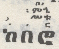
Use Case 1
Features:
- Four rows of annotation.
- Fairly simple.
- Clear left align of ᎖ over ከ in 2nd row. Question: Is this positioning important vs a default center alignment?
- Spanning and centered miliket on 2nd, 3rd and 4th rows over the last two letters. The spanning-centered layout may or may not be important.
- Use Case Question: What is the correct positioning of the annotation in all rows?
- TBD: Add a context note (modes, ceremonies).
| Alternate Rendering | ||
|---|---|---|
 |
|
|
Figure 1 Selot Kidassie p. 113
Issues:
- Had to specify a 2nd column width or the example gets cut off by the table. A rendering engine appears not be calculating cell content width correctly.
- In the alternative rendering, unable to right align ruby-text over the final base character on rows 1, 2 and 3 using
"ruby-align: right". - ቱ and ኂ on rows 2 and 3 respectively appear to overhang the right side of ሮ unexpectedly. ር on row one aligns with the right side of ሮ as expected. This may be attributable to the font and not the layout engine.
- Is the first or second redendering preferable? Does the difference impact vocalization?
Use Case 2
Features:
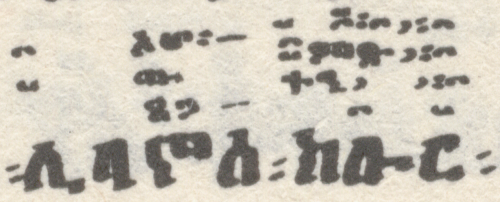
- Four rows of annotation.
- Apparent rise rise to the right of some rows up to ክ then a descent to ር which may mirror a vocal rise and fall.
- Presence of the chords and which must render inline with a row.
- TBD: Add a context note (modes, ceremonies).
 |
|
Figure 2 Zimarie Wemewasit p. 34
Issues:
- Could not center ᎖ over ቡ in Row 2 because character width included the "u" diacritic mark. Desired "center" location was in the midline of the base glyph በ. Instead, "text-align: left;" is used with a right side space padding before the ᎖ where the space used for padding is at a 25% scale.
Use Case 3
Features:
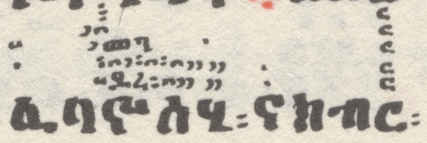
- Five rows of annotation.
- Apparent descent on first and second rows from ኖ to ሃ (which also appears to be a contiguous sequence).
- Clear disribution between letters ኖ and ስ on first and second rows.
- TBD: Add a context note (modes, ceremonies).
 |
|
Figure 3 Zimarie Wemewasit p. 34
Issues:
- Determine if ደረ is actually ይረ.
- Determine if the first and second rows sequence from ኖ to ሃ is indeed contiguous.
- Determine if the marks in the space inbetween ኖ and ስ is essential.
Use Case 4
Features:
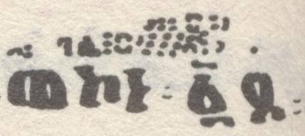
- Three rows of annotation.
- Slanted qirts in first row after ነ and following.
- Spanning of annotations in both rows across the word boundary ፡ marker over the sequence ነ፡፩.
- TBD: Add a context note (modes, ceremonies).
| Alternate Rendering | ||
|---|---|---|
 |
|
|
Figure 4 Zimarie Wemewasit p. 68
Issues:
- The beginning of the ᎒᎒᎒ sequence does not begin over ነ but the overall start and end of the annotation between ኮ and ፩ seems ok. Review with an expert-practioner.
Use Case 5
Features:
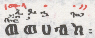
- Four rows of annotation -verify that the apparent lower rows are independent.
- TBD: Add a context note (modes, ceremonies).
| Alternate Rendering | ||
|---|---|---|
 |
|
|
Figure 5 Merha Liqawnt p. 127
Issues:
- Verify ይ or ዶ in row 3.
- Look up the miliket for ኢ ይ ኃ to determine if these are 1, 2 or 3 miliket and if they should be written contiguously.
- Right justify desired for ኢ above ወ on row 3, and for both ጐ᎖ and ᎐᎖᎖ above ከ on rows 3 and 4 respectively
- ፡ would vanish if placed after the closing ruby tag as per:
<rb>ወሀብከ</rb><rt><span></span></rt></ruby>፡
Accordingly it was placed just within the closing ruby tag as per:
<rb>ወሀብከ</rb><rt><span></span></rt>፡</ruby>
This may be a browser issue or an issue with the markup approach taken. - Is the first or second redendering preferable? Does the diference impact vocalization?
Use Case 6
Features:
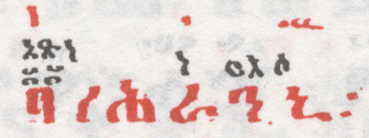
- Three rows of annotation -verify that the apparent lower rows are independent.
- TBD: Add a context note (modes, ceremonies).
| Alternate Rendering | ||
|---|---|---|
 |
|
|
Figure 6 Merha Liqawnt p. 128
Issues:
- Determine if ርእሶ is one or two (ርእ & ሶ) miliket and space as needed.
- Determine if it is OK for አጽነ to extend over ነ.
- Is the first or second redendering preferable? Does the diference impact vocalization?
Use Case 7
Features:
- Three rows of annotation.
- Apparent overhang of ᎓᎔ from ከ.
- Example of ፴ with omitted lower bar.
- TBD: Add a context note (modes, ceremonies).
 |
|
Figure 7 Merha Liqawnt p. 128
Issues:
- Top alignment of ሙ᎘ beside ᎒ likely just due to the arrival of ከመ in the 2nd row and is not meaningful.
- ከመ ፀሐይ in the 2nd row is curious. Determine if this is miliket or another type of annotation.
Use Case 8
Features:
- Four rows of annotation -verify that the apparent lower rows are independent.
- Hidet above ርጥቁ may is possibly a case of a nested Ruby (annotation with annotation as per serayu). May also be an example of joining Hidet.
- TBD: Add a context note (modes, ceremonies).
 |
|
Figure 8 Merha Liqawnt p. 23
Issues:
- ኢየሱስ ክርስቶ in the 2nd row is curious. Determine if this is miliket or another type of annotation.
- The Hidet alignment appears off in Safari, review in other browsers.
Use Case 9
Features:
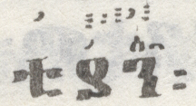
- The ᎒᎓᎒᎖᎒ sequence spans 2 letters along a render line rising at a slight angle to the right.
- The alternate rendering divides the ᎒᎓᎒᎖᎒ sequence over ያ and ን seprately.
- TBD: Add a context note (modes, ceremonies).
| Alternate Rendering | |||
|---|---|---|---|
 |
|
|
|
Figure 9 Selot Kidasie p. 9
Issues:
- Unable to use
"ruby-align: space-between;"to distribute ᎒᎓᎒᎖᎒ over ያን. - Is anything lost when the rising qirts marks are arranged fully horizontal and not rising? Can the Zaima be reproduced vocally in the same way?
- Is the first or second redendering preferable? Does the diference impact vocalization?
Use Case 10
Features:
- Fairly simple.
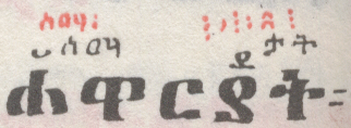
- Presence of the chord which must render inline with a row.
- The ᎒᎖᎒᎓᎒ sequence spans 2 or possibly 3 letters along a render line rising at a slight angle to the right.
- TBD: Add a context note (modes, ceremonies).
 |
|
Figure 10 Selot Kidassie p. 129
Issues:
- Determine if the bottom row is actually two rows.
- Unable to use
"ruby-align: space-between;"to distribute ᎒᎖᎒᎓ ᎒ over ርያት. rotate(5deg)has no effect, determine if misused.- Determine if ደ above ያ might actually be ይ.
- Is anything lost when the rising qirts marks are arranged fully horizontal and not rising? Can the Zaima be reproduced vocally in the same way?
Use Case 11
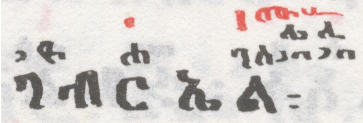
Features:
- Right side overhang, rising.
- Three part distribution of ዮሐንስ.
- Use Case Question: How critical is it to reproduce the overhang as seen?
- TBD: Add a context note (modes, ceremonies).
 |
|
Figure 11 Selot Kidasie p. 83
Issues:
- The extent of overhang of the annotation is visually very diferent as a consquence of the typeface properties -does this matter?
- Top alignment of ሙ᎘ beside ᎒ likely just due to the arrival of the ሌሊ in the 2nd row and not meaningful.
- Is ᎖ left aligned with ገ important, or may it be centered (default)?
Use Case 12
Features:
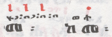
- Right side overhang, rising.
- Use Case Question: How critical is it to reproduce the overhang as seen?
- TBD: Add a context note (modes, ceremonies).
 |
|
Figure 12 Merha Liqawnt p. 66
Issues:
- The vertical red strokes are either a form of ᎒ or ᎙, check with an expert-practioner.
Use Case 13
Features:
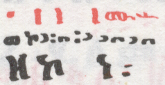
- Inner overhang, falling.
- Use Case Question: How critical is it to reproduce the overhang as seen?
- TBD: Add a context note (modes, ceremonies).
 |
|
Figure 13 Merha Liqawnt p. 84
Issues:
- The vertical red strokes are either a form of ᎒ or ᎙, check with an expert-practioner.
Use Case 14
Features:
- Inner overhang.
- Use Case Question: How critical is it to reproduce the overhang as seen?
- TBD: Add a context note (modes, ceremonies).
 |
|
Figure 14 Merha Liqawnt p. 84
Issues:
- "text-align: left;" of ቡበ᎖᎓᎔᎖᎓᎔᎓᎔ in the rt over ፡ኦ had no effect, until an " " was added in the rb.
- An " " was added to after ፡ኦ to force alignment of ቡ over ፡ and not the white space before it. This forced space between ፡ and ኦ.
- The vertical red strokes are either a form of ᎒ or ᎙, check with an expert-practioner.
Use Case 15
Features:
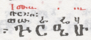
- Left side overhang.
- Use Case Question: How critical is it to reproduce the overhang as seen?
- TBD: Add a context note (modes, ceremonies).
 |
|
Figure 15 Merha Liqawnt p. 21
Issues:
- Difficulty with positioning the first letter of each row to the left of ጕ -is the left overhang critical.
- The calligraphic sample depicts no overhang from ጕ to ር -is the digital form acceptable?
- Validate that ሢ is the correct symbol.
- Positioning of ሢ should align the diacrtic symbol with the diacritic with ሁ.
Use Case 16
Features:
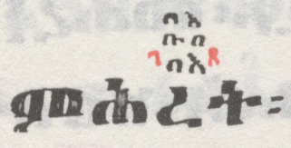
- Overlapping row position -row 2 overlaps rows 1 and 3.
- Use Case Question: How critical is it to reproduce the low overlap as seen?
- TBD: Add a context note (modes, ceremonies).
| Alternate Rendering | ||
|---|---|---|
 |
|
|
Figure 16 Selot Kidasie p. 213
Issues:
- Is the first or second redendering preferable? Does the difference impact vocalization?
- Verify spelling of ገጸ.
- If laying out ገጸ on its own row is appropriate, is using the default annotation alignment (centered) also appropriate or should the original be preserved?
- Rows 1 and 4 appear redundant in our isolated example, check the broader context of the line of text line.
Use Case 17
Features:
- Two or three rows of annotation.
- Apparent row overlap above ንሴብሕ.
- TBD: Add a context note (modes, ceremonies).
 |
ይሕ፤
ይሕ፤ |
Figure 17 Merha Liqawnt p. 103
Issues:
- Determine if two or three rows are present above ንሴብሕ. If two rows, what is the context of the red annotation in the first row?
- Some 2nd row annotation appear very close to the first row, as if shadowing it, is this spacing required in digital form?
- If the first row red annotation above ሴ ,ብ & ሕ belong in their own row, is using the default annotation alignment (centered) also appropriate or should the original be preserved?
Use Case 18
Features:
- Three or four rows of annotation.
- Second row (red) appears to collapse into the first row in several places.
- TBD: Add a context note (modes, ceremonies).
| Alternate Rendering | ||
|---|---|---|
 |
|
|
Figure 18 Merha Liqawnt p. 145
Issues:
- Determine if three or four rows are present. If three rows, what is the context of the red annotation in the first row?
Use Case 19
Features:
- Three to five rows of annotation.
- As with use cases 16-18, some red annotations may or may not represent separate rows.
- TBD: Add a context note (modes, ceremonies).
 |
|
Figure 19 Selot Kidasie p. 189
Issues:
- Determine if three, four or five rows are present. If three rows, what is the context of the red annotation in the lower rows?
- Some 2nd row annotation appear very close to the first row, as if shadowing it, is this spacing required in digital form?
- If the first row red annotation above ሴ ,ብ & ሕ belong in their own row, is using the default annotation alignment (centered) also appropriate or should the original be preserved?
- As with similar occurences in Use Cases 16 & 17, is the repositioning of ᎒ጽ above ብ appropriate?
Use Case 20
Features:
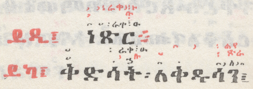
- Three or four rows of annotation.
- As with use cases 16-19, some red annotations may or may not represent separate rows.
- TBD: Add a context note (modes, ceremonies).
 |
ይዲ፤
ይካ፤ |
Figure 20 Selot Kidasie p. 253
Issues:
- As with similar occurences in Use Cases 16-19, is the repositioning of ቡ above ት appropriate?