Working with long descenders
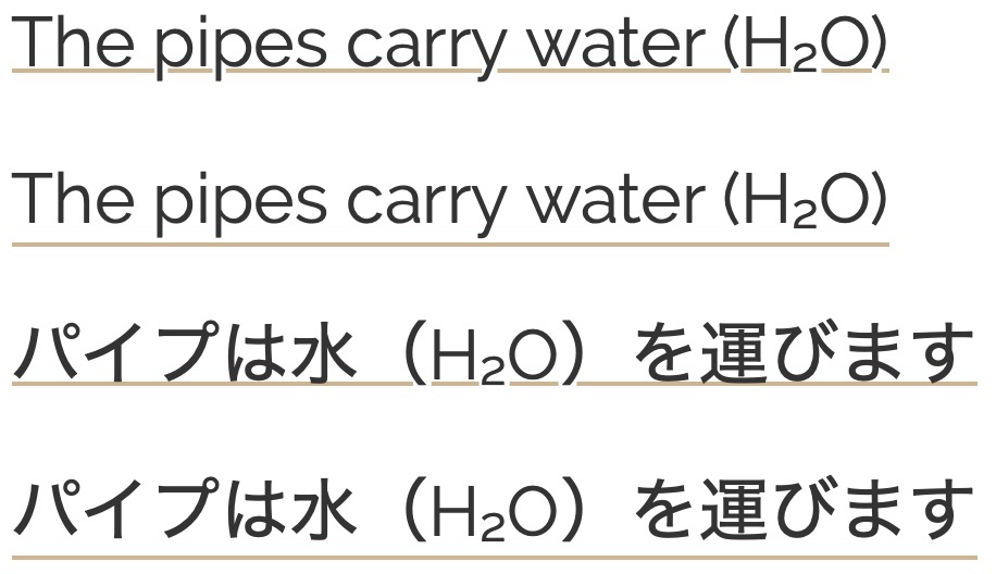
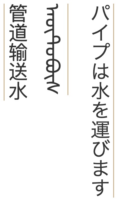
The underline for Latin script text generally falls just below the alphabetic baseline. However, for some other writing systems, it is often better to move the underline downwards so that it doesn't cut through diacritics or descenders.
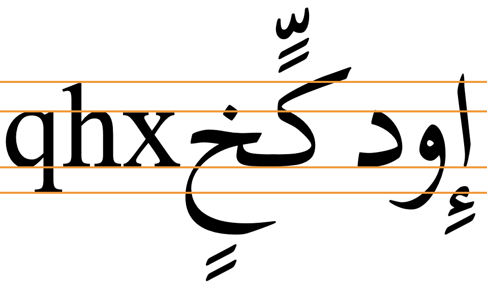
Writing systems that extend below the baseline much further than Latin script text include Arabic, most Brahmi-derived scripts, particularly Balinese and Javanese, Tibetan, etc. The following image shows typical metrics for Arabic font glyphs compared to size-appropriate Latin text. Note the extra vertical space required.
The CSS specification suggests that, without styling, browsers should place an underline at or near the alphabetic baseline, but should also take into account that some scripts will need the underline to be lower. Browsers are encouraged to take these scripts into account for default settings and auto values, but typically some additional styling will be needed.
If you allow the browser to use the default position or an auto value, the line will typically be drawn immediately below the alphabetic baseline, cutting through descenders, subjoined consonants/vowels and diacritics. Gecko browsers will however apply the underline position given by font metrics, if available for that font.
How to do it. CSS offers three possible strategies for positioning the underline lower than just below the alphabetic baseline. However, the choice of styling is not straightforward. Given the same CSS declarations, the actual placement of the underline will usually vary by font, and may also vary by browser used. It is therefore necessary to set the underline at the same time as assigning the font family for the text, and it's likely you'll need to do some experimentation to get the setting you want.
Using text-underline-position:from-font typically lowers the underline, but only for the few fonts that contain the metric. Typically, the underline still cuts through descenders or subjoined glyphs below the baseline.
Text-underline-position:under usually pushes the underline down further, and for some scripts may clear most descenders and subjoined glyphs, but not all. It is, however, a little unreliable, and the position may vary from browser to browser, not just font to font.
Text-underline-offset gives you more predictable control over the position of the underline, allowing for clearance of long descenders, as well as any diacritics below them. However, the actual setting is still script dependent, although font by font differences are not a significant issue.
Whichever approach you choose, you should ensure that line heights are set so that the underline doesn't hit the text on following lines.
The following subsections provide additional details as well as tests that you can run for yourself. We chose a number of scripts to test that are representative of writing systems with significant downward extensions. These are Arabic (with and without diacritics), Khmer, Javanese, and Tibetan.
Using built-in font metrics (from-font)
If a font has a built-in metric to indicate the preferred underline position then text-underline-position:from-font should allow you to use that. However, many fonts don't include that metric.
from-font is applied. If the font doesn't have built-in metrics to indicate the preferred position of the underline the value falls back to auto, which relies on the browser to do the right thing. Currently, when the value of this property is set to auto Blink and WebKit browsers draw the underline just below the alphabetic baseline, but Gecko applies the from-font position when auto is specified and the font metric exists (which is what the CSS spec recommends).
Key points to note are that only a few fonts are likely to make the metric available, and that the position may not always clear the bottom of the glyph descenders or any associated diacritics.
It is possible to set text-underline-position just once for the whole document; then any text-decoration property or u element that is used will automatically apply it. The CSS specification suggests the following.
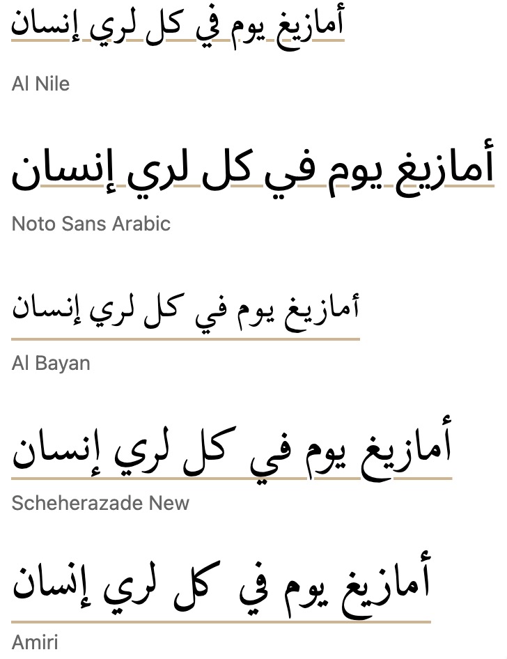
:root { text-underline-position:from-font; }Output in your browser (only the bottom two lines use text-underline-position):
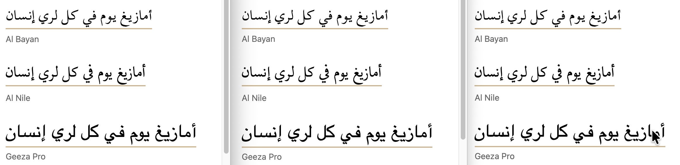
أمازيغ يوم في كل لري إنسان
أمازيغ يوم في كل لري إنسان
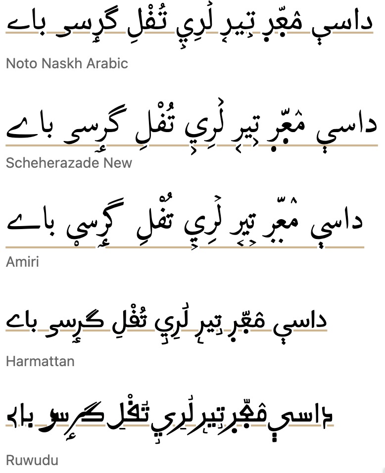
داسې مٛعّٜرٜ تࣺيرࣹ لࣸرِيࣺ تُفْلِ گرٟسؠ باے
Does it work? All three major browser engines support the use of text-underline-position:from-font where that metric is available in the font.
The from-font position is used as the unstyled default in Gecko browsers (ie. without styling).
Safari only renders pre-installed macOS fonts, so fonts such as Amiri, and Scheherazade New, which do have underline metrics, won't display unless you use a webfont.
More tests...
The following links allow you to test this property and value against a range of fonts. The links open a web page in a separate browser window. The text is composed from lists of words or graphemes that show long descenders.
There are two types of test. One (W3C) allows you to change the font by mousing over or tapping on the fonts in a list. The other (r12a) lists the text with all fonts at the same time. Of course, the tests only produce results for the fonts installed on your device or platform. Note, in particular, that WebKit browsers do not allow you to access non-system fonts unless they are packaged as webfonts.
W3C: Arabic (NO vowel signs) • Wolofal, Hausa, Pashto, Kashmiri (Arabic WITH vowel signs) • Javanese • Khmer • Tibetan
r12a: Arabic (no vowel signs) • Wolofal, Hausa, Pashto, Kashmiri (Arabic WITH vowel signs) • Javanese • Khmer • Tibetan
Test results...
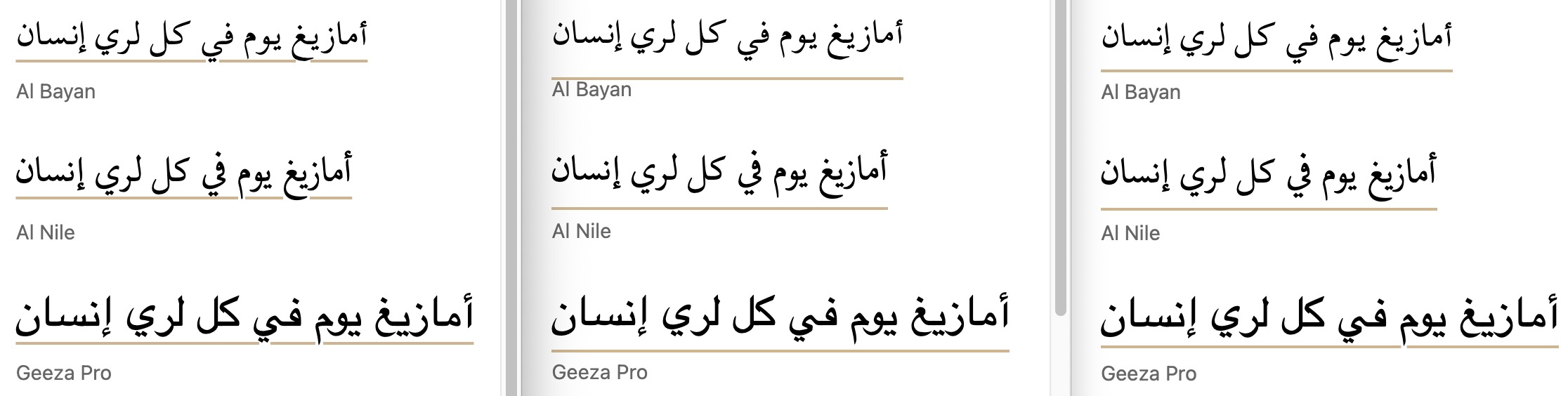
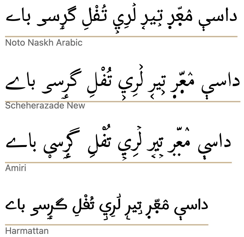
Arabic. Tests with 43 system, Noto, and SIL Arabic fonts found that only 11 moved the underline down when from-font was applied. Of those 11, only 7 actually cleared the descenders. Diacritics below the descenders are not usually present in Arabic and Persian language text, but they may occur for educational or clarification purposes, and there are certain orthographies using the Arabic script that always include all diacritics (such as African ajami texts). When diacritics appear below the descenders they are sometimes bisected by the underline.
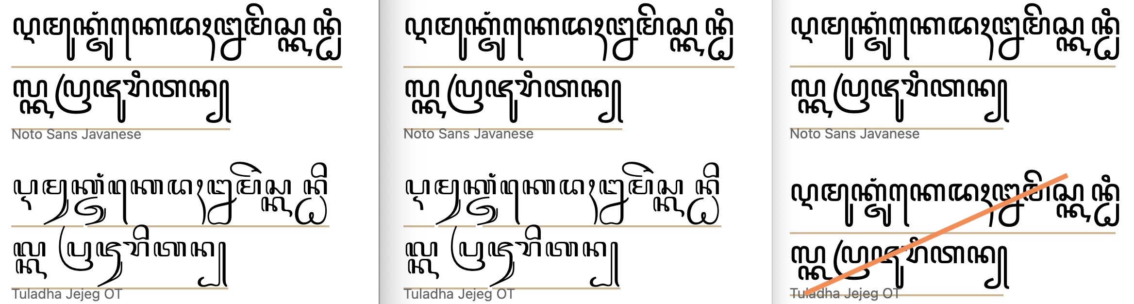
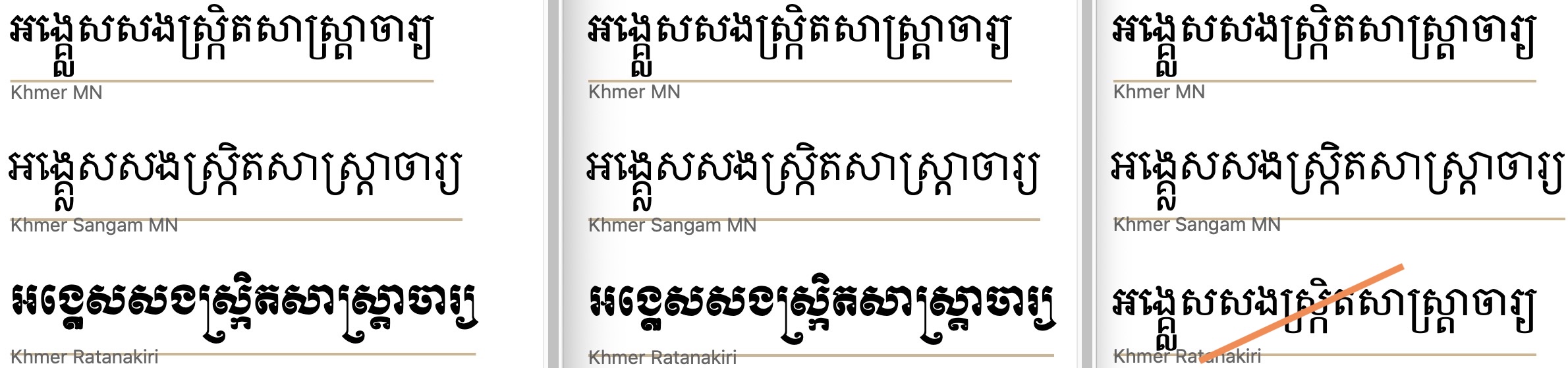
Javanese & Khmer. None of the fonts tested moved the underline.
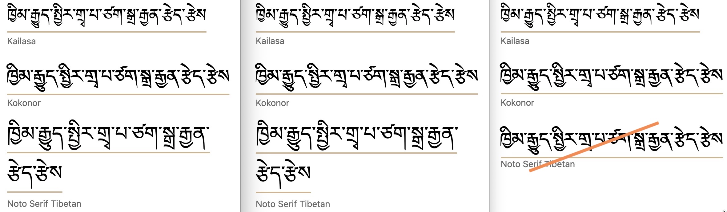
Tibetan The application of this property only produced a small shift in the position of the underline for those fonts with the metric. The bottom of the subjoined glyphs (and sometimes single consonant descenders) was not cleared.
Positioning below the em box (under)
An alternative to from-font that works for all fonts is text-underline-position:under. This is designed to push the underline below the font's em box descent metric.
under is applied.The position below the alphabetic baseline still varies from font to font, but the underline typically appears slightly lower than that produced byfrom-font. From the fonts tested, however, there is still a degree of unpredictability regarding where the line will be drawn, and the result differs depending on which browser is used. In some cases, the basic descenders are cleared, but in others, especially when vowel markers appear below long descenders or stacks, they are not.
So, you should still test the results for a given font, and on multiple browsers.
As mentioned in the previous section, it is possible to set text-underline-position just once for the whole document; then any text-decoration property that is used will automatically apply it. The CSS specification suggests the following.
:root { text-underline-position:under; }Output in your browser (only the bottom two lines use text-underline-position):
أَمَازِيغ يَوْم فيِ كُلّ هٰذِهِ إِنْسَان
أمازيغ يوم في كل هٰذه إنسان
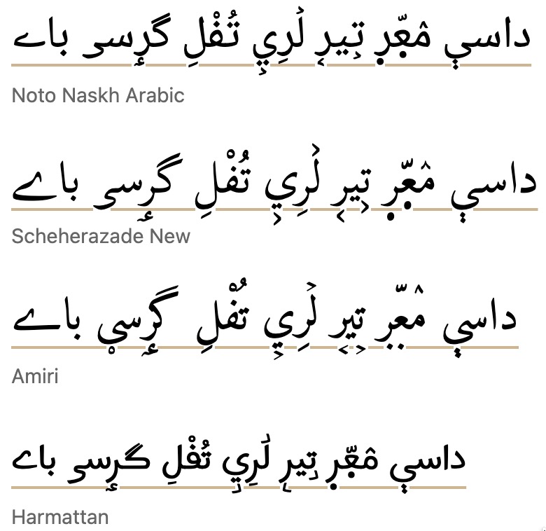
داسې مٛعّٜرٜ تࣺيرࣹ لࣸرِيࣺ تُفْلِ گرٟسؠ باے
Does it work? All three major browser engines support the use of text-underline-position:under.
Safari only renders pre-installed macOS fonts or webfonts.
More tests...
The following links allow you to test this property and value against a range of fonts. The links open a web page in a separate browser window. The text is composed from lists of words or graphemes that show long descenders.
There are two types of test. One (W3C) allows you to change the font by mousing over or tapping on the fonts in a list. The other (r12a) lists the text with all fonts at the same time. Of course, the tests only produce results for the fonts installed on your device or platform. Note, in particular, that WebKit browsers do not allow you to access non-system fonts unless they are packaged as webfonts.
W3C: Arabic (NO vowel signs) • Wolofal, Hausa, Pashto, Kashmiri (Arabic WITH vowel signs) • Javanese • Khmer • Tibetan
r12a: Arabic (no vowel signs) • Wolofal, Hausa, Pashto, Kashmiri (Arabic WITH vowel signs) • Javanese • Khmer • Tibetan
Test results...
For all results, the actual position for a given font varies from browser to browser. Click on the images to see them full-size.
Arabic. For Arabic fonts, this setting generally clears the bottom of the descenders, but several fonts still run the underline through or above the diacritics. For a small number of fonts there is a sizeable gap between the bottom of the ink and the underline.
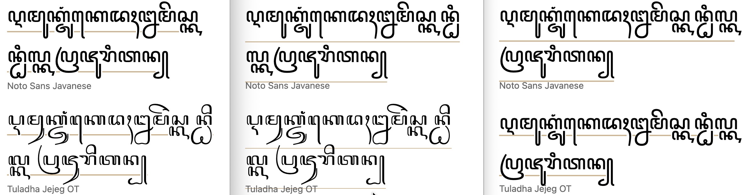
under.Javanese. In the Chrome browser the underline cuts through descenders and subjoined consonants, but Firefox and Safari (which only displays one font) both clear the bottom of all glyphs.
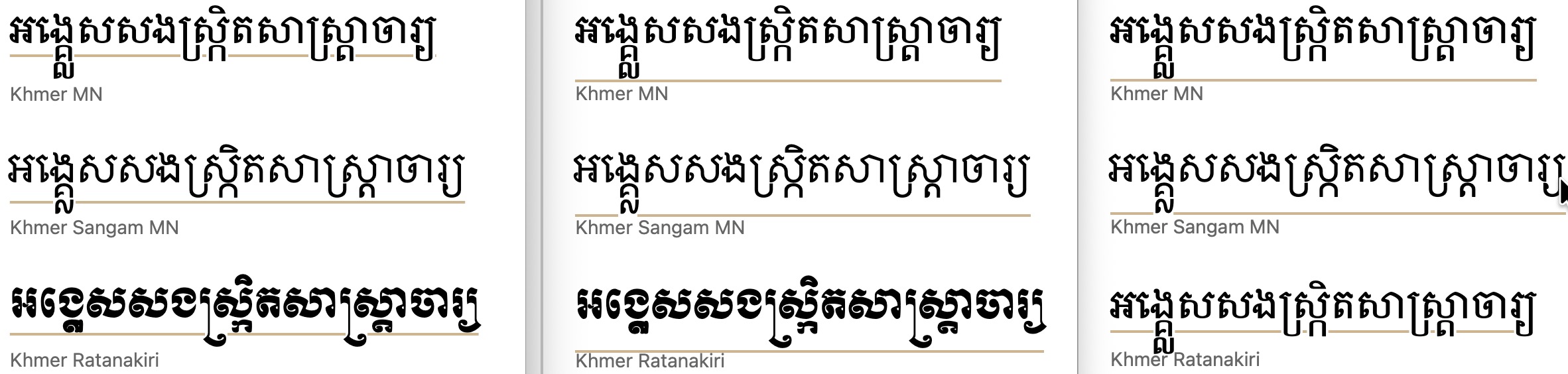
under.Khmer. In the Chrome browser the underline sometimes clears single subjoined consonants, but not always. When there are two subjoined consonants (not very common), the line doesn't clear the bottom of the glyph. Firefox and Safari (only two fonts shown) both clear the bottom of all glyphs. For a typical text, this means that there is a fair-sized gap between the line and the bottom of the glyphs.
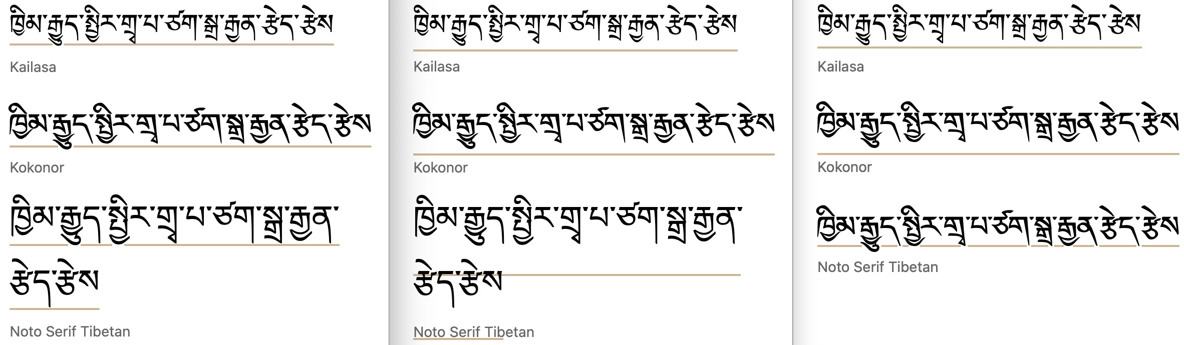
under.Tibetan. Chrome is again more conservative, placing the line just below or bisecting vowels after medial consonants. Firefox and Safari (just the first 2 fonts shown) typically just clear the vowels after medials, but Firefox creates an unexpectedly large gap for Noto Serif Tibetan.
under.Specifying the distance explicitly (text-underline-offset)
text-underline-offset provides a more reliable positioning of the underline relative to the text than the other approaches. For example, if you want to be sure that an underline always clears the glyphs, this generally provides much more predictable results than the previous approaches. Although you may need to set a different offset for each type of script, the test results indicate that the results don't vary as much, if at all, on a font to font basis.
text-underline-offset is set to 75%.The value can be expressed as a fixed distance, for example using px, but generally speaking this is suboptimal because if the font size is changed that distance remains the same. It would be necessary to change the underline offset each time a change is made to the font size. A better approach is to specify the distance in ems or as a percentage.
The actual value needed will commonly depend on the script characteristics. The tests run below showed the following values to be effective on the whole: for unvowelled Arabic, 45%; for vowelled Arabic orthographies, 75%; for Javanese, 100%; for Khmer, 90%, and for Tibetan, 60%. However, some font variation also occurs; for example, unvowelled text in the Scheherazade New and Amiri fonts required a setting of 60%, rather than 45%.
It follows, then, that the font family and the underline offset for the text need to both be set at the same time. However, it's not necessary to change the value when the font size varies, and, unlike the other alternatives just discussed, one setting is more likely to be useful for most or all fonts used for that script.
Values for text-underline-offset can be negative, allowing you to move the underline higher as well as lower.
Be aware that the offset is calculated in addition to any text-underline-position setting. Unless you have a reason not to, it's best to ensure that text-underline-position is not set when text-underline-offset is applied.
If the value is set to auto the browser takes control of the positioning. Note that if text-underline-position is also set to from-font, then that overrides any text-underline-offset:auto setting.
:root { text-underline-offset:<distance>; }Output in your browser (only the bottom line uses text-underline-offset):
داسې مٛعّٜرٜ تࣺيرࣹ لࣸرِيࣺ تُفْلِ گرٟسؠ باے
داسې مٛعّٜرٜ تࣺيرࣹ لࣸرِيࣺ تُفْلِ گرٟسؠ باے
Does it work? All three major browser engines support the use of text-underline-offset.
Safari only renders pre-installed macOS fonts or webfonts.
More tests...
The following links allow you to test this property and value against a range of fonts. The links open a web page in a separate browser window. The text is composed from lists of words or graphemes that show long descenders.
There are two types of test. One (W3C) allows you to change the font by mousing over or tapping on the fonts in a list. The other (r12a) lists the text with all fonts at the same time. Of course, the tests only produce results for the fonts installed on your device or platform. Note, in particular, that WebKit browsers do not allow you to access non-system fonts unless they are packaged as webfonts.
W3C: Arabic (NO vowel signs) • Wolofal, Hausa, Pashto, Kashmiri (Arabic WITH vowel signs) • Javanese • Khmer • Tibetan
r12a: Arabic (no vowel signs) • Wolofal, Hausa, Pashto, Kashmiri (Arabic WITH vowel signs) • Javanese • Khmer • Tibetan
Test results...
For all results, this produced the most consistent placement of the underline. The tests were designed to place the underline just below the lowest extent of the ink for each script. Different percentages were applied to each group, but no difference was applied on a font to font basis within a group.
Arabic. A setting of 45% consistently cleared the longest descenders for the set of fonts without descenders. For the fonts with diacritics from Wolofal, Hausa, Pashto, and Kashmiri orthographies, the same result was achieved when the percentage was set to 75%. (No pre-installed fonts supported these diacritics, so the result for Safari is not shown.)
text-underline-offset value is set to 45%.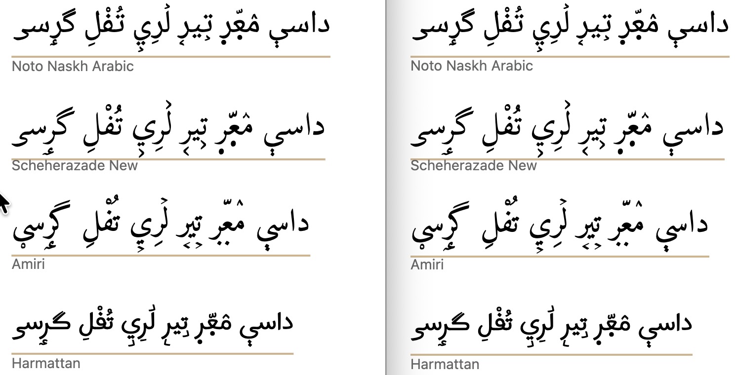
text-underline-offset value is set to 75%. (Safari results are not shown since no preinstalled fonts support the diacritics for these languages.)Javanese. A setting of 100% consistently cleared the longest descents.
text-underline-offset value is set to 100%.Khmer. A setting of 90% consistently cleared the longest descents.
text-underline-offset value is set to 90%.Tibetan. A setting of 60% consistently cleared the longest descents.
text-underline-offset value is set to 60%.