Status
This understanding document is part of the draft WCAG 2.2 content. It may change or be removed before the final WCAG 2.2 is published.
Intent
The purpose of this Success Criterion (SC) is to ensure a keyboard focus indicator is clearly visible and discernible. Focus Appearance (Minimum) is closely related to 2.4.7 Focus Visible and 1.4.11 Non-text Contrast. Where Focus Visible merely requires a visible focus indicator, this SC defines a minimum level of visibility. Where Non-text Contrast requires a component to have adequate contrast against the background in each of its states, this SC requires sufficient contrast for the focus indicator itself.
For sighted people with mobility impairments who use a keyboard or keyboard-like device (such as a switch or voice input), knowing the current point of focus is very important. Visible focus must also meet the needs of users with low vision, who may also be keyboard-only users.
A keyboard focus indicator can take different forms. This Success Criterion lists three primary considerations that can be met to consistently achieve a sufficient focus appearance. It then provides a list of exceptions for a focus indicator which may be less optimal for some users but still achieves a minimum level of focus appearance. This Understanding document will elaborate on each of the three primary considerations, then address the exceptions.
Encloses
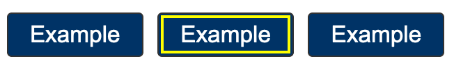
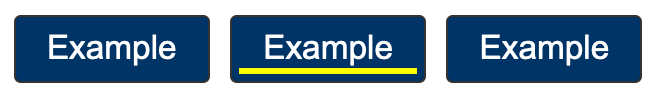
The first of the primary bullets states that the focus indicator "encloses" the user interface component. This is defined to mean "solidly bounds or surrounds." Both bounds and surrounds describe optimal and established ways of showing focus. Bounds and its related term "bounding box" generally describe a rectangle drawn around the outside of a user interface component. It is the most common form of focus indication and is sometimes referred to as a "focus rectangle."

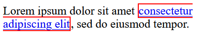
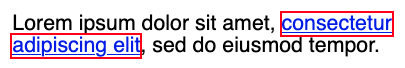
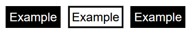
"Surrounds" also refers to something that solidly encloses a shape. However, a shape can be surrounded in many ways. For instance, the focus indicator may follow the outline of the object being enclosed. The difference between bounds and surrounds is illustrated in the following two images of a set of ratings stars. In both examples, the same three stars have already been selected, and focus is on the third star.


Solidly
Where the indicator does not "solidly" bound or surround the component, as with a dashed or dotted line, it cannot meet this primary consideration. However, a non-solid line can still pass if it meets the wording of the exceptions (discussed in more detail under Exceptions).


Indicator contrasts between its focused and unfocused states
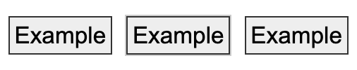
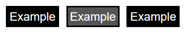
The second of the primary bullets states that the indicator "has a contrast ratio of at least 3:1 between its pixels in the focused and unfocused states." The following illustration shows a minimally contrasting focus indicator, where some of the white pixels making up the page background have been altered to a mid-grey, which contrast 3:1 with the original white. Authors are encouraged to exceed the minimum focus appearance. For instance, the dark blue lines in the first two illustrations are much more visible.

Contrasts at least 3:1 against adjacent colors
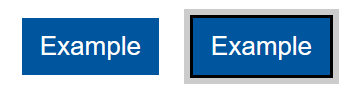
The third of the primary bullets states that the focus indicator must contrast against the pixels on either side. Where the indicator is offset from the shape and does not directly abut the component or any other object -- as in all preceding examples -- it simply needs to contrast at least 3:1 against the page background. Offsetting is the recommended way of creating a more visible focus indicator. However, where authors choose to position the indicator so it is directly next to or overlaps another shape, it must contrast 3:1 against this adjacent shape as well.
Component keyboard focus
The preamble to this SC is "When a user interface component has keyboard focus..." The keyboard focus is the point of interaction for someone using a keyboard. For environments with a keyboard-operable interface, the keyboard focus can be moved around the interface in order to interact with different components. Whichever component is being interacted with has focus.
WCAG defines user interface component as "a part of the content that is perceived by users as a single control for a distinct function." Because different users may perceive controls differently, there is a potential for some variation when interpreting what constitutes both a single control and a distinct function. This is particularly the case when something visually presents in a way that may differ from how it is programmatically created under the covers. Where there is not a native HTML component upon which to base designs, there can be great variations in how the components and their focus indicators are portrayed. Further, some components have sub-components that can take focus, such as the menu items on a menu.
Nonetheless, consistent results from different testers were obtained for this SC by using the focus indicator itself as the gauge of what constitutes the component being interacted with. For complex components, the three typical focus indicators are as follows:
- Focus indicator around only the whole component
- Focus indicators around both the component and subcomponent
- Focus indicator around only the subcomponent
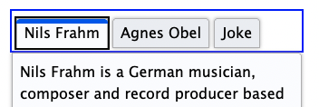
Each of these will be discussed, using a tablist as a familiar complex component.
Focus indicator around only the whole component
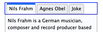
When the focus indicator is shown only around the whole tablist, the user is guided to considering the tablist as a single user component. The tab items within it are visually distinguished between selected and unselected states (and visual indicators of selection state must meet the criteria given in 1.4.11 Non-text Contrast).
Having a focus indicator only around the whole is possible where there is no need to have a selected sub-component while another sub-component has focus. For a tablist which synchronizes its tab panel content with whatever tab is active, only one tab item can be selected at a time, and since whatever tab is selected is considered active, a separate focus indicator is redundant.
Result: the group focus indicator must meet the requirements of this SC.
A radio button group and a star-rating widget, which each use only a whole-component focus indicator, provide working examples of different complex components that pass the primary requirements of this SC. In the star ratings example, users can increment the rating by 1/2 stars. Not only is a focus indicator for each 1/2 star unnecessary, but it would actually be difficult to achieve without making the interaction confusing.
Focus indicators around both the component and subcomponent
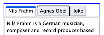
For a tablist which does not keep its tab panel content synchronized with whatever tab is selected, there needs to be a focus indicator for the tab item subcomponent. This is because the tab item with focus may be different than the selected item.
The user can navigate to the tablist, which in this implementation has a focus rectangle around the whole tablist as well as one around a tab item (conventionally the item that is currently selected). The focus around the whole is helpful in cueing a keyboard user that this is a complex component that has its own interaction. The user can then move focus between the unselected and selected tab items -- each of which in turn has its own focus indicator -- before activating one, which then makes it selected as well as focused, and updates the tab panel to match.
In this scenario, either the group focus indicator or the sub-component indicator must meet the requirements of this Success Criterion. To avoid being overly prescriptive, the Success Criterion allows authors to choose which makes the most sense. Generally, if a sub-component focus is necessary, it should be assessed instead of the group indicator.
Result: the focus indicator for the tab item meets the requirements of this SC. The tablist focus indicator does not need to meet the requirements.
A slider to pick colors provides a working example of a different complex component that predominantly shows focus for the subcomponent. In this case, the thumb slider sub-component has a focus indicator of sufficient size and contrast to pass the exception. There is also a subtle focus around the whole slider component, but it does not need to be assessed to pass this SC.
Focus indicator around only the subcomponent
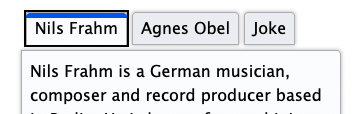
The same unsynchronized tablist can also be implemented as something which only shows focus on the tab items and not on the whole. The behaviour is the same as in the prior example, but there is never a focus indicator placed around the tablist. This interaction is acceptable, but it is not best practice since it demands more understanding from the user with less information. For example, some visual cues for the tablist and tab items (and tab panel) may not be clear. As well, keyboard users may not initially understand the expected keyboard interaction.
Result: the focus indicator for the tab item must meet the requirements of this SC, judging focus with both selected and unselected tab items.
A functional example of sub-component-only tab focus has an indicator that is large enough (at least four times the shortest side) with sufficient contrast to pass the exception language of this SC.
Where something with focus is not a user interface component
Some pages contain very large editing regions, such as web implementations of word
processors and code editors. Unlike a textarea element, which is a user interface component, these large editing regions do not
typically meet the definition of user interface components; they are not "perceived by users as a single control for a distinct function." Providing
focus indicators around such editing regions may still be beneficial to some; however,
where the region is not perceived as a single control, it is not covered by this Success
Criterion. The web page will still need to provide a insertion point (caret indicator)
in such editing regions in order to meet the requirements of 2.4.7 Focus Visible.
Some non-operable elements can take focus (such as a heading element that is the target of a skip link). However, the preamble of this SC refers to user interface components; it is only when the element with focus is operable by keyboard that this Success Criterion applies.
Exceptions
In addition to achieving a minimum keyboard focus appearance using the three primary means described above, an author can also meet this SC's requirements through one of several exceptions, where either:
- the focus indicator cannot be adjusted by the author,
- the author has not modified the effects of the user agent default, or
- the author provides an indicator of sufficient size and contrast.
First exception: the focus indicator cannot be adjusted by the author
The focus indicator is determined by the user agent and cannot be adjusted by the author
Some components or technologies may not allow the author to adjust the focus indicator.
This is the case with HTML select elements (both single and multi-select), where the visual treatments for selection
and focus cannot be adjusted by the author. In this case the Success Criterion does
not apply.
select element presentation cannot be modified by the author, so it passes regardless of
the quality of the focus indicator
Second exception: the default indicator and background are not modified
The focus indicator and the indicator’s background color are not modified by the author
If the focus indicator and the background behind the focus indicator are not modified by the author, the Success Criterion does not apply.
The intent of this exception is to reduce burden on authors by allowing them to rely on the default indicators provided by user agents (browsers). If all user agents provided good focus indicators, author would be able to concentrate efforts on other accessibility considerations. Unfortunately, browser default focus indicators vary by component, browser, and across devices and operating systems, and the default focus indicators in some browsers can be difficult to see (such as a 1px dotted outline). For this reason, most authors override browser defaults in order to overcome these deficiencies and create a more uniform user experience, regardless of browser.
Some browser makers are improving their default focus indicators to make them more visible. As more browsers adopt defaults that meet the primary bullets of this SC, authors will be able to achieve improved focus indicators without customization.
Modifying the focus indicator background
Browser default focus indicators can be made more difficult to see if the author modifies the page background color, for instance using a blue background in combination with a browser's blue default indicator.
[Future image set: a button with a default light blue focus indicator; the same buton and focus indicator on a light blue page background]
As well, if the browser provides an indicator within a component by default, then authors can potentially reduce the visibility by changing the component color. For example, if the default indicator on a button is a bright yellow inner focus rectangle, the authors can negatively affect the focus appearance by making the button yellow or orange. For this reason, this user agent exception can only be met if the author both does not modify the default focus indicator and does not modify its background.
[Future image set: a button with a default internal focus indicator; the same button, now with a colour similar to the default internal focus indicator]
Third exception: an area of the focus indicator meets size and contrast measurements
The last exception allows for focus indicators in different forms if they meet the size and contrast requirements set out in a series of sub-bullets.
Minimum area
- At least as large as the area of a 1 CSS pixel thick perimeter of the unfocused component, or is at least as large as a 4 CSS pixel thick line along the shortest side of a minimum bounding box of the unfocused component
The first of these sub-bullets defines a minimum area for the focus indicator using a calculation for perimeter, and a secondary minimum based on the shortest side of the control. It does not restrict where the indicators are placed, it is just providing two methods to calculate a minimum area.
For the first calculation, the minimum area of the focus indicator must be at least as large as the area of a 1 CSS pixel thick perimeter (border) of the control in its unfocused state. The indicator does not have to be a border, but the indicator's area must be at least as large. For example, if a control is a rectangle of 90px wide and 30px tall, the size of the outer border is 90 + 90 + 30 + 30 = 240 CSS pixels. You then must subtract the 4 corner pixels (which are counted twice, both horizontally and vertically), for a total minimum area of 236 CSS pixels.
A CSS pixel is what developers use in CSS declarations like “width: 200px”. It is device-independent
and not to be confused with device pixels which vary depending on the physical pixel
density.
The rest of this document notates CSS pixels as "px".
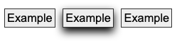
The following 3 examples use a 90px wide by 30px tall button, therefore the surface area requirement is 236px (240px minus corner 4 pixels). The middle button is focused in each example.
If controls change size across different variations of a page (e.g., in a responsive design), it helps to use a proportionally sized indicator such as an outline or background change. In that way you can be sure of meeting the size requirement.
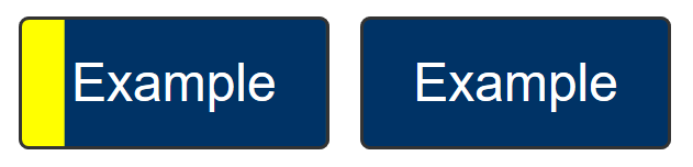
Another way of achieving the area exception is to alter the appearance of the entire component, for instance by changing its color. This can be effective in a set of closely placed buttons. The following example using the same set of 5 ratings stars given in the first illustrations in this document, shows how this can be achieved. However, it is much more difficult to detect such a focus indicator when components are not near each other and so cannot be easily compared. For users using magnfication, even components relatively close together may be difficult to compare, so it is not considered a best practice.

The Success Criterion includes an alternative size measure of "at least as large as a 4 CSS pixels border along the shortest side". This is included to allow for smaller but thick indicators. For example, some controls might be of a fixed height but variable width, in which case this measure allows for a more consistent approach.
Typical focus indicators:
- A solid outline around the whole component would pass the size requirement;
- A 1 CSS pixel dotted outline around the whole component would not pass the size requirement, as it is roughly 50% of the surface area of a solid line.
- Changing the background within a control would pass the size requirement;
- A 1px wide vertical line (such as a blinking cursor) would not pass the size requirement; a text input would need a larger or separate focus indicator.
The bigger the visible change when an item receives focus, the easier it is for someone to see. Authors are encouraged to make the change as significant as possible, for example by designing a thick border around the element. If you need to use complex mathematics to work out if a focus indicator is large enough, it is probably a sign that you should use a larger and proportional indicator that will provide a more visible indicator.
Unusual shapes
If you have an unusual shape (not rectangular), some mathematics may be required if the focus indicator is on the edge of the size requirement. For example, if the focusable control is a circle with a diameter of 100px, the circumference would be 314 pixels. A 1px (or greater) outline would meet the size criterion.

If a focus indicator is an irregular shape, such as a drop shadow under a star icon, it helps if the contrasting area is quite large.

What is the contrasting area of the drop shadow? The quick method is:
- Look at the size of the component, how long is it around the edges?
- Look at the (contrasting) area of the focus indicator.
- Mentally compare the focus indicator to the border of the component.
If it is too close to call, you could extract the contrasting area of the focus indicator and evaluate the surface area.
Gradients
If a focus indicator has a gradient, the principle is to measure the contrast of the changed area, and ignore the change that does not meet 3:1.
If you take some spot-checks on the gradient area and establish what area meets the contrast, it is straightforward to work out if that area is sufficient.

Some of the examples in this document, especially in the Exceptions section, are screen-captured images of elements. Due to loss of resolution in these images, the actual pixel color may not match the original. As such, they are intended to be used for illustrative purposes, and should not be inspected on a pixel-by-pixel basis for sufficient contrast.
Some designs have pages with a non-solid background image covering the whole (or part) of the page or make use of parallax scrolling effects which result in a near-infinite number of color combinations if a page is scrolled and/or changes are made to the viewport size.
If the contrast of background colors that change are close enough to need to be tested for each combination then they would likely not meet the user need of people with low vision in certain scroll combinations and would likely fail in certain combinations as well. In these cases it would be an easy solution to use a double ring focus indicator or some other mechanism to indicate focus such as a solid box with a border to guarantee there is sufficient contrast across variations of background images or background gradients.
Inline links
If an inline link is broken over multiple lines, some methods of focus indicator are
treated differently by browsers. Using CSS, an outline wraps each part of a wrapped link separately. A border will wrap the whole link as one perimeter. Each part of the link will pass or fail
as though they were separate links. If a 1px CSS border is used rather than outline,
the thickness may need to be increased to compensate for the missing sides as it is
not a complete perimeter for each part of the link.
Change of contrast
- has a contrast ratio of at least 3:1 against the same pixels in the unfocused state
The second of these exception sub-bullets matches the second of the primary considerations about a visual difference between a component with and without focus. The greater the change of contrast between states, the easier it is for users to see it. Authors are encouraged to make the change of color contrast as great as possible.
When a component changes to include a focus indicator, that change can be measured as a change of color contrast. For example, if a yellow outline is added to a button on a blue background, the change of color is from blue to yellow. This change can be measured whether the focus indicator is on the background around the component, or the background within the component.
Text and non-text contrast measures use adjacent colors; this Success Criterion measures the change in color between non-focused and focused states.
Color contrast measurements in WCAG are based on luminance (brightness) regardless of the hue.
If a control receiving focus changes its background (fill color) to a color that contrasts less than 3:1 with the original background, that would not pass the change of contrast.
If the background change is sufficient, it is a method of passing the criterion.
It is possible to use visual patterns such as strips switching places to disguise a change of focus indicator. This is not considered a visible indicator.
Adjacent contrast
- Has a contrast ratio of at least 3:1 against the component, or is no thinner than 2 CSS pixels.
The third of these exception sub-bullets is similar to the third primary consideration -- the focus indicator must contrast with whatever it is next to or it must be thick enough that it is easier to see. Where a control is a solid color, and you add a border or outline of a very similar color, it is difficult to perceive the change to the control.

The requirement is to have an indicator that has a 3:1 contrast ratio with the adjacent colors of the component, or to be separated from the component, or to be at least 2px thick.


If the focus indicator uses several colors, any color which does not contrast 3:1 against adjacent colors can be ignored as long as there is a 2 CSS pixel-thick part of the focus indicator whose pixels all change at least 3:1 between their focused and non-focused states. Practically, this means 3D drop-shadows and other stylings on a focus indicator can likely be ignored.
Where a focus indicator is defined in code as a certain size (e.g. 2px thickness) or color, anti-aliasing can be ignored for the purposes of calculation. Dotted or dashed outlines have various levels of gaps depending on the browser, screen density, and thickness. For example, in most browsers a "dotted" line will have roughly half the number of pixels due to gaps. However, in some sizes or browsers it might be slightly less than half, so increasing the thickness may be required.
Relationship to Non-text Contrast
In combination with 2.4.7 Focus Visible, 1.4.11 Non-text Contrast requires that the visual focus indicator for a component must have sufficient contrast against the adjacent colors when the component is focused, except where the appearance of the component is determined by the user agent and not modified by the author.
However, Non-text Contrast differs in what it assesses. Unlike the current Success Criterion, it does not require that the focus indicator has a change of contrast between the focused and non-focused states. Additionally, there is no size requirement and no exception for user agent default indicators.

Benefits
- This Success Criterion helps anyone who relies on the keyboard to operate the page, by letting them visually determine the component on which keyboard operations will interact at any point in time.
- People with attention limitations, short term memory limitations, or limitations in executive processes benefit by being able to discover where the focus is located.
Examples
- When links receive focus, an outline is displayed around the link that contrasts with the background adjacent to the link.
- When buttons receive focus, an outline is displayed within the button (around the text) that contrasts with the button’s background.
- When text fields receive focus, an outline is displayed around the field, indicating that the input has focus.
- When radio buttons receive focus, an outline is displayed around the control, indicating that the input has focus.
Related Resources
Resources are for information purposes only, no endorsement implied.
- A guide to designing accessible focus indicators by Sara Soueidan
Techniques
Each numbered item in this section represents a technique or combination of techniques that the WCAG Working Group deems sufficient for meeting this Success Criterion. However, it is not necessary to use these particular techniques. For information on using other techniques, see Understanding Techniques for WCAG Success Criteria, particularly the "Other Techniques" section.
Sufficient Techniques
Failures
The following are common mistakes that are considered failures of this Success Criterion by the WCAG Working Group.
- Using a CSS border for inline text which can wrap (Potential future technique)
Key Terms
visual angle of about 0.0213 degrees
A CSS pixel is the canonical unit of measure for all lengths and measurements in CSS. This unit is density-independent, and distinct from actual hardware pixels present in a display. User agents and operating systems should ensure that a CSS pixel is set as closely as possible to the CSS Values and Units Module Level 3 reference pixel [[!css3-values]], which takes into account the physical dimensions of the display and the assumed viewing distance (factors that cannot be determined by content authors).
Solidly bounds or surrounds
the pixels that are changed to visually indicate when a user interface component is in a focused state.
the smallest enclosing rectangle aligned to the horizontal axis within which all the points of a shape lie. Where a component consists of disconnected parts, such as a link that wraps onto multiple lines, each part is considered to have its own bounding box.
continuous line forming the boundary of a shape not including shared pixels, or the minimum bounding box, whichever is shortest. For example, the perimeter calculation for a rectangle is 2h+2w -4, where h is the height and w is the width and the corners are not counted twice. The perimeter of a circle is 2𝜋r.
a part of the content that is perceived by users as a single control for a distinct function
Multiple user interface components may be implemented as a single programmatic element. "Components" here is not tied to programming techniques, but rather to what the user perceives as separate controls.
User interface components include form elements and links as well as components generated by scripts.
What is meant by "component" or "user interface component" here is also sometimes called "user interface element".
An applet has a "control" that can be used to move through content by line or page or random access. Since each of these would need to have a name and be settable independently, they would each be a "user interface component."