Status
This understanding document is part of the draft WCAG 2.2 content. It may change or be removed before the final WCAG 2.2 is published.
Intent
The intent of this Success Criterion is to ensure targets can easily be activated without accidentally activating an adjacent target. When targets are small, it is difficult for users with hand tremors and those who have difficulty with fine motor movement to activate them accurately. Providing spacing between targets will reduce the likelihood of accidentally activating the wrong control.
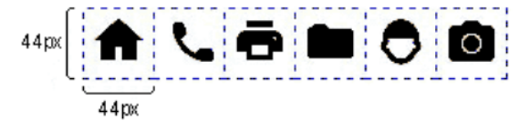
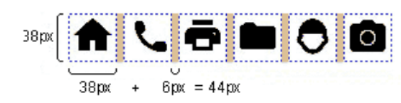
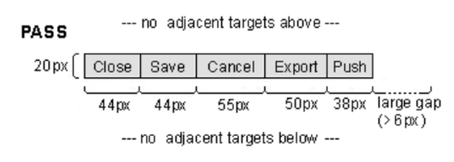
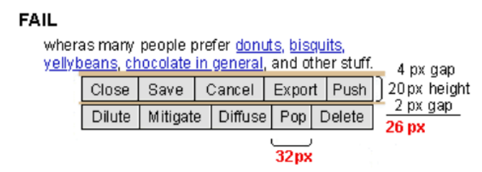
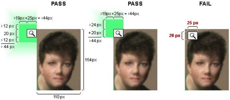
The requirement is for targets that are smaller than 44 x 44px to be included in an area with a width and height of at least 44px each. For the horizontal dimension, this means that the total width of 44px is composed of the width of the target and the width of the spacing that separates it from adjacent targets. The same applies to the height. For example, a target of 24 x 24px would meet the requirement if it had a spacing of 10 px on all sides. If the target is 44 x 44px or larger, no spacing between it and adjacent targets would be required.
There are three exceptions:
- If there is a mechanism to change the target sizes or spacing to meet the minimum, such as a button to change the sizes and layout of the targets.
- If the target is inline within a sentence there doesn’t need to be a minimum target size.
- If the spacing of the targets is essential to the information being conveyed there doesn’t need to be a minimum target size.
The requirement is independent of the zoom factor of the page, when users zoom in the CSS pixel size of elements does not change. This means that authors cannot meet it by claiming that the target will have enough spacing or sufficient size if the user zooms into the page.
The requirement does not apply to the spacing of targets inside unstyled native elements. For example, when a default select element is used, the vertical spacing of option elements inside the select's dropdown list is exempt.
While the Success Criterion primarily helps touch users by ensuring that activation with the 'fat finger' will not accidentally trigger adjacent targets, it is also useful for mouse or pen users. It reduces the chances of erroneous activation due to a tremor or some other input imprecision.
As mobile devices generally have internal heuristics to identify which link is closest, spacing can work as effectively as a larger target size.
Where targets are embedded inside other targets, the inner target either needs a size of at least 44 x 44 CSS pixels or must be placed at the edge or corner to make sure that there is sufficient adjacent spacing in each dimension.
Users with different disabilities have different needs for control sizes. It can be beneficial to provide an option to increase the active target area without increasing the visible target size. Another option is to provide a mechanism to control the density of layout and thereby change target size or spacing, or both. This can be beneficial for a wide range of users. For example, users with visual field loss may prefer a more condensed layout with smaller sized controls while users with other forms of low vision may prefer large controls.
Where user-agents control the size of a target, such as the options in a select drop-down, and the author has not tried to change the size of target with size or
padding adjustments, the target is exempted from this criterion. It would be beneficial
for users if the minimum size & spacing requirement is met, but where the user-agent
has defined the target it is not the authors responsibility.
Benefits
Having targets with sufficient target spacing can help all users who may have difficulty in confidently targeting or operating small controls. Users who benefit include, but are not limited to:
- Users who use a mobile device where the touch screen is the primary mode of interaction;
- Users with mobility impairments such as hand tremors;
- Users who use a device in environments where they are exposed to shaking such as public transportation;
- Users who have difficulty with fine motor movements;
- Users who access a device using one hand;
- Users with large fingers, or who are operating the device with only a part of their finger or knuckle.
Examples
- Three buttons are on-screen and the target area of each button is 44 by 44 CSS pixels. Since the target size itself is 44 x 44 px, no additional spacing is required, the Success Criterion passes.
- A row of buttons, each of which has a horizontal width of more than 44 px, but a height of only 30 px. Since there is sufficient spacing above and below the row of buttons, the Success Criterion passes.
- Links within a paragraph of text have varying target dimensions. Links within paragraphs of text do not need to meet the 44 by 44 CSS pixels requirements, so the Success Criterion passes.
Techniques
Each numbered item in this section represents a technique or combination of techniques that the WCAG Working Group deems sufficient for meeting this Success Criterion. However, it is not necessary to use these particular techniques. For information on using other techniques, see Understanding Techniques for WCAG Success Criteria, particularly the "Other Techniques" section.
Sufficient Techniques
Key Terms
hardware and/or software that acts as a user agent, or along with a mainstream user agent, to provide functionality to meet the requirements of users with disabilities that go beyond those offered by mainstream user agents
functionality provided by assistive technology includes alternative presentations (e.g., as synthesized speech or magnified content), alternative input methods (e.g., voice), additional navigation or orientation mechanisms, and content transformations (e.g., to make tables more accessible).
Assistive technologies often communicate data and messages with mainstream user agents by using and monitoring APIs.
The distinction between mainstream user agents and assistive technologies is not absolute. Many mainstream user agents provide some features to assist individuals with disabilities. The basic difference is that mainstream user agents target broad and diverse audiences that usually include people with and without disabilities. Assistive technologies target narrowly defined populations of users with specific disabilities. The assistance provided by an assistive technology is more specific and appropriate to the needs of its target users. The mainstream user agent may provide important functionality to assistive technologies like retrieving Web content from program objects or parsing markup into identifiable bundles.
Assistive technologies that are important in the context of this document include the following:
- screen magnifiers, and other visual reading assistants, which are used by people with visual, perceptual and physical print disabilities to change text font, size, spacing, color, synchronization with speech, etc. in order to improve the visual readability of rendered text and images;
- screen readers, which are used by people who are blind to read textual information through synthesized speech or braille;
- text-to-speech software, which is used by some people with cognitive, language, and learning disabilities to convert text into synthetic speech;
- speech recognition software, which may be used by people who have some physical disabilities;
- alternative keyboards, which are used by people with certain physical disabilities to simulate the keyboard (including alternate keyboards that use head pointers, single switches, sip/puff and other special input devices.);
- alternative pointing devices, which are used by people with certain physical disabilities to simulate mouse pointing and button activations.
satisfying all the requirements of a given standard, guideline or specification
process or technique for achieving a result
The mechanism may be explicitly provided in the content, or may be relied upon to be provided by either the platform or by user agents, including assistive technologies.
The mechanism needs to meet all success criteria for the conformance level claimed.
series of user actions where each action is required in order to complete an activity
Successful use of a series of Web pages on a shopping site requires users to view alternative products, prices and offers, select products, submit an order, provide shipping information and provide payment information.
An account registration page requires successful completion of a Turing test before the registration form can be accessed.
the content would not conform if that technology is turned off or is not supported
region of the display that will accept a pointer action, such as the interactive area of a user interface component
If two or more touch targets are overlapping, the overlapping area should not be included in the measurement of the target size, except when the overlapping targets perform the same action or open the same page.
mechanism for encoding instructions to be rendered, played or executed by user agents
As used in these guidelines "Web Technology" and the word "technology" (when used alone) both refer to Web Content Technologies.
Web content technologies may include markup languages, data formats, or programming languages that authors may use alone or in combination to create end-user experiences that range from static Web pages to synchronized media presentations to dynamic Web applications.
Some common examples of Web content technologies include HTML, CSS, SVG, PNG, PDF, Flash, and JavaScript.
any software that retrieves and presents Web content for users
Web browsers, media players, plug-ins, and other programs — including assistive technologies — that help in retrieving, rendering, and interacting with Web content.