Status
This understanding document is part of the draft WCAG 2.2 content. It may change or be removed before the final WCAG 2.2 is published.
Intent
The intent of this Success Criterion is to ensure that user interface components (controls) can be found easily by people with cognitive disabilities, vision loss, and mobility and motor impairments.
Some design approaches hide controls and require certain user interactions, such as mouseover, to reveal them (both visually and programmatically). Where the hidden controls are needed to complete tasks, the difficulty in discovering the controls can leave some users with disabilities without a way to progress.
Cognitive disabilities
People with low executive function, impaired memory, and other cognitive and learning disabilities may not be able to find hidden controls. If a hidden control is needed in order to progress, this can prevent some users from completing a task. Users who discover controls that display on hover may not remember how to show and operate the controls the next time they interact with the site. So even when a user is able to proceed, time on task can be affected for both one-time and repeated uses.
Vision loss
One of the main challenges for people with vision loss is simply locating related controls on the screen, moving the mouse from control to control, and getting the keyboard focus to coincide with where they are looking. This Success Criterion can help reduce that cumulative load.
People with vision loss may not see controls that display only on hover or focus, particularly if they display outside of the viewport. For users who require enlarged or magnified content, the portion of the content in the viewport may be significantly reduced. Low vision users may have 800 x 600 resolution as the default. They may look closely at the monitor from a few inches away due to limited acuity (inability to see detail) or Scotomas (blind spots). They may have a significant amount of head and neck movement while using content. When users don't see something on the screen, they may assume they are missing it — for example, that it’s in their blind spot or hidden in a menu — and go searching until they either find it or give up searching.
Mobility and motor impairments
People who use alternative input methods may have difficulty locating and operating controls that display only on hover or focus. For example, speech recognition users activate controls by speaking the name of the control. Functions that are only exposed through hover interaction or keyboard focus can pose significant barriers to alternative input methods.
When Needed
Information needed to identify controls does not need to be visible all the time. But information needed to identify controls must be visible without hover interaction or keyboard focus when the controls are needed. For example, if the control is required to carry out a task or progress through a user process. Controls can be available through a persistent visible entry point, such as a menu button that opens subitems. In a multi-step process or multi-part form, controls may be hidden in an earlier step or part; however, at the time the user can move the process forward, the information needed to identify the control, which is usually the control itself, must be visible without hover interaction or keyboard focus.
Ideally the information needed to identify controls exist would be visible all the time. Controls can be available through a persistent visible entry point, such as a menu button that opens subitems. There are also several exceptions outlined in the criterion text:
- If controls are provided in multiple locations on a page or at multiple points within a process, at least one of the instances of the control must be visible without hover interaction or keyboard focus. For example, with an email reader some controls such as Trash may be visible when hovering over individual messages in the inbox list view. Those controls will always be visible on the email view so they do not need to be persistently visible on the inbox view.
- If the control is to enhance keyboard navigation. For example, a link that skips from the top of the page to the navigation could become visible only on focus.
- If there is a mechanism to make the indicators persistently visible. For example, a button at the top of the page could make all the hidden controls visible without needing to hover over them.
- If hiding the information needed to identify the component is essential. For example, a memory game hides the controls for selecting a card to flip over.
The exception for components that provide "keyboard-only functionality" is to allow for features such as skip links, which are not visible by default. As they appear on focus, and are aimed at keyboard-only users, they are not intended to be covered by this criterion.
The following images highlight when a hidden hover feature is used, and there should be an indicator of those controls
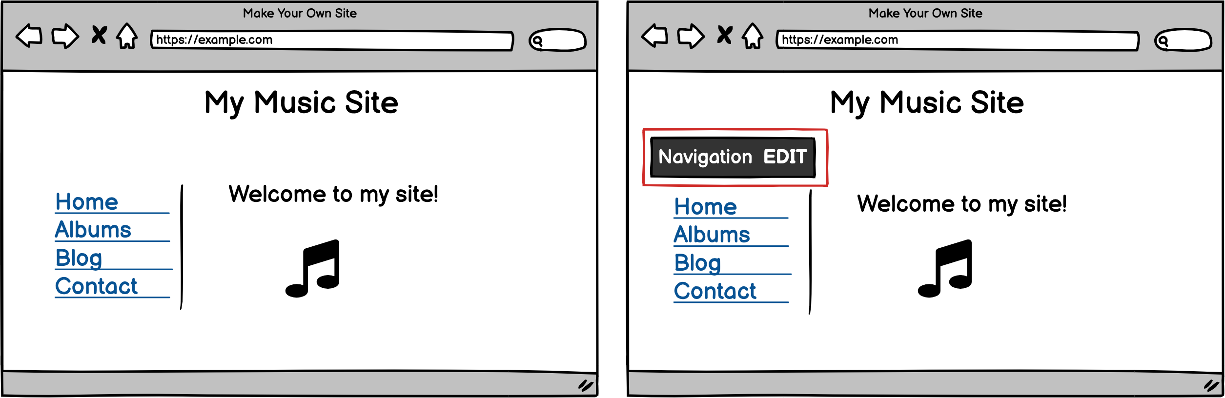
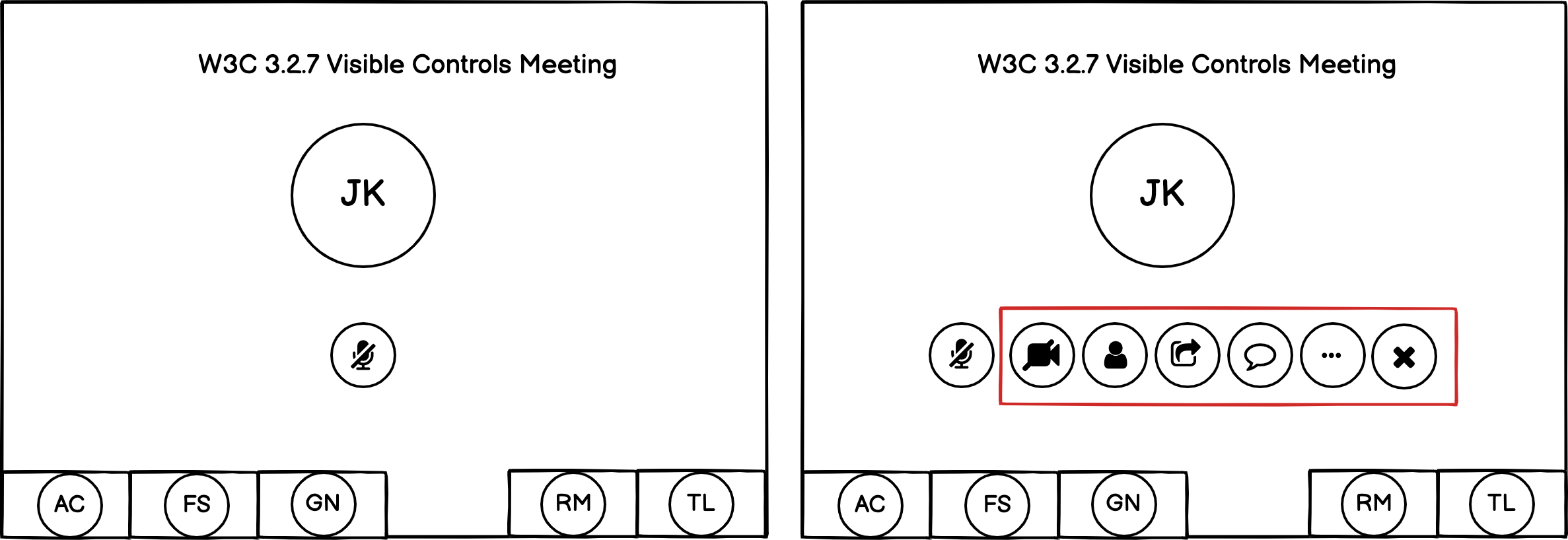
If figure 1 had an edit icon (e.g. a pencil) and figure 2 used a three dots / ellipsis icon, those would provide a visual indicator and pass the success criterion.
Embedded Controls
Information needed to identify user interface components is usually the component itself; however, there are situations where controls are not visible. Complex components such as video players and carousels often include controls that are visible on hover. The presence of the complex component — for example, the carousel component or the video image — provides the “Information needed to identify the user interface components.” For a carousel, controls displayed on hover should also be displayed when the carousel is activated. For a video player, activating the video image should launch the video (sometimes in a new window), at which point more video player controls, including controls displayed previously on hover, should be visible. Some users may still struggle if video controls are not persistently visible, so there is benefit to providing a mechanism that allows users to have the controls persistently visible.
Many scenarios are out of scope because they do not rely on hover or focus, for example:
- Options/fields become visible because of a selection elsewhere on the form. For example, address and City fields only appearing once the user has selected a State.
- An e-reader that allows the user to select a text passage and then pops-up a contextual toolbar with buttons that allows the user to interact with that text.
- Controls that become visible upon scrolling, such as a confirmation button that only appears when the user has scrolled through all the content in a Terms and Conditions dialog.
Benefits
- People with cognitive and learning disabilities can more easily locate controls that allow them to successfully progress through a process.
- People with memory impairments do not need to remember where controls are located.
- People with low vision do not need to coordinate visually searching for controls with the act of moving the pointer hover or keyboard focus.
- People with mobility and motor impairments who use speech or other input methods do not need to use hover or focus to locate and operate controls.
Examples
- Indication of which fields are editable: In a web editor, once a page is open for editing, all possible fields that can be edited always display a clear visible activation control, such as a pencil icon.
- Enable user to set controls as always visible instead of being hidden until revealed by hover: In a web editor that reveals hidden editing controls when a user hovers over them, a setting can be changed so that the editing controls are always shown by default, without requiring a hover event.
- Visible access to email controls: When viewing a list of emails the controls needed to delete or forward the email are not visible unless hovered. When an email has been selected for viewing, the same controls are persistently visible.
Other Success Criteria apply to the requirement for controls being “visible." Visibility is not limited to appearing graphically on the screen, but also includes following a meaningful sequence, not relying on sensory characteristics, and all other requirements under 1.4: Distinguishable.
Techniques
Each numbered item in this section represents a technique or combination of techniques that the WCAG Working Group deems sufficient for meeting this Success Criterion. However, it is not necessary to use these particular techniques. For information on using other techniques, see Understanding Techniques for WCAG Success Criteria, particularly the "Other Techniques" section.
Sufficient Techniques
- G222: Provide persistently visible controls
- Indicate programmatically that a control is important (future)
Key Terms
if removed, would fundamentally change the information or functionality of the content, and information and functionality cannot be achieved in another way that would conform
a part of the content that is perceived by users as a single control for a distinct function
Multiple user interface components may be implemented as a single programmatic element. "Components" here is not tied to programming techniques, but rather to what the user perceives as separate controls.
User interface components include form elements and links as well as components generated by scripts.
What is meant by "component" or "user interface component" here is also sometimes called "user interface element".
An applet has a "control" that can be used to move through content by line or page or random access. Since each of these would need to have a name and be settable independently, they would each be a "user interface component."