Intent
The intent of this Success Criterion is to ensure that active user interface components and meaningful (non-text) graphics are distinguishable by people with moderately low vision (who do not use contrast-enhancing assistive technology). The requirements and rationale are similar to those for text in WCAG 2.0's 1.4.3 Contrast (Minimum).
Low contrast controls are more difficult to perceive, and may be completely missed by people with a visual impairment. Similarly, if a graphic is needed to understand the content or functionality of the webpage then it should be perceivable by people with low vision or other impairments.
Active User Interface Components
For active controls on the page, such as buttons and form fields, the visual boundaries of the component must have sufficient contrast with the adjacent background. Also, the visual effects which indicate state, such as whether a component is selected or focused, must also provide the minimum 3:1 contrast with the adjacent background of the component.
This success criteria does not require that controls have a visual indicator, but that if there is an indicator, it has sufficient contrast.
Regardless of the whether or not there is a visible indication of the hit area for the button, the focus indicator for the component must have sufficient contrast when the component is focused. If only the text (or icon) is visible and there is no visual indication of the hit area, then there is no contrast requirement beyond the text contrast (as per 1.4.3) or icon contrast as per this Success Criteria. Regardless of the whether or not there is a visible indication of the hit area for the button, the focus indicator for the component must have sufficient contrast when the component is focused.
Note on SC 1.4.1 Use of Color
1.4.1 states Color is not used as the only visual means of conveying information, indicating an action, prompting a response, or distinguishing a visual element.
Although every object on a screen is arguably created through use of color only (shapes are created by altering a bunch of pixels from white to another color), the context made clear in the Understanding document is that 1.4.1 addresses changing only the color of an object (or text) without otherwise altering the object's form. If an author adds an outline or shadow to a shape to indicate a change in state, that is not relying solely on use of color.
Relative luminence: If the selected and unselected states of an object do vary only by color, this is still acceptable so long as the luminosity contrast ratio between the selected and unselected colors differs by at least 3:1.
User agent enhancment: If the author-supplied visual indicators of change in state vary only by color, this is still acceptable if the user agent provides a redundant visual effect which authors do not obscure.
Active User Interface Component Examples
For designing focus indicators, selection indicators and user interface components that need to be perceived clearly, the following are examples that have sufficient contrast.
| Type | Description | Examples |
|---|---|---|
| Visual Focus Indicator | Visual focus indicator for a link that is a blue (#6699cc) outline around the link. The blue (#6699cc) outline does provide a sufficient contrast with the white (#ffffff) background that is equal to 3 to 1. | Example 1 |
| Text Input with border | Text Input with a border. The blue outline does provide a sufficient contrast that is equal to 3 to 1. Blue border line (#6699cc) against immediate surrounding color of white (#FFFFFF) has a contrast ratio of exactly 3 to 1. | |
| Text input using background colour | Text input using a different in background colour to indicate the input. |
@@Additional examples could be added for any native html elements that are interactive and have visual affordances (including: select, radio button, checkbox, details / summary, video and/or audio controls ). @@
Inactive User Interface Components
User Interface Components that are not available for user interaction (eg: a disabled control in HTML) are not required to meet this color contrast requirements in WCAG 2.1. Due to the different needs and preferences of people with low vision and people with cognitive disabilities, a contrast requirement for disabled user interface components is recommended for future advancements in user preferences.
An inactive user interface component is visible but not currently operable. Example: A submit button at the bottom of a form that is visible but cannot be activated until all the required fields in the form are completed.
Graphical Objects
The term "graphical object" applies to stand-alone icons such as a print icon (with no text), and the important parts of a more complex diagram such as each line in a graph. For simple graphics such as single-color icons the entire image is a graphical object. Images made up of multiple lines, colors and shapes will be made of multiple graphical objects, some of which are required for understanding.
Not every graphical object needs to contrast with its surroundings - only those that are required for a user to understand what the graphic is conveying. Gestalt principles such as the "law of continuity" can be used to ignore minor overlaps with other graphical objects or colors.
| Image | Notes |
|---|---|
 |
The phone icon is a simple shape within the orange circle. The meaning can be understood from that icon alone, the background behind the circle is irrelevant. The graphical object is the white phone icon. |
 |
A magnet can be understood by the U shape with lighter colored tips. Therefore to understand this graphic you should be able to discern the overall shape (against the background) and the lighter colored tips (against the rest of the U shape and the background). The graphical objects are the U shape (by outline or by the solid red color), and each tip of the magnet. |
 |
The low-currency symbol can be understood with recognition of the shape (down arrow) and the currency symbol (pound icon with the shape). To understand this graphic you need to discern the arrow shape against the white background, and the pound icon against the yellow background. The graphical objects are the shape and the currency symbol. |
 |
In order to understand the graph you need to discern the lines and shapes for each condition. Therefore each line and colored shape is a ‘graphical object’ in the graph and should be over 3:1 against the white background. Most of them have good contrast except the green triangles. The graphical objects are the lines in the graph, including the background lines for the values, and the colored lines with shapes. The lines should have 3:1 contrast against their background, but as there is little overlap with other lines they do not need to contrast with each other. (See the testing principles below.) |
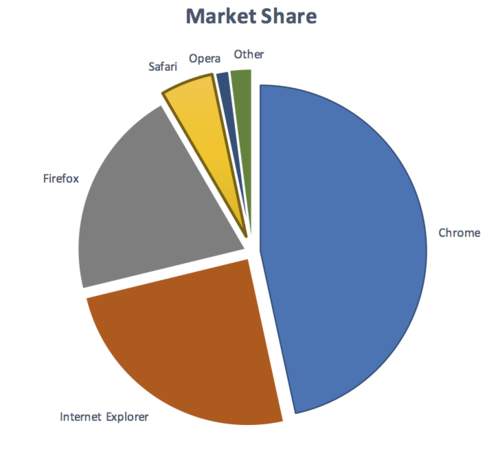 |
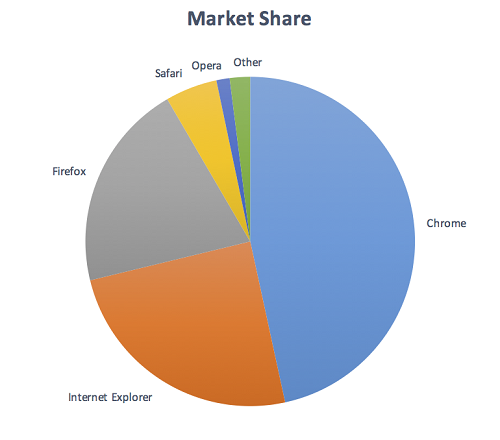
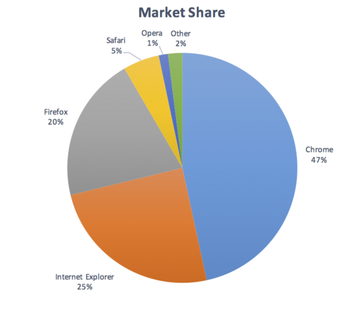
To understand the pie chart you have to discern each slice of the pie chart from the others. The graphical objects are the slices of the pie (chart). Note: If the values of the pie chart slices were also presented in a conforming manner, the slices would not be required for understanding. |
Taking the magnet image above as an example, the process for establishing the graphical object(s) is to:
- Assess what part of each image is needed to understand what it represents.
The magnet's U shape can be conveyed by the outline or by the red background (either is acceptable). The white tips are also important (otherwise it would be a horseshoe), which needs to contrast with the red background. - Assume that the user could only see those aspects, do they contrast with the adjacent colors?
The outline of the magnet contrasts with the surrounding text (black/white), and the red and white between the tips also has sufficient contrast.
Due to the strong contrast of the red and white, it would also be possible to only put the outline around the white tips of the magnet and it would still conform.
Required for understanding
The term "required for understanding" is used in the Success Criterion as many graphics do not need to meet the contrast requirements. If a person needs to perceive a graphic, or part of a graphic (a graphical object) in order to understand the content it should have sufficient contrast. However, that is not a requirement when:
- A graphic with text embedded or overlayed conveys the same information, such as labels and values on charts.
- The graphic is for aesthetic purposes that does not require the user to see or understand it to understand the content or use the functionality.
- The information is available in another form.
- The graphic is part of a logo or brand name (which is considered 'essential' to it's presentation).
Gradients
Gradients can reduce the apparent contrast between areas, and make it more difficult to test. The general principles is to identify the graphical object(s) required for understanding, and take the central color of that area. If you remove the adjacent colour which does not have sufficient contrast, can you still identify and understand the graphical object?

Dynamic Examples
Some graphics may have interactions that either vary the contrast, or display the information as text when you mouseover/tap/focus each graphical object. In order for someone to discern the graphics exist at all, there must be contrasting colors or text in order to find the graphics. Within that area, information available by a conforming method (e.g. focusable elements) can be used to make that information available dynamically as text, or dynamically increase the contrast.
Infographics
Infographics can mean any graphic conveying data, such as a chart or diagram. On the web it is often used to indicate a large graphic with lots of statements, pictures, charts or other ways of conveying data. In the context of graphics contrast, each item within such an infographic should be treated as a set of graphical objects, regardless of whether it is in one file or separate files.
Infographics often fail to meet have several WCAG level AA criteria including: (*@@@ link to other understanding docs)
- 1.1.1 Non-text Content
- 1.4.1 Use of Color
- 1.4.3 (Text) Contrast
- 1.4.5 Images of Text
Where an infographic passes other success criteria and requires the user to perceive graphical objects in order to understand the content, each graphical object should have sufficient contast.
Essential exception
The exception for graphical objects is for when "a particular presentation of graphics is essential to the information being conveyed". This is intended to apply when there is no way of presenting the graphic with sufficient contrast without undermining the meaning. For example:
- Logotypes and flags: The brand logo of an organization or product is the representation of that organization and therefore exempt. Flags may not be identifiable if the colours are changed.
- Sensory: There is no requirement to change pictures of real life scenes such as photos of people or scenery.
- Representing other things: If you cannot represent the graphic in any other way, it is essential. Examples include:
- Screenshots to demonstrate how a website appeared.
- Diagrams of medical information that use the colors found in biology (example medical schematic from Wikipedia).
- Colour gradients that represent a measurement, such as heat maps (example heatmap from Wikipedia).
Testing Principles
Each technique has a test procedure, but there are top-line principles that help to assess graphical objects on a web page:
- Identify each user-interface component on the page and:
- Identify the boundaries of the component and test the contrast ratio against the adjacent colors.
- Identify the state indicators and test the contrast ratio against the adjacent colors.
- Identify each graphic on the page that includes information required for understanding the content (i.e. excluding graphics which have visible text for the same information, or are decorative).
- For each graphic identify the graphical objects within that graphic and:
- Check the contrast of the graphical object against its adjacent colours;
- If there are multiple colours and/or a gradient, chose the least contrasting area to test;
- If it passes, move to the next graphical object;
- If the least-contrasting area is less than 3:1, assume that area is invisible, is the graphical object still understandable?
- If there is enough of the graphical object to understand, it passes, else fail.
The techniques below each have detailed testing criteria.
Benefits
People with low vision often have difficulty perceiving graphics that have insufficient contrast. This can be exacerbated if the person has a color vision deficiency that lowers the contrast even further. Providing a relative luminance (lightness difference) of 3:1 or greater can make these items more distinguishable when the person does not see a full range of colors.
