Examples
- A thin (under 3 CSS pixel width) border on form fields in a university admissions application have a 4.5:1 minimum contrast ratio.
- A thick (3 CSS pixel or wider) border on form fields in a university admission application has a 3:1 minimum contrast ratio.
- Focus indicators on all links in a Web site have a 4.5:1 minimum contrast ratio.
Sufficient Contrast Examples
For designers developing focus indicators, selection indicators and user interface components that need to be perceived clearly, the following are examples that have sufficient contrast.
@@Additional examples could be added for any native html elements that are interactive and have visual affordances (including: select, radio button, checkbox, details / summary, video and/or audio controls ). @@
| Type | Contrast Required | Description | Examples |
|---|---|---|---|
| Visual Focus Indicator with 3 CSS pixel stroke |
3 to 1 | Visual focus indicator for a link that is a 3 CSS pixel blue outline around the link. The 3 CSS pixel blue outline does provide a sufficient contrast that is equal to 3 to 1. 3 CSS pixel blue visual focus indicator line (#6699cc) against the immediate surrounding color of white (#FFFFFF) has a contrast ratio of exactly 3 to 1. | 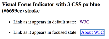 See working examples at Accessible Visual Focus Indicators |
| Visual Focus Indicator with 1 CSS pixel stroke |
4.5 to 1 | Visual focus indicator for a link that is a 1 CSS pixel black outline around the link. The 1 CSS pixel black outline provides sufficient contrast greater than 4.5 to 1. 1 CSS pixel black visual focus indicator line (#000000) against the immediate surrounding color of white (#FFFFFF) has a contrast ratio of 21 to 1. | 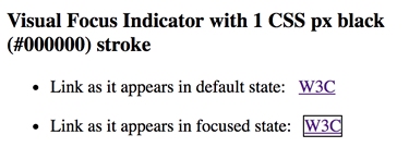 See working examples at Accessible Visual Focus Indicators |
| Type | Contrast Required | Description | Examples |
|---|---|---|---|
| Thick Selection Indicator | 3 to 1 | Selected Tab is visually indicated with a tab background of black (#000000). The black (#000000) background on the selected tab provides a sufficient contrast that is greater than 3 to 1. The black (#000000) tab against the immediate surrounding color of light grey (#eeeeee) has a contrast ratio of 18.1 to 1. The selected tab's color of black (#000000) has a contrast of at least 3 to 1 with the color of the white (#FFFFFF) non-selected tabs The black tab background is larger that 3 CSS pixel wide and 3 CSS pixel high so it is considered "thick" and only has to meet a 3 to 1 color contrast ratio.. | See working example at Accessible Contrast for Selection Indicators |
| Type | Contrast Required | Description | Examples |
|---|---|---|---|
| Text Input with 3 CSS pixel border stroke |
3 to 1 | Text Input with a 3 CSS pixel border. The 3 CSS pixel blue outline does provide a sufficient contrast that is equal to 3 to 1. 3 CSS pixel blue border line (#6699cc) against immediate surrounding color of white (#FFFFFF) has a contrast ratio of exactly 3 to 1. | See working example at Accessible Contrast for Text Input |
| Text Input with 3 CSS pixel border stroke on bottom only |
3 to 1 | Text Input with a 3 CSS pixel border on bottom. The 3 CSS pixel blue bottom border does provide a sufficient contrast that is equal to 3 to 1. 3 CSS pixel blue border line (#6699cc) against immediate surrounding color of white (#FFFFFF) has a contrast ratio of exactly 3 to 1. | See working example at Accessible Contrast for Text Input |
| Text Input with 1 CSS pixel stroke |
4.5 to 1 | Text Input with a 1 CSS pixel border. The 1 CSS pixel black outline provides sufficient contrast greater than 4.5 to 1. 1 CSS pixel black line (#000000) against immediate surrounding color of white (#FFFFFF) has a contrast ratio of 21 to 1. | See working example at Accessible Contrast for Text Input |
| Text Input with 1 CSS pixel border stroke on bottom only |
4.5 to 1 | Text Input with a 1 CSS pixel border on bottom. The 1 CSS pixel black bottom border does provide a sufficient contrast that is greater than 4.5 to 1. 1 CSS pixel black border line (#000000) against immediate surrounding color of white (#FFFFFF) has a contrast ratio of 21 to 1. | See working example at Accessible Contrast for Text Input |
| Text Input with no border | 3 to 1 | Text Input with no border. The white background of the text input does provide sufficient contrast that is equal to 3 to 1. While there is no border, the solid area of the white text input easily meets the minimum 3 css pixel by 3 css pixel requirement to qualify as thick. The white (#FFFFFF) text input against the immediate surrounding color of blue(#6699cc) has a contrast ratio of exactly 3 to 1. | See working example at Accessible Contrast for Text Input |
| Type | Contrast Required | Description | Examples |
|---|---|---|---|
| Transparent Submit Button with 3 CSS pixel border |
3 to 1 | Transparent submit button with a 3 CSS pixel blue border. The 3 CSS pixel blue border does provide a sufficient contrast that is equal to 3 to 1. 3 CSS pixel blue border line (#6699cc) against immediate surrounding color of white (#FFFFFF) has a contrast ratio of exactly 3 to 1. | See working examples at Accessible Contrast for Submit Button |
| Light Grey Submit Button with 3 CSS pixel border |
3 to 1 | Light Grey (#EBEBEB) submit button with a 3 CSS pixel blue border. The 3 CSS pixel blue border does provide a sufficient contrast that is equal to 3 to 1. 3 CSS pixel blue border line (#6699CC) against immediate outer surrounding color of white (#FFFFFF) has a contrast ratio of exactly 3 to 1. The fact that the background of the submit button is a light grey (#EBEBEB) is irrelevant for testing the color contrast of the border line of the button, because this SC only requires the border line to contrast with the immediate outer color. | See working examples at Accessible Contrast for Submit Button |
| Transparent Submit Button with 1 CSS pixel border |
4.5 to 1 | Transparent submit button with a 1 CSS pixel black border. The 1 CSS pixel black border provides sufficient contrast greater than 4.5 to 1. 1 CSS pixel black border line (#000000) against immediate surrounding color of white (#FFFFFF) has a contrast ratio of 21 to 1. | See working examples at Accessible Contrast for Submit Button |
| Blue Submit Button with no border | 3 to 1 | Blue submit button with no border. The blue button provides sufficient contrast equal to 3 to 1. While there is no border, the solid area of the blue button easily meets the minimum 3 css pixel by 3 css pixel requirement to qualify as thick. The blue (#6699cc) text input against the immediate surrounding color of white (#FFFFFF) has a contrast ratio of exactly 3 to 1. | See working examples at Accessible Contrast for Submit Button |
| Transparent Submit Button with no border |
4.5 to 1 | Transparent submit button with a no border. There is no visual affordance indicating this is a button for any user. This SC does not require the visual affordance to exist, it just requires that if the essential visual affordance (non-text) does exist, that essential visual affordance is accessible to people with low vision too. Note: The proposed SC that does relate to the cognitive usability problem created with a button like this is Issue #36 Clear Controls | See working examples at Accessible Contrast for Submit Button |
Failure Examples
| Type | Contrast Required | Description | Failure Example |
|---|---|---|---|
| Transparent Submit Button with very light grey 3 CSS px border (Failure) |
3 to 1 | Failure - Transparent submit button with a 3 CSS px very light grey border. The 3 CSS px very light grey does not meet the minimum contrast requirement of 3 to 1. 3 CSS px very light grey border line (#D2D2D2) against immediate outer surrounding color of white (#FFFFFF) has a contrast ratio of only 1.5 to 1. | See working failure examples at Failure Contrast for Submit Button Border |
Transparent Submit Button |
4.5 to 1 | Failure - Transparent submit button with a 1 CSS px light blue border. The 1 CSS px light blue border does not meet the minimum contrast requirement of 4.5 to 1. 1 CSS px light blue border line (#6699cc) against immediate surrounding color of white (#FFFFFF) only has a contrast ratio of 3 to 1. | See working failure examples at Failure Contrast for Submit Button Border |