Extended Description: Website Visitor Statistics
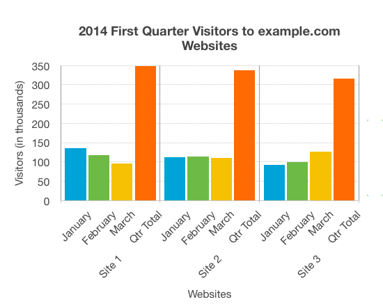
Overview
The chart shows the website hits for the first quarter of 2014 across three different sites. Site 1 has more visitors than either of the other sites, but the number of visitors is decreasing. Site 2 has a fairly constant number of visitors, while for Site 3 page hits are increasing month on month.
Data Table
| Period | Site 1 | Site 2 | Site 3 |
|---|---|---|---|
| Jan | 135 | 112 | 92 |
| Feb | 117 | 114 | 99 |
| Mar | 96 | 111 | 126 |
| Qtr Total | 348 | 337 | 308 |
Presentation
The bar chart represents both the number of visitors per month for each website, and the total number of visitors per website for the entire quarter. Website visitors for each month are represented using columns lined up horizontally, with heights indicating the number of visitors. A fourth column is provided for each website with the accumulated site visitors for the quarter.
Extended Description: Circulatory and Respiratory Systems
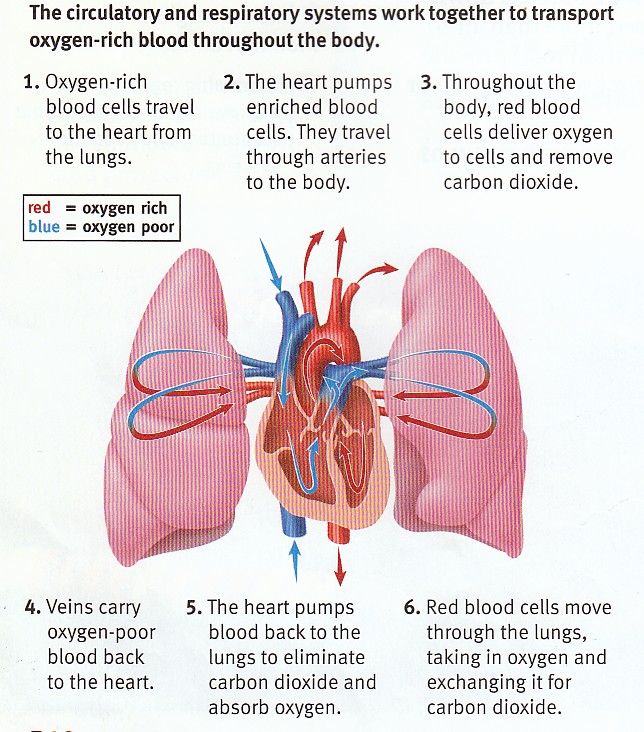
Systems in Sync
The circulatory and respiratory systems work together to transport oxygen-rich blood through the body. A diagram shows a cross-section of a heart between two lungs. Red arrows show the path of oxygen-rich blood cells. Blue arrows show the path of oxygen-poor blood.
The Process
- Oxygen-rich blood cells travel to the heart from the lungs.
- The heart pumps enriched blood cells. They travel through the arteries to the body.
- Throughout the body, red blood cells deliver oxygen to cells and remove carbon dioxide.
- Veins carry oxygen-poor blood back to the heart.
- The heart pumps blood back to the lungs to eliminate carbon dioxide and absorb oxygen.
- Red blood cells move through the lungs, taking in oxygen and exchanging it for carbon dioxide.
Key Functions
The heart acts as a pump that powers circulation, while the lungs facilitate gas exchange. This interconnected system ensures that every cell in the body receives the oxygen it needs to function, while waste products are efficiently removed and expelled through respiration. Without either system, the other cannot function effectively.
Extended Description: Market Segment Pie Chart
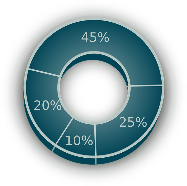
Chart Overview
A pie chart with 4 parts representing different market segments:
The largest segment, capturing nearly half of the total market. This dominant segment represents the primary focus of market activity and accounts for the greatest proportion of overall market share.
The second largest segment, representing a quarter of the market. This significant segment shows moderate market presence and suggests a substantial secondary market opportunity.
The third segment, accounting for one-fifth of the market. This smaller segment still represents a meaningful portion of the overall market composition.
The smallest segment, representing one-tenth of the total market. Despite being the smallest, this segment may still offer opportunities for growth and development.
Market Analysis
This pie chart illustrates the market distribution across four distinct segments. The largest segment captures 45% of the market, indicating it is the dominant area. The second segment at 25% represents a significant but smaller portion. The remaining two segments together account for 30% of the market, with one at 20% and the smallest at 10%.
The concentration of 45% in the largest segment suggests a market where a single segment dominates. The complementary distribution of the remaining segments provides insight into the market's diversity and the opportunities that exist in secondary markets.