Examples with Detailed Information
This page demonstrates how complex visual information can be described and made accessible through extended descriptions in separate files. Each image has a brief alt text for basic context, plus a link to a detailed extended description file that provides comprehensive information about the content.
Website Visitor Analytics
Let's examine the website traffic statistics for the first quarter of 2014. The following bar chart compares visitor numbers across three different websites.
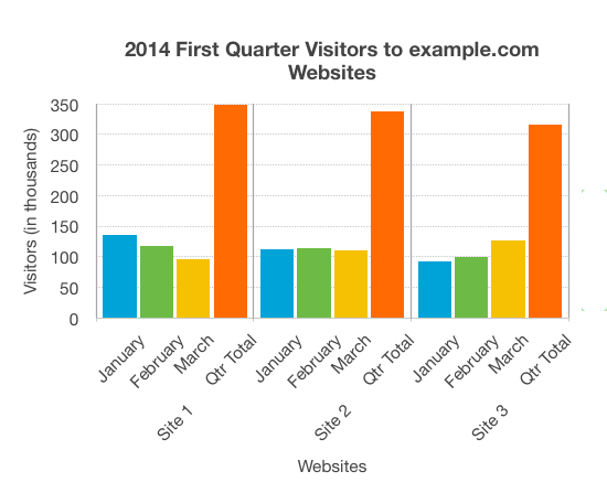
This bar chart displays monthly visitor data for three websites throughout the first quarter of 2014.
The chart reveals interesting trends across the three sites. Site 1 maintains the highest traffic but shows declining visitor numbers, while Site 3 demonstrates steady growth throughout the quarter.
Human Circulatory and Respiratory Systems
Understanding the interconnection between different body systems is crucial to biology. The following diagram illustrates how the heart and lungs work together to transport oxygen throughout the body.
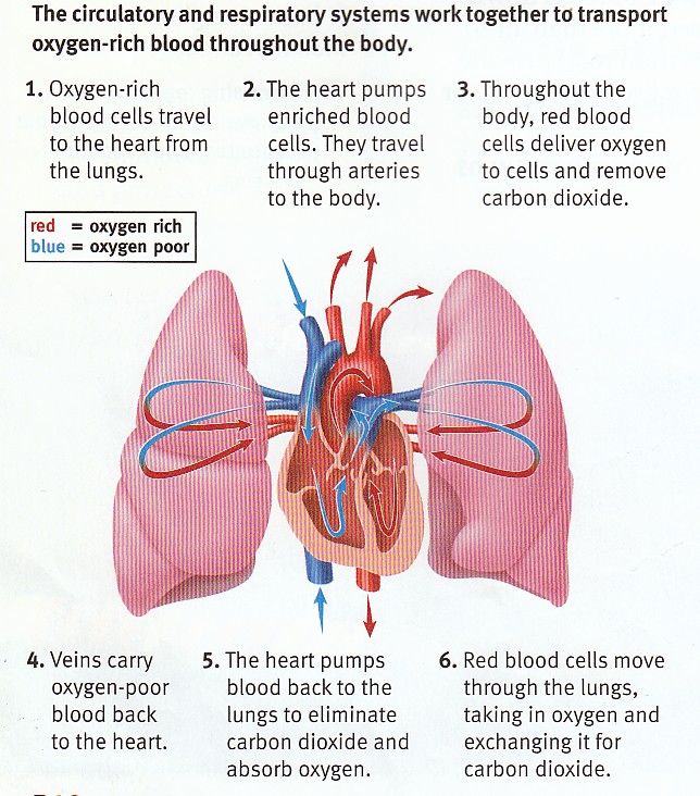
A cross-section showing how oxygen-rich and oxygen-poor blood flow through the heart and lungs.
This biological partnership ensures that cells throughout the body receive the oxygen they need while waste products are efficiently removed.
Market Segmentation Analysis
Market analysis often employs pie charts to show how different segments contribute to the whole. The following pie chart represents the breakdown of market segments in a hypothetical analysis.
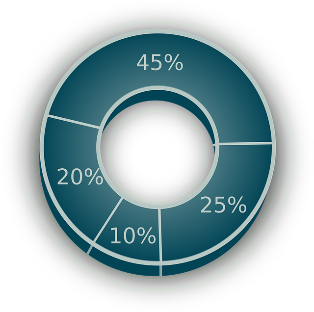
Distribution of market segments represented as percentages of the whole.
About Extended Descriptions
Each image on this page has a brief alt text describing what the image shows, plus a link to an extended description in a separate file that provides detailed information. Users can choose whether to view the extended description based on their needs. This approach is particularly useful in EPUB publications where extended descriptions are kept in separate files.