Related Tips and Techniques: Responsive Images
Status: This is not ready for detailed review. It is an in-progress, unapproved editor’s draft.
High resolution images are often not needed for the smaller viewports of small devices. Image size can be made responsive by using the same "container" for the image in all the viewport sizes, but changing out the image source file. There are two techniques for doing this. In both cases all images must be adequately described using the same principles for describing images.
Technique 1: The <picture> Element
The picture element can be used to describe image sources. The <picture> element needs a base image using the <img> element, which is enabled with alternative text. No matter what <source> is used in the <picture> is used, the same alt attribute is used.
<picture>
  <source media="(max-width: 40em)"
    srcset="dragon-320.jpg 1x">
  <source media="(max-width: 80em)"
    srcset="dragon-640.jpg 1x">
  <source
    srcset="dragon-1024.jpg 1x">
  <img src="dragon-640.jpg" alt="60 foot long dragon lit internally with lights">
</picture>
Technique 2: The srcset Attribute
A similar approach is to use a single element, but use the srcset attribute to define image sources for different viewports. The
element space is enabled with alternative text.
<img src="dragon-640.jpg"
        srcset="dragon-1024.jpg 1024w, dragon-640.jpg 640w, dragon-320.jpg 320w"
        sizes="(min-width: 320px) 33.3vw, 100vw"
        alt="60 foot long dragon lit internally with lights"
>
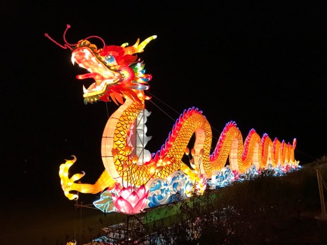
Figure 1: Dragon 320.jpg
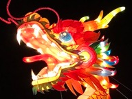
Figure 2: Dragon 640.jpg
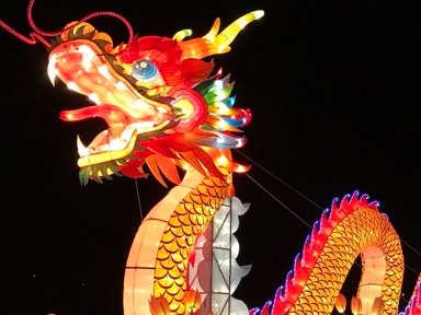
Figure 3: Dragon 1024.jpg