Web Accessibility Perspectives: Large Links, Buttons, and Controls
Introduction
Web accessibility is essential for people with disabilities and useful for all. Learn about the impact of accessibility and the benefits for everyone in a variety of situations.
Video on Large Links, Buttons, and Controls
[ Previous: Text to Speech | Overview | Next: Video Captions ]
What is "Large Links, Buttons, and Controls"?
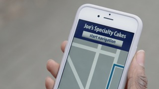
The area for clicking and tapping controls must be large enough for people to activate them. This includes links, buttons, checkboxes, and other controls. Small controls, and controls that are placed too close to each other, are difficult for many people to use. This is particularly relevant on mobile devices with small screens.
Who depends on this feature?
- People with physical disabilities who have reduced dexterity.
What are the additional benefits?
- Content is more usable on touch screens, especially on smaller mobile devices.
- Content is more usable for people who are not experienced with the mouse or touch-pad on the computer they are using.
- Content is more usable in situations where the device cannot be held steady.
What needs to happen for this to work?
Design large controls or activation areas around the controls. (Increasing the font size of the control sometimes isn't enough.) Provide adequate separation between selectable controls. Provide labels for controls, which enlarges the activation area in many browsers because the label for checkboxes and option buttons is also clickable.
Learn more
- Accessibility Principle:
- Getting Started:
- Easy Check:
- User Story:
- Web Content Accessibility Guidelines (WCAG Overview):

