Intent
The intent of this Success Criterion is to ensure that active user interface components (i.e., controls) and meaningful graphics are distinguishable by people with moderately low vision. The requirements and rationale are similar to those for large text in 1.4.3 Contrast (Minimum).
Low contrast controls are more difficult to perceive, and may be completely missed by people with a visual impairment. Similarly, if a graphic is needed to understand the content or functionality of the webpage then it should be perceivable by people with low vision or other impairments without the need for contrast-enhancing assistive technology.
Active User Interface Components
For active controls on the page, such as buttons and form fields, any visual boundary that indicates the component's hit area (the region where a pointer can activate the control) must have sufficient contrast with the adjacent background. Also, the visual effects which indicate state, such as whether a component is selected or focused, must also provide the minimum 3:1 contrast with the background adjacent to the component.
This success criteria does not require that controls have a visual boundary indicating the hit area, but that if there is an indicator then it has sufficient contrast. If only the text (or icon) is visible and there is no visual indication of the hit area, then there is no contrast requirement beyond the text contrast (1.4.3 Contrast (Minimum)) or icon contrast covered by the Graphical Objects portion of this Success Criteria. Note that for people with cognitive disabilities it is recommended to delineate the boundary of controls to aid in the recognition of controls and therefore the completion of activities.
Regardless of the whether or not there is a visible boundary for the button, the focus indicator for the component must have sufficient contrast when the component is focused.

The Use of Color success criteria addresses changing only the color of an object (or text) without otherwise altering the object's form. If the states of an object vary by color this is acceptable if the luminosity contrast ratio between the colors of the states differ by at least 3:1, or there is another indicator of state.
Active User Interface Component Examples
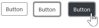
For designing focus indicators, selection indicators and user interface components that need to be perceived clearly, the following are examples that have sufficient contrast.
| Type | Description | Examples |
|---|---|---|
| Visual Focus Indicator | Visual focus indicator for a link that is a blue (#6699cc) outline around the link. The blue (#6699cc) outline does provide a sufficient contrast with the white (#ffffff) background that is equal to 3 to 1. | Example 1 |
| Text Input with border | Border line (#787878) against immediate surrounding color of white (#FFFFFF) has a contrast ratio of exactly 3 to 1. |
|
| Text input using background colour | Text input using a different in background colour to indicate the input. | |
| Text Input with partial border | Bottom-border line (#787878) against immediate surrounding color of white (#FFFFFF) has a contrast ratio of exactly 3 to 1. The input also has a very light background, however, it is the bottom border that is intended to convey the nature of the input. |
|
Inactive User Interface Components
User Interface Components that are not available for user interaction (eg: a disabled control in HTML) are not required to meet this color contrast requirements in WCAG 2.1. An inactive user interface component is visible but not currently operable. Example: A submit button at the bottom of a form that is visible but cannot be activated until all the required fields in the form are completed.
Inactive components, such as disabled controls in HTML, are not available for user interaction. The decision to exempt inactive controls from the contrast requirements was based on a number of considerations:
-
Backward compatibility: WCAG 2.0 guidance for 1.4.3 Contrast (Minimum) specifically exempts
text or images of text that are part of an inactive user interface component
. It would be confusing and inconsistent to exempt text in inactive components from contrast considerations while requiring sufficient contrast for the graphical container the text resides in. -
Variations in significance: Depending on the circumstances, disabled controls may be intentionally designed to be more or less visible depending on how meaningful a control's disabled state is. Two examples can illustrate.
- A control remains disabled only until the user completes a prerequisite task, at which point it becomes active.
- A designer uses a standard layout for a number of operations. In one operation a control is not valid and so is disabled, but remains visible simply to maintain a consistent layout.
The disabled control in the first example offers a more significant cue, and a designer may intentionally decrease the contrast in the second case to de-emphasize its importance.
-
Conflicting needs and desires. Although meaningful information is conveyed by a lower-contrast disabled control (to those who can perceive it), not all users desire an increase in the prominence of disabled controls.
- Low-vision - some users want to ignore the disabled elements, just focusing on the enabled elements. Other low vision users want to see the disabled items clearly.
- Cognitive - some people with cognitive differences really want to be able to focus on the active elements (and ignore the non-active elements). If we force stronger contrast on the disabled elements, it will likely be difficult for all sighted people to distinguish what is active (and what is disabled).
A one-size fits all solution has been very difficult to establish, a method of varying the presentation of disabled controls based on user preferences is anticipated as an advancement in future.
Graphical Objects
The term "graphical object" applies to stand-alone icons such as a print icon (with no text), and the important parts of a more complex diagram such as each line in a graph. For simple graphics such as single-color icons the entire image is a graphical object. Images made up of multiple lines, colors and shapes will be made of multiple graphical objects, some of which are required for understanding.
Not every graphical object needs to contrast with its surroundings - only those that are required for a user to understand what the graphic is conveying. Gestalt principles such as the "law of continuity" can be used to ignore minor overlaps with other graphical objects or colors.
| Image | Notes |
|---|---|
|
The phone icon is a simple shape within the orange circle. The meaning can be understood from that icon alone, the background behind the circle is irrelevant. The graphical object is the white phone icon. |

|
A magnet can be understood by the U shape with lighter colored tips. Therefore to understand this graphic you should be able to discern the overall shape (against the background) and the lighter colored tips (against the rest of the U shape and the background). The graphical objects are the U shape (by outline or by the solid red color), and each tip of the magnet. |

|
The low-currency symbol can be understood with recognition of the shape (down arrow) and the currency symbol (pound icon with the shape). To understand this graphic you need to discern the arrow shape against the white background, and the pound icon against the yellow background. The graphical objects are the shape and the currency symbol. |
|
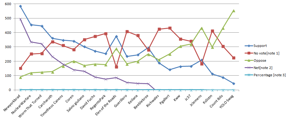
In order to understand the graph you need to discern the lines and shapes for each condition. Therefore each line and colored shape is a ‘graphical object’ in the graph and should be over 3:1 against the white background. Most of them have good contrast except the green triangles. The graphical objects are the lines in the graph, including the background lines for the values, and the colored lines with shapes. The lines should have 3:1 contrast against their background, but as there is little overlap with other lines they do not need to contrast with each other. (See the testing principles below.) |
|
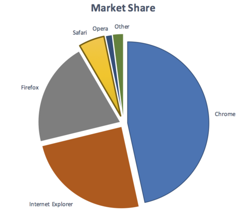
To understand the pie chart you have to discern each slice of the pie chart from the others. The graphical objects are the slices of the pie (chart). Note: If the values of the pie chart slices were also presented in a conforming manner (see the Pie Charts example for details), the slices would not be required for understanding. |
Taking the magnet image above as an example, the process for establishing the graphical object(s) is to:
- Assess what part of each image is needed to understand what it represents.
The magnet's U shape can be conveyed by the outline or by the red background (either is acceptable). The white tips are also important (otherwise it would be a horseshoe), which needs to contrast with the red background. - Assume that the user could only see those aspects, do they contrast with the adjacent colors?
The outline of the magnet contrasts with the surrounding text (black/white), and the red and white between the tips also has sufficient contrast.
Due to the strong contrast of the red and white, it would also be possible to only put the outline around the white tips of the magnet and it would still conform.
Required for Understanding
The term "required for understanding" is used in the Success Criterion as many graphics do not need to meet the contrast requirements. If a person needs to perceive a graphic, or part of a graphic (a graphical object) in order to understand the content it should have sufficient contrast. However, that is not a requirement when:
- A graphic with text embedded or overlayed conveys the same information, such as labels and values on charts.
- The graphic is for aesthetic purposes that does not require the user to see or understand it to understand the content or use the functionality.
- The information is available in another form.
- The graphic is part of a logo or brand name (which is considered "essential" to it's presentation).
Gradients
Gradients can reduce the apparent contrast between areas, and make it more difficult to test. The general principles is to identify the graphical object(s) required for understanding, and take the central color of that area. If you remove the adjacent colour which does not have sufficient contrast, can you still identify and understand the graphical object?

Dynamic Examples
Some graphics may have interactions that either vary the contrast, or display the information as text when you mouseover/tap/focus each graphical object. In order for someone to discern the graphics exist at all, there must be contrasting colors or text in order to find the graphics. Within that area, information available by a conforming method (e.g. focusable elements) can be used to make that information available dynamically as text, or dynamically increase the contrast.
Infographics
Infographics can mean any graphic conveying data, such as a chart or diagram. On the web it is often used to indicate a large graphic with lots of statements, pictures, charts or other ways of conveying data. In the context of graphics contrast, each item within such an infographic should be treated as a set of graphical objects, regardless of whether it is in one file or separate files.
Infographics often fail to meet several WCAG level AA criteria including:
An infographic can use text which meets the other criteria to minimise the number of graphical objects required for understanding. For example, using text with sufficient contrast to provide the values in a chart.
Essential Exception
Graphical objects do not have to meet the contrast requirements when "a particular presentation of graphics is essential to the information being conveyed". The Essential exception is intended to apply when there is no way of presenting the graphic with sufficient contrast without undermining the meaning. For example:
- Logotypes and flags: The brand logo of an organization or product is the representation of that organization and therefore exempt. Flags may not be identifiable if the colors are changed to have sufficient contrast.
- Sensory: There is no requirement to change pictures of real life scenes such as photos of people or scenery.
-
Representing other things: If you cannot represent the graphic in any other way, it is essential. Examples include:
- Screenshots to demonstrate how a website appeared.
- Diagrams of medical information that use the colors found in biology (example medical schematic from Wikipedia).
- Colour gradients that represent a measurement, such as heat maps (example heatmap from Wikipedia).
Graphical Object Examples
- Status icons on an application's dashboard (without associated text) have a 3:1 minimum contrast ratio.
- A text input has a dark border around the white editable area.
- A graph uses a light background and ensures that the colors for each line have a 3:1 contrast ratio against the background.
Pie Charts
Pie charts make a good case study for the graphical objects part of this success criteria, the following pie charts are intended to convey the proportion of market share each browser has. NB: The actual figures are made up, these are not actual market shares.
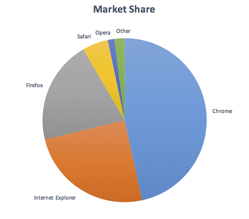
Fail: The pie chart has labels for each slice (so passes 1.4.1 Use of Color), but in order to understand the proportions of the slices you must discern the edges of the slices (the graphical objects conveying essential information), and the contrast between the slices is not over 3:1.
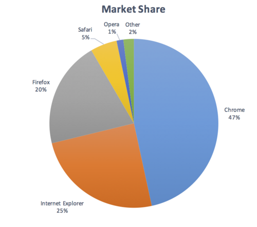
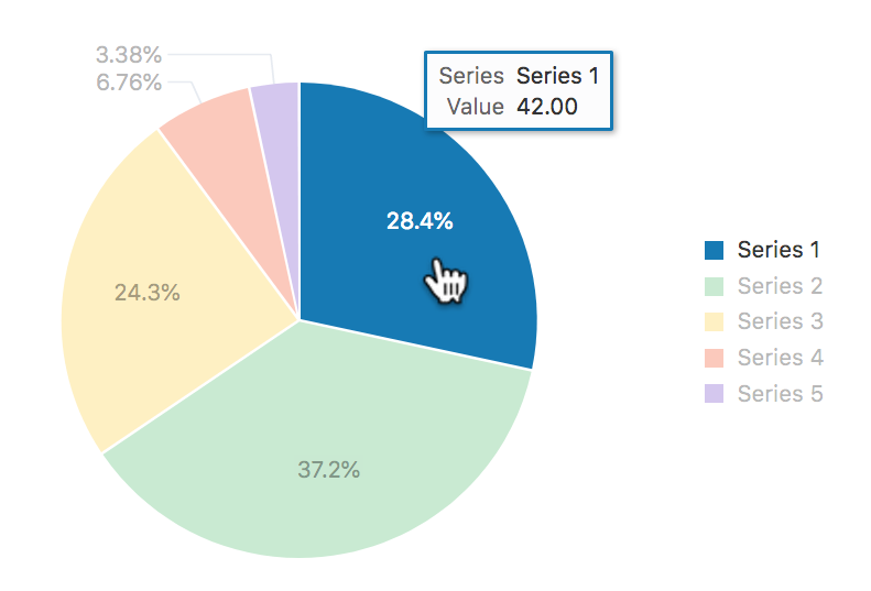
Not applicable: The pie chart has visible labels and values that convey equivalent information to the graphical objects (the pie slices).
Pass: The pie chart has visible labels, and sufficient contrast around and between the slices of the pie chart (the graphical objects). A darker border has been added around the yellow slice in order to achieve the contrast level.
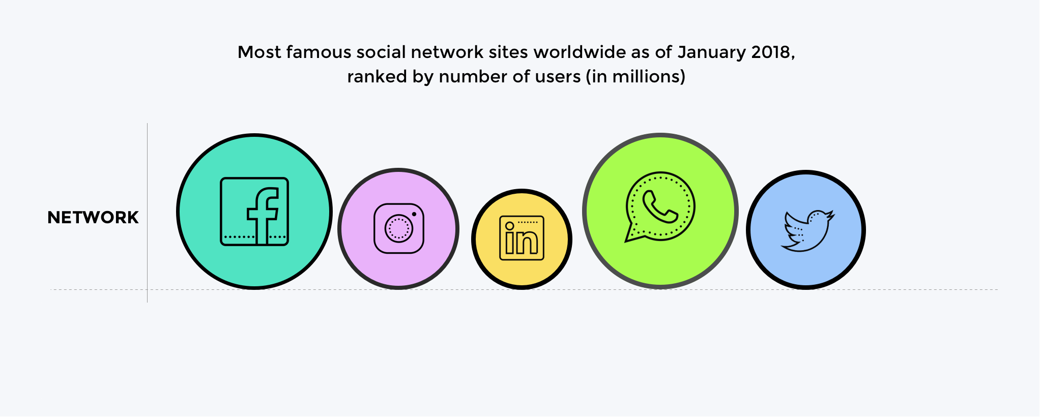
Infographics

Fail: Discerning the circles is required to understand the size of network and discerning the icons in each circle is required to identify which network it shows.
The graphical objects are the circles (measured against the background) and the icons in each circle (measured against the circle's background).
Pass: The circles have contrasting borders and the icons are a contrasting dark colour against the light circle backgrounds.
There are many possible solutions to ensuring contrast, the example shows the use of borders. Other techniques are to use darker colours for the circle backgrounds, or to add text labels & values for each item.
Testing Principles
A summary of the high-level process for finding and assessing non-text graphics on a web page:
- Identify each user-interface component (link, button, form control) on the page and:
- Identify the visible boundaries of the component that indicate it is a component and test the contrast ratio against the adjacent colors.
- Identify the state indicators and test the contrast ratio against the adjacent colors.
- Identify each graphic on the page that includes information required for understanding the content (i.e. excluding graphics which have visible text for the same information, or are decorative) and:
- Check the contrast of the graphical object against its adjacent colours;
- If there are multiple colours and/or a gradient, chose the least contrasting area to test;
- If it passes, move to the next graphical object;
- If the least-contrasting area is less than 3:1, assume that area is invisible, is the graphical object still understandable?
- If there is enough of the graphical object to understand, it passes, else fail.
The techniques below each have testing criteria.
Benefits
People with low vision often have difficulty perceiving graphics that have insufficient contrast. This can be exacerbated if the person has a color vision deficiency that lowers the contrast even further. Providing a relative luminance (lightness difference) of 3:1 or greater can make these items more distinguishable when the person does not see a full range of colors.
Related Resources
Resources are for information purposes only, no endorsement implied.
- Accessibility Requirements for People with Low Vision.
- Smith Kettlewell Eye Research Institute - "If the text is better understood with the graphics, they should be equally visible as the text".
- Gordon Legge - "Contrast requirements for form controls should be equivalent to contrast requirements for text".
Techniques
Each numbered item in this section represents a technique or combination of techniques that the WCAG Working Group deems sufficient for meeting this Success Criterion. However, it is not necessary to use these particular techniques. For information on using other techniques, see Understanding Techniques for WCAG Success Criteria, particularly the "Other Techniques" section.
Sufficient Techniques
Select the situation below that matches your content. Each situation includes techniques or combinations of techniques that are known and documented to be sufficient for that situation.
Graphics with sufficient contrast
- Contrasting colors between graphical objects (TBD)
- Include contrasting lines between adjoining colors (TBD)
Text in or over graphics
- Include labels and values with the graphic (TBD)
- G18: Ensuring that a contrast ratio of at least 4.5:1 exists between text (and images of text) and background behind the text
- G145: Ensuring that a contrast ratio of at least 3:1 exists between text (and images of text) and background behind the text
- G174: Providing a control with a sufficient contrast ratio that allows users to switch to a presentation that uses sufficient contrast
- Using sufficient contrast for images that convey information (Draft)
Advisory Techniques
Although not required for conformance, the following additional techniques should be considered in order to make content more accessible. Not all techniques can be used or would be effective in all situations.
Key Terms
(L1 + 0.05) / (L2 + 0.05), where
- L1 is the relative luminance of the lighter of the colors, and
- L2 is the relative luminance of the darker of the colors.
Contrast ratios can range from 1 to 21 (commonly written 1:1 to 21:1).
Because authors do not have control over user settings as to how text is rendered (for example font smoothing or anti-aliasing), the contrast ratio for text can be evaluated with anti-aliasing turned off.
For the purpose of Success Criteria 1.4.3 and 1.4.6, contrast is measured with respect to the specified background over which the text is rendered in normal usage. If no background color is specified, then white is assumed.
Background color is the specified color of content over which the text is to be rendered in normal usage. It is a failure if no background color is specified when the text color is specified, because the user's default background color is unknown and cannot be evaluated for sufficient contrast. For the same reason, it is a failure if no text color is specified when a background color is specified.
When there is a border around the letter, the border can add contrast and would be used in calculating the contrast between the letter and its background. A narrow border around the letter would be used as the letter. A wide border around the letter that fills in the inner details of the letters acts as a halo and would be considered background.
WCAG conformance should be evaluated for color pairs specified in the content that an author would expect to appear adjacent in typical presentation. Authors need not consider unusual presentations, such as color changes made by the user agent, except where caused by authors' code.
if removed, would fundamentally change the information or functionality of the content, and information and functionality cannot be achieved in another way that would conform
rendering of the content in a form to be perceived by users
New
dynamic property expressing characteristics of a user interface component that may change in response to user action or automated processes
States do not affect the nature of the component, but represent data associated with the component or user interaction possibilities. Examples include focus, hover, select, press, check, visited/unvisited, and expand/collapse.
a part of the content that is perceived by users as a single control for a distinct function
Multiple user interface components may be implemented as a single programmatic element. Components here is not tied to programming techniques, but rather to what the user perceives as separate controls.
User interface components include form elements and links as well as components generated by scripts.
What is meant by "component" or "user interface component" here is also sometimes called "user interface element".
An applet has a "control" that can be used to move through content by line or page or random access. Since each of these would need to have a name and be settable independently, they would each be a "user interface component."